Jason Song
a5e09a5595
Fix UI regression of asciinema player ( #26159 )
...
It was caused by updating `asciinema-player`, the upstream changed the
CSS class prefix:
`40505e479ehttps://github.com/go-gitea/gitea/assets/9418365/b91a2cf5-c1da-43d6-bac2-bc278728b11e ">
</details>
<details>
<summary>After:</summary>
<img width="1311" alt="image"
src="https://github.com/go-gitea/gitea/assets/9418365/c9872d25-e0bb-43d4-8b1e-d87c6b03c0a2 ">
</details>
2023-07-26 09:46:59 +00:00
Lunny Xiao
5dc37ef97a
Display deprecated warning in admin panel pages as well as in the log file ( #26094 )
...
This PR includes #26007 's changes but have a UI to prompt administrator
about the deprecated settings as well as the log or console warning.
Then users will have enough time to notice the problem and don't have
surprise like before.
<img width="1293" alt="图片"
src="https://github.com/go-gitea/gitea/assets/81045/c33355f0-1ea7-4fb3-ad43-cd23cd15391d ">
---------
Co-authored-by: wxiaoguang <wxiaoguang@gmail.com>
2023-07-26 03:53:37 +00:00
silverwind
e62ea96ada
Increase table cell horizontal padding ( #26140 )
...
Extract from https://github.com/go-gitea/gitea/pull/26043 , just the
padding increase.
Before and After (hard to notice, but it's there):
<img width="427" alt="Screenshot 2023-07-25 at 19 37 12"
src="https://github.com/go-gitea/gitea/assets/115237/9543dcda-eccb-4739-b7dd-06b076108ab4 ">
<img width="420" alt="Screenshot 2023-07-25 at 19 37 26"
src="https://github.com/go-gitea/gitea/assets/115237/0a9c3724-81a1-4c67-a13b-4b728a51fc3a ">
Co-authored-by: Giteabot <teabot@gitea.io>
2023-07-25 23:54:20 +02:00
puni9869
5a56f9699c
Fix UI for release tag page / wiki page / subscription page ( #25948 )
...
Agenda:
This PR contains UI fixes for release tag page / wiki page /
subscription page.
Here is the list of changes made in this PR.
1. Release tag page
a. In the New Release page the whole ui got change. Now it is covering
in full page page with mobile view port. Description about the release
the editor preview now has a min-height. and the check boxes for
`Prerelease` and option are left aligned. Couple of divider are added.
2. Subscription page:
a. In the subscription page the ui was distorted in mobile view. Now its
fix. Couple of unused styles were removed.
3. Create Wiki page:-
a. In the page the preview of markdown is now contains a fix min-height
so this it will not distorted in desktop view and a divider is added
before action buttons. Couple of unused styles were removed.
# Before
## Release page
<img width="1391" alt="image"
src="https://github.com/go-gitea/gitea/assets/80308335/319dec2e-08cf-40c5-920a-d651930ee28e ">
<img width="494" alt="image"
src="https://github.com/go-gitea/gitea/assets/80308335/03249f40-2d36-4552-bb93-43832aac2f8b ">
<img width="1390" alt="image"
src="https://github.com/go-gitea/gitea/assets/80308335/bf8b2d31-4857-480b-abd9-66a3ae6e24d8 ">
<img width="484" alt="image"
src="https://github.com/go-gitea/gitea/assets/80308335/c3a58210-a337-4c8e-89a6-edb3975986bb ">
Editor
<img width="958" alt="image"
src="https://github.com/go-gitea/gitea/assets/80308335/3bdd299d-d12b-4774-ace9-7184b1a57b18 ">
Editor preview
<img width="1293" alt="image"
src="https://github.com/go-gitea/gitea/assets/80308335/2b61c528-c018-4800-ab86-07aae56adecd ">
<img width="484" alt="image"
src="https://github.com/go-gitea/gitea/assets/80308335/ff7bc5ee-9dc0-4f78-a0b1-94277ab27700 ">
#### After
<img width="1439" alt="image"
src="https://github.com/go-gitea/gitea/assets/80308335/94f7e073-5977-40bd-98ef-0711ed0815cc ">
<img width="1384" alt="image"
src="https://github.com/go-gitea/gitea/assets/80308335/83e3105f-c1ee-4329-b90f-8bb724dac50f ">
<img width="1440" alt="image"
src="https://github.com/go-gitea/gitea/assets/80308335/05f024a5-52eb-4072-8599-d6ca12f6fad1 ">
<img width="1387" alt="image"
src="https://github.com/go-gitea/gitea/assets/80308335/c73f069b-572a-4a13-aaa9-fc5b4dd3420d ">
<img width="1440" alt="image"
src="https://github.com/go-gitea/gitea/assets/80308335/2f98f012-8e64-4a12-9595-5acdef18f85c ">
Markdown preview change
<img width="1368" alt="image"
src="https://github.com/go-gitea/gitea/assets/80308335/31e583ec-48f6-4f1a-8b56-0164fcb127a5 ">
Wiki page
Before
<img width="1393" alt="image"
src="https://github.com/go-gitea/gitea/assets/80308335/9c9cfdf6-3c2a-4f47-883b-76624d96f9a0 ">
<img width="499" alt="image"
src="https://github.com/go-gitea/gitea/assets/80308335/522ad573-1ad2-4fa2-8bf7-48a3dded14e7 ">
Preview of mark down.
<img width="488" alt="image"
src="https://github.com/go-gitea/gitea/assets/80308335/998f3c25-9fca-43c8-b1ff-648aab291727 ">
Footer
<img width="490" alt="image"
src="https://github.com/go-gitea/gitea/assets/80308335/89c6cf4e-4599-4403-bac8-285efdd9361a ">
After
<img width="1389" alt="image"
src="https://github.com/go-gitea/gitea/assets/80308335/1ee0fc72-f864-44c0-b2e4-e0e8a8470204 ">
<img width="498" alt="image"
src="https://github.com/go-gitea/gitea/assets/80308335/b35b9a5d-8e26-4869-a6ed-6cef1f4a87a6 ">
<img width="499" alt="image"
src="https://github.com/go-gitea/gitea/assets/80308335/b40bcbaa-fca6-42ab-9556-f950811b565d ">
Preview tab block has min-height
<img width="1392" alt="image"
src="https://github.com/go-gitea/gitea/assets/80308335/4a53d6c2-596c-423a-91b1-533cef734f93 ">
Mobile view
<img width="496" alt="image"
src="https://github.com/go-gitea/gitea/assets/80308335/c5ffc4c9-3c21-4cad-bc32-2ea3f0644a08 ">
<img width="497" alt="image"
src="https://github.com/go-gitea/gitea/assets/80308335/08dd560f-4333-41ec-95b9-8154910d2254 ">
<img width="496" alt="image"
src="https://github.com/go-gitea/gitea/assets/80308335/9fba8f55-727b-4756-a4a6-2070c719b15b ">
## Subscription page
### Before
<img width="1393" alt="image"
src="https://github.com/go-gitea/gitea/assets/80308335/0a7d561b-f56c-4ebe-93bd-952abecd437f ">
<img width="492" alt="image"
src="https://github.com/go-gitea/gitea/assets/80308335/4dc44d0c-ea81-4130-8afb-8f271c029e8a ">
After
<img width="1394" alt="image"
src="https://github.com/go-gitea/gitea/assets/80308335/a3567e30-2b5b-49d6-9ecb-2ab481ea4d36 ">
<img width="494" alt="image"
src="https://github.com/go-gitea/gitea/assets/80308335/024da9e2-dfc4-4672-95cc-a6ac034d9712 ">
<img width="508" alt="image"
src="https://github.com/go-gitea/gitea/assets/80308335/b748ecea-427c-4f8b-a1bf-08f82f9a42e6 ">
2023-07-25 17:53:16 +00:00
wxiaoguang
ad5ce59800
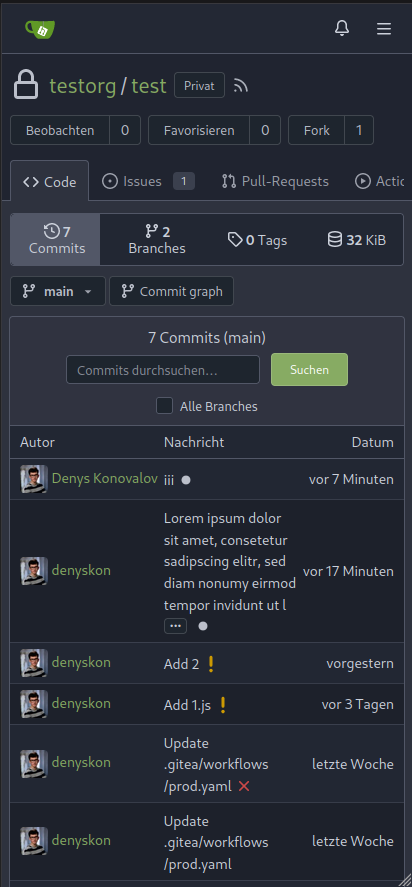
Improve commit graph alignment and truncating ( #26112 )
...
Fix #26101

2023-07-25 10:17:41 +00:00
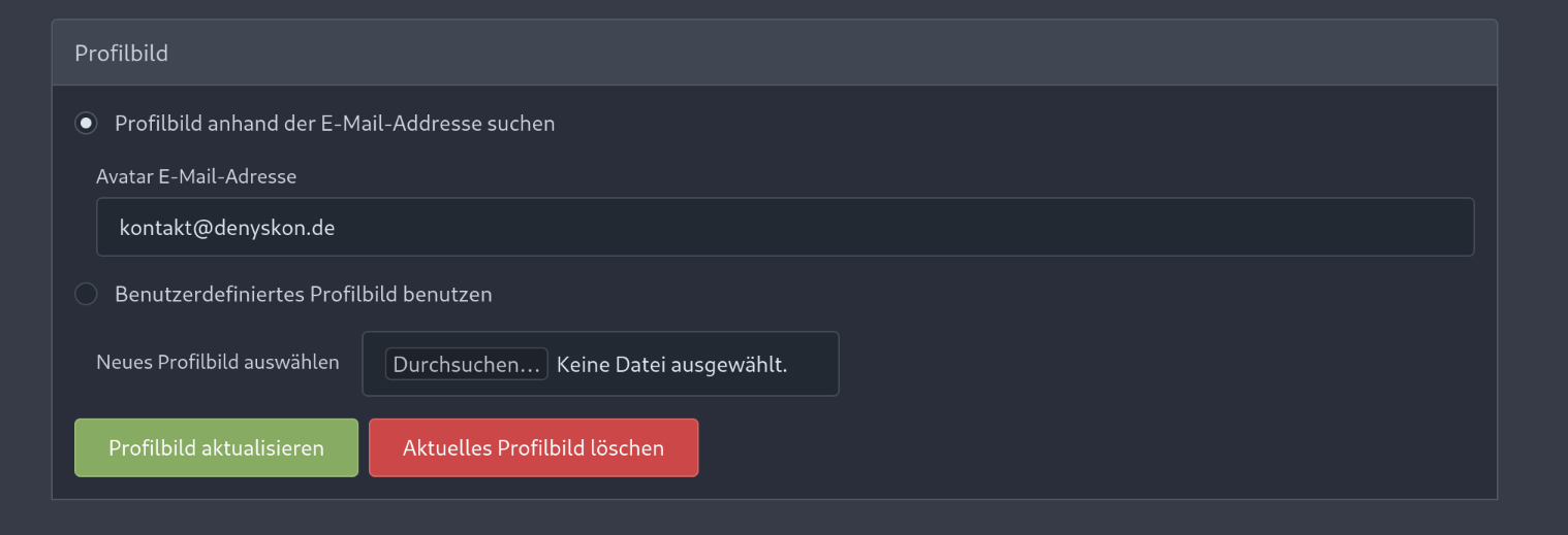
JakobDev
6598d0291c
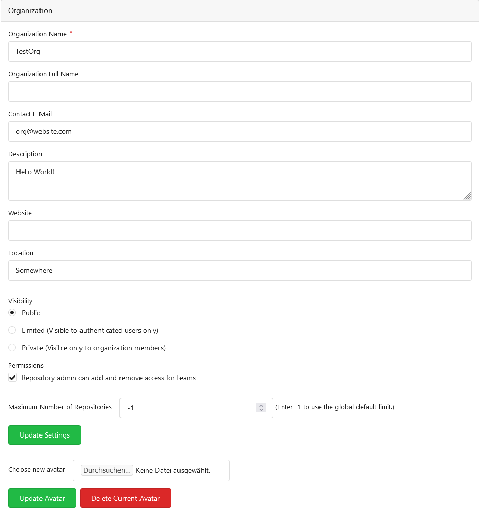
Allow Organisations to have a E-Mail ( #25082 )
...
Resolves #25057
This adds a E-Mail field to Organisations. The E-Mail is just shown on
the Profile when it is visited by a logged in User. The E-mail is not
used for something else.
**Screenshots:**

---------
Co-authored-by: Denys Konovalov <kontakt@denyskon.de>
Co-authored-by: Denys Konovalov <privat@denyskon.de>
Co-authored-by: wxiaoguang <wxiaoguang@gmail.com>
Co-authored-by: Giteabot <teabot@gitea.io>
2023-07-25 08:26:27 +00:00
wxiaoguang
a7e8273574
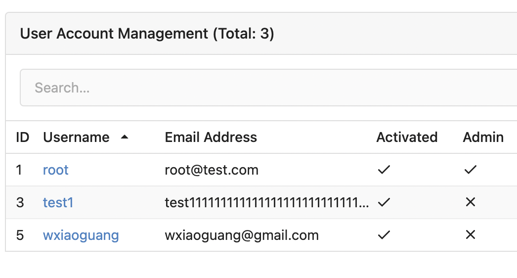
Fix the truncate and alignment problem for some admin tables ( #26042 )
...
Some "text truncate email" code were just copied&pasted, they are not
suitable for most admin tables.
For the table layouts, some "max-width" helpers could be very helpful.
At least, we can get rid of the confusing "email" CSS class.


2023-07-22 10:54:48 +00:00
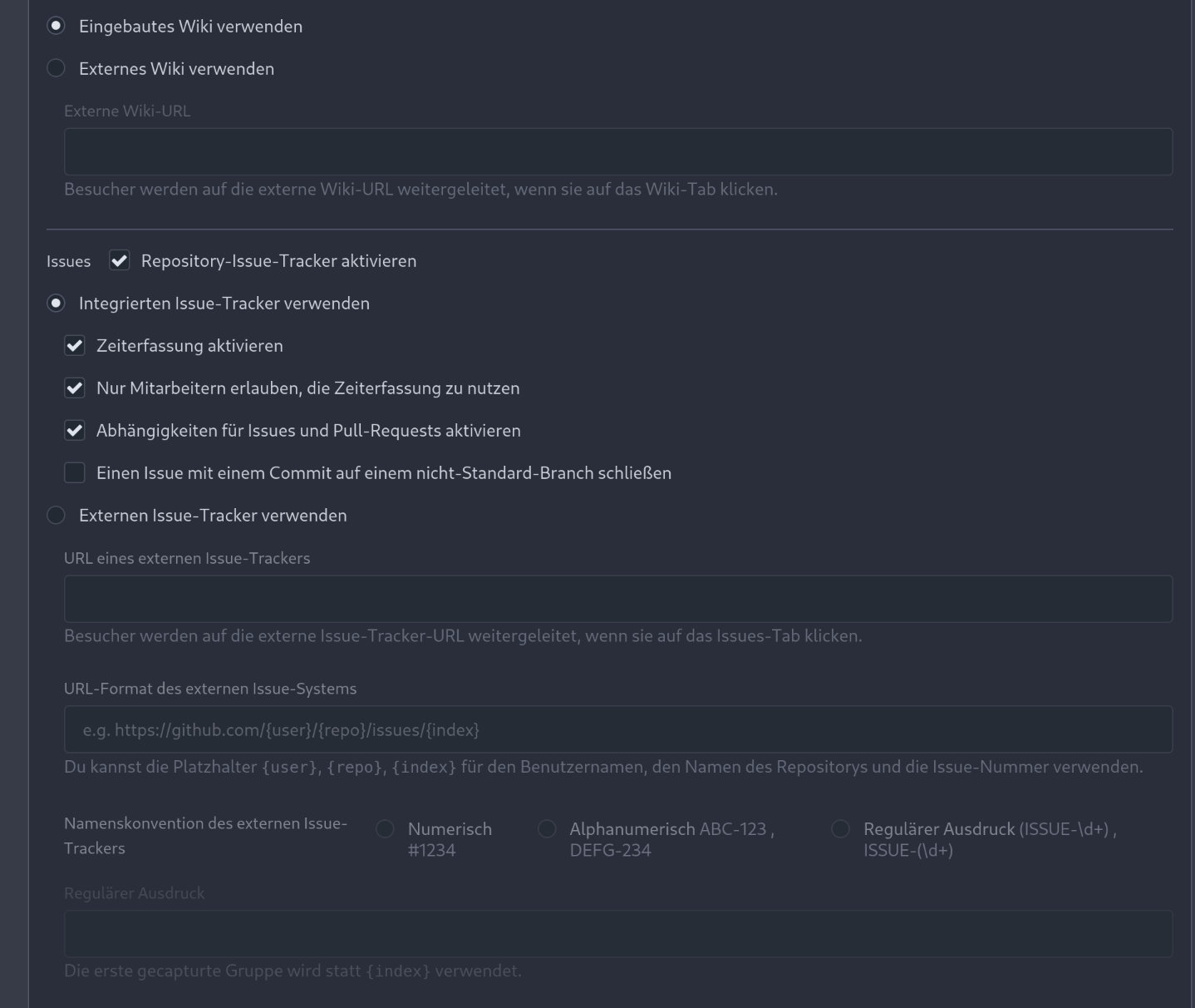
HesterG
2f0e79e639
Use frontend fetch for branch dropdown component ( #25719 )
...
- Send request to get branch/tag list, use loading icon when waiting for
response.
- Only fetch when the first time branch/tag list shows.
- For backend, removed assignment to `ctx.Data["Branches"]` and
`ctx.Data["Tags"]` from `context/repo.go` and passed these data wherever
needed.
- Changed some `v-if` to `v-show` and used native `svg` as mentioned in
https://github.com/go-gitea/gitea/pull/25719#issuecomment-1631712757 to
improve perfomance when there are a lot of branches.
- Places Used the dropdown component:
Repo Home Page
<img width="1429" alt="Screen Shot 2023-07-06 at 12 17 51"
src="https://github.com/go-gitea/gitea/assets/17645053/6accc7b6-8d37-4e88-ae1a-bd2b3b927ea0 ">
Commits Page
<img width="1431" alt="Screen Shot 2023-07-06 at 12 18 34"
src="https://github.com/go-gitea/gitea/assets/17645053/2d0bf306-d1e2-45a8-a784-bc424879f537 ">
Specific commit -> operations -> cherry-pick
<img width="758" alt="Screen Shot 2023-07-06 at 12 23 28"
src="https://github.com/go-gitea/gitea/assets/17645053/1e557948-3881-4e45-a625-8ef36d45ae2d ">
Release Page
<img width="1433" alt="Screen Shot 2023-07-06 at 12 25 05"
src="https://github.com/go-gitea/gitea/assets/17645053/3ec82af1-15a4-4162-a50b-04a9502161bb ">
- Demo
https://github.com/go-gitea/gitea/assets/17645053/d45d266b-3eb0-465a-82f9-57f78dc5f9f3
- Note:
UI of dropdown menu could be improved in another PR as it should apply
to more dropdown menus.
Fix #14180
---------
Co-authored-by: silverwind <me@silverwind.io>
Co-authored-by: wxiaoguang <wxiaoguang@gmail.com>
2023-07-21 11:20:04 +00:00
silverwind
d021c88d29
Reduce margins on admin pages ( #26026 )
...
Reduce margins around admin boxes and reduce sidebar size from 275px to
240px. This is the same 16px margin we use on issue pages.
Before and After:
<img width="1270" alt="Screenshot 2023-07-21 at 00 28 11"
src="https://github.com/go-gitea/gitea/assets/115237/f9b0dcb0-8f7e-49b4-b130-54bf31c142fd ">
<img width="1271" alt="Screenshot 2023-07-21 at 00 30 51"
src="https://github.com/go-gitea/gitea/assets/115237/ddd75d59-9ab9-4061-8989-852e89727560 ">
2023-07-21 03:11:42 +00:00
Earl Warren
e20f8f0977
Improve profile readme rendering ( #25988 )
...
- Tell the renderer to use the `document` mode, so it's consistent with
other renderers.
- Use the same padding as `.file-view.markup`, so it's consistent with
other containers that contain markup rendering.
- Resolves https://codeberg.org/forgejo/forgejo/issues/833

Co-authored-by: Gusted <postmaster@gusted.xyz>
2023-07-19 22:22:32 +00:00
Earl Warren
8833853dd6
avoid hard-coding height in language dropdown menu ( #25986 )
...
This commit removes the hard-coded height of 500px, using that as a
max-height instead. The height of items in the dropdown menu, assuming a
default font size of 16px, is 36px, so the old CSS would cause overly
large dropdown menus in instances where less than 14 languages are
offered.

Refs: https://codeberg.org/forgejo/forgejo/pulls/1000

Co-authored-by: rome-user <rome-user@noreply.codeberg.org>
Co-authored-by: Giteabot <teabot@gitea.io>
2023-07-19 23:30:57 +02:00
sebastian-sauer
d473de0c2d
Make add line comment buttons focusable ( #25894 )
...
Use a real button and add an aria-label.
Additionally, show the button whenever it is focused.
See https://codeberg.org/forgejo/forgejo/issues/998 for explanation.

Our handling of this button is now equal to that of GitHub.
Nothing has changed visually.
2023-07-15 11:45:34 +02:00
sebastian-sauer
b81c013057
Don't stack PR tab menu on small screens ( #25789 )
...
the stacking takes up screen space - display the tabs as the navigation
bar. github uses the same layout.
Screenshots (left before, right after):


Large screen:

2023-07-14 01:54:20 +00:00
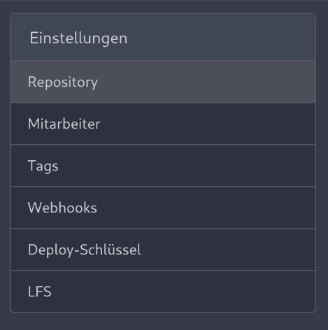
Denys Konovalov
eec45b43db
move issue filters to shared template ( #25729 )
...
Issue filters are being used on repo list page and on milestone issues
page, and the code is mostly duplicated.

This PR does the following changes:
- move issue filters into a shared template
- allow filtering milestone issues by project, so no need to hide this
filter on milestone issues page
- remove some dead code (e. g. issue actions in milestone issues
template)
- fix label filter dropdown width

---------

Co-authored-by: 6543 <6543@obermui.de>
2023-07-13 20:00:38 +00:00
wxiaoguang
fa0b5b14c2
Make "install page" respect environment config ( #25648 )
...
Replace #25580
Fix #19453
The problem was: when users set "GITEA__XXX__YYY" , the "install page"
doesn't respect it.
So, to make the result consistent and avoid surprising end users, now
the "install page" also writes the environment variables to the config
file.
And, to make things clear, there are enough messages on the UI to tell
users what will happen.
There are some necessary/related changes to `environment-to-ini.go`:
* The "--clear" flag is removed and it was incorrectly written there.
The "clear" operation should be done if INSTALL_LOCK=true
* The "--prefix" flag is removed because it's never used, never
documented and it only causes inconsistent behavior.

2023-07-09 22:43:37 +00:00
Denys Konovalov
be23b73e85
Restructure issue list template, styles ( #25750 )
...
This PR does various modifications on the issue list shared template:
- restructure layout to achieve better responsiveness
- fix various style issues
- restructure styles (better result with less code :)
- remove numerous `gt-*` patches and other unneeded classes -> use
existing css classes
<details>
<summary>Before:</summary>


</details>
<details>
<summary>After:</summary>


</details>
---------
Co-authored-by: silverwind <me@silverwind.io>
2023-07-09 19:38:01 +00:00
silverwind
f8bb1018ae
Tweak repo topics bar ( #25769 )
...
Minor tweaks to repo topics:
- Use gap instead of margin to align "Manage Topics" when no topics
present
- Add margin to description instead
Before:
<img width="1232" alt="Screenshot 2023-07-08 at 13 08 15"
src="https://github.com/go-gitea/gitea/assets/115237/a5d3586c-6cbf-4b74-8137-11d91f2cbb45 ">
<img width="1233" alt="Screenshot 2023-07-08 at 13 08 05"
src="https://github.com/go-gitea/gitea/assets/115237/59b18d93-e4cb-4f2b-9bc2-d6aa63f93827 ">
After:
<img width="1232" alt="Screenshot 2023-07-08 at 13 08 42"
src="https://github.com/go-gitea/gitea/assets/115237/470d42ad-3f7e-40f9-b0a1-203b4af77eb9 ">
<img width="1231" alt="Screenshot 2023-07-08 at 13 08 32"
src="https://github.com/go-gitea/gitea/assets/115237/42d18048-748c-4a3f-ab89-3403866cef34 ">
---------
2023-07-08 18:12:30 +00:00
wxiaoguang
cc00fd50f3
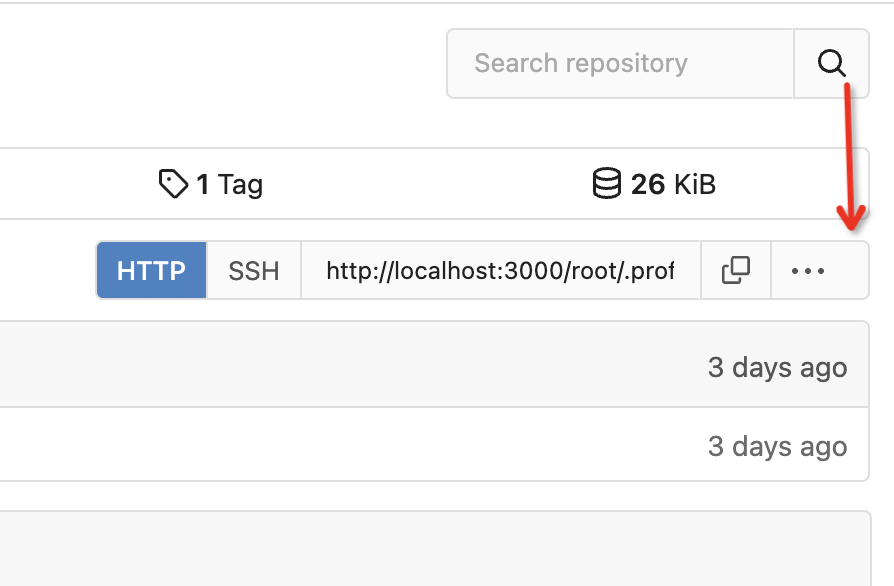
Clarify "text-align" CSS helpers, fix clone button padding ( #25763 )
...
Changes:
* Rename gt-tl/gt-tc/gt-tr to gt-text-left/gt-text-center/gt-text-right
* The gt-ab and gt-br-0 are removed because they are not needed anymore
* Fix the clone dropdown button padding by ":not(.icon)"
Before:
<details>
</details>
After:
<details>

</details>
Fixes #25758
Co-authored-by: Giteabot <teabot@gitea.io>
2023-07-08 11:53:56 +02:00
Denys Konovalov
753755bd4e
Fix commits table regression ( #25710 )
...
Fixes #25693
The commits table appearance fix in #25634 was incomplete and caused a
regression. This PR fixes that issue and removes some unneeded CSS
classes because of the proper fix.
<details>
<summary>Before</summary>


</details>
<details>
<summary>After</summary>

</details>
---------
Co-authored-by: silverwind <me@silverwind.io>
2023-07-06 23:07:57 +02:00
puni9869
2af30f715e
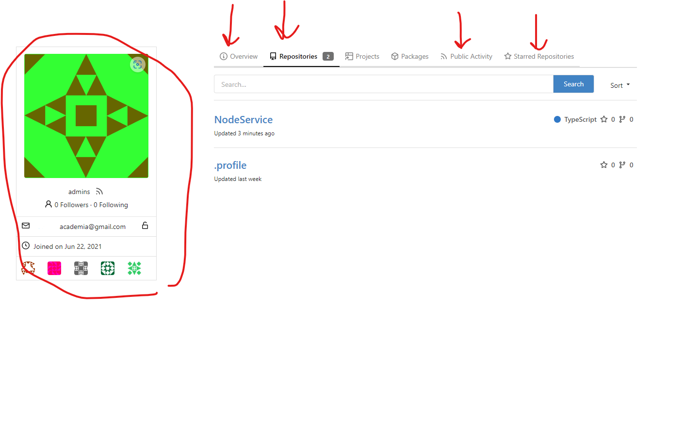
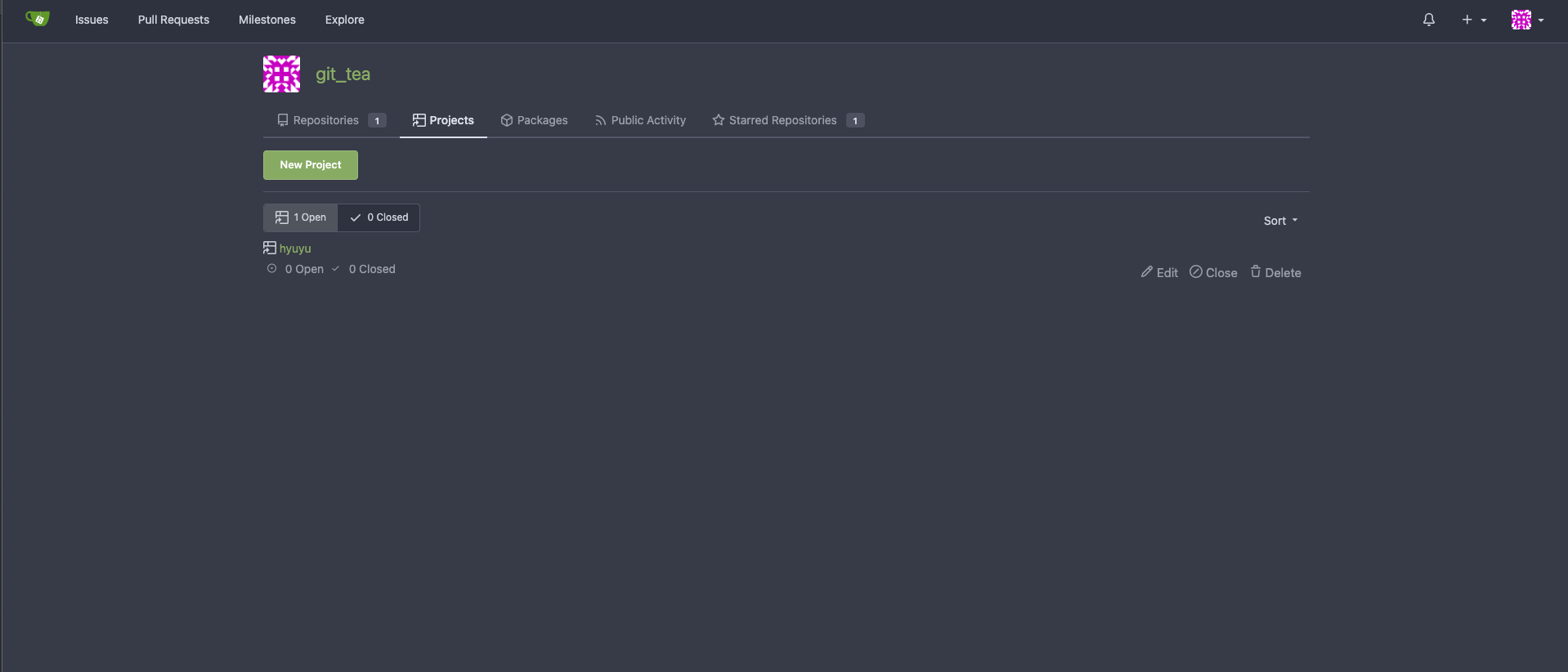
Fix inconsistent user profile layout across tabs ( #25625 )
...
Fix ::User Profile Page Project Tab Have Inconsistent Layout and Style
Added the big_avator for consistency in the all header_items tabs.
Fixes : #24871
> ### Description
> in the user profile page the `Packages` and `Projects` tab have small
icons for user but other tabs have bigger profile picture with user
info:
>
> ### Screenshots
> ### **For Packages And Projects:**
>

>
> ### **For Other Tabs:**
>
>
## Before
## After changes
Project View
<img width="1394" alt="image"
src="https://github.com/go-gitea/gitea/assets/80308335/95d181d7-8e61-496d-9899-7b825c91ad56 ">
Packages View
<img width="1378" alt="image"
src="https://github.com/go-gitea/gitea/assets/80308335/7f5fd60f-6b18-4fa8-8c56-7b0d45d1a610 ">
## Org view for projects page
<img width="1385" alt="image"
src="https://github.com/go-gitea/gitea/assets/80308335/6400dc89-a5ae-4f0a-831b-5b6efa020d89 ">
## Org view for packages page
<img width="1387" alt="image"
src="https://github.com/go-gitea/gitea/assets/80308335/4e1e9ffe-1e4b-4334-8657-de11b5fd31d0 ">
---------
Co-authored-by: wxiaoguang <wxiaoguang@gmail.com>
Co-authored-by: Giteabot <teabot@gitea.io>
Co-authored-by: silverwind <me@silverwind.io>
2023-07-06 18:59:24 +00:00
silverwind
e7495735d5
Fix position of org follow button ( #25688 )
...
This has recently regressed it seems. Put it back into same position as
https://github.com/go-gitea/gitea/pull/24345 .
2023-07-04 23:41:46 -04:00
Denys Konovalov
00dbba7f42
Several fixes for mobile UI ( #25634 )
...
Resolves #25622
<details>
<summary>Screenshots</summary>


</details>
---------
Co-authored-by: wxiaoguang <wxiaoguang@gmail.com>
Co-authored-by: silverwind <me@silverwind.io>
2023-07-04 17:45:45 +00:00
silverwind
0006169f38
Actions list enhancements ( #25601 )
...
Various small enhancements to the actions list. Before and after:
<img width="1264" alt="Screenshot 2023-06-30 at 00 11 40"
src="https://github.com/go-gitea/gitea/assets/115237/bb4162ee-cdcf-4a73-b05e-f9521562edbb ">
<img width="1264" alt="Screenshot 2023-06-30 at 00 09 51"
src="https://github.com/go-gitea/gitea/assets/115237/52a70ea9-4bb3-406e-904b-0fdaafde9582 ">
---------
Co-authored-by: Giteabot <teabot@gitea.io>
2023-07-04 09:59:47 +00:00
silverwind
1195d66c15
Prevent SVG shrinking ( #25652 )
...
This will prevent the most common cases of SVG shrinking because lack of
space. I evaluated multiple options and this seems to be the one with
the least impact in size and processing cost, so I went with it.
Unfortunately, CSS can not dynamically convert `16` obtained from
`attr()` to `16px`, or else a generic solution for all sizes would have
been possible. But a solution is [in
sight](https://developer.mozilla.org/en-US/docs/Web/CSS/attr#type-or-unit )
with `attr(width px)` but no browser supports it currently.
2023-07-04 02:15:06 +00:00
wxiaoguang
eea58a5d55
Fix UI misalignment on user setting page ( #25629 )
...
Fix #25628
Diff with ignoring space:
https://github.com/go-gitea/gitea/pull/25629/files?diff=unified&w=1
The "modal" shouldn't appear between "ui attached segment", otherwise
these segments lose margin-top.
After the fix:
<details>


</details>
2023-07-03 20:38:06 +00:00
silverwind
64f2d70262
Replace fomantic divider module with our own ( #25539 )
...
Should look exactly like before for normal dividers. "Horizontal" ones
look better because they no longer use image backgrounds.
<img width="917" alt="Screenshot 2023-06-27 at 19 07 56"
src="https://github.com/go-gitea/gitea/assets/115237/d97d8dec-6859-44a8-85ba-e4549b4dd9df ">
<img width="914" alt="Screenshot 2023-06-27 at 19 05 58"
src="https://github.com/go-gitea/gitea/assets/115237/8bf98544-2d82-4ebf-ac68-d6dc237bd6b2 ">
<img width="1246" alt="Screenshot 2023-06-27 at 19 00 42"
src="https://github.com/go-gitea/gitea/assets/115237/36a6bb21-6029-4f53-8bee-535f55c66fed ">
<img width="344" alt="Screenshot 2023-06-27 at 18 58 15"
src="https://github.com/go-gitea/gitea/assets/115237/a9e70aee-8e6b-4ea1-9e93-19c9f96aec6e ">
<img width="823" alt="Screenshot 2023-06-27 at 18 56 22"
src="https://github.com/go-gitea/gitea/assets/115237/e7a497cd-f262-4683-8872-23c3c8cce32f ">
<img width="330" alt="Screenshot 2023-06-27 at 19 21 11"
src="https://github.com/go-gitea/gitea/assets/115237/42f24149-a655-4c7e-bd26-8ab52db6446b ">
2023-06-29 20:24:22 +08:00
silverwind
c76b221cca
Reduce table padding globally ( #25568 )
...
Fomantic's tables have too much padding. Reduce it so we have more
information density in them. Especially the admin tables need this
because they are bursting already because of column count.
## Admin repolist before and after
<img width="909" alt="Screenshot 2023-06-28 at 20 27 55"
src="https://github.com/go-gitea/gitea/assets/115237/954c925c-8db5-47ce-ae51-a2168b857014 ">
<img width="897" alt="Screenshot 2023-06-28 at 20 36 03"
src="https://github.com/go-gitea/gitea/assets/115237/0bddc09a-9117-48b3-a17e-3d34c58d8d3d ">
## Other tables
<img width="1230" alt="Screenshot 2023-06-28 at 20 36 22"
src="https://github.com/go-gitea/gitea/assets/115237/38f555b6-a7ce-416a-9f1f-706eaf18863b ">
<img width="1236" alt="Screenshot 2023-06-28 at 20 26 37"
src="https://github.com/go-gitea/gitea/assets/115237/82b2878e-358c-4dc2-a6b4-c66e43cd2dfb ">
<img width="1231" alt="Screenshot 2023-06-28 at 20 59 30"
src="https://github.com/go-gitea/gitea/assets/115237/c6a92e55-a3a3-4c80-9a0d-50aebb49886c ">
Files table is unaffected because it has custom padding already.
---------
Co-authored-by: Giteabot <teabot@gitea.io>
2023-06-29 04:40:03 +00:00
HesterG
c6f1fb1c6d
Use fetch form action for lock/unlock/pin/unpin on sidebar ( #25380 )
...
Before:
<img width="364" alt="Screen Shot 2023-06-20 at 11 59 11"
src="https://github.com/go-gitea/gitea/assets/17645053/ad284b7e-8d21-43be-b178-bbcfd37cb5bd ">
Might trigger many posts when keep clicking the buttons above.
<img width="448" alt="Screen Shot 2023-06-20 at 11 52 28"
src="https://github.com/go-gitea/gitea/assets/17645053/a60aa6ac-af74-45e4-b13a-512b436b81b0 ">
<img width="678" alt="Screen Shot 2023-06-20 at 11 52 37"
src="https://github.com/go-gitea/gitea/assets/17645053/d6662700-3643-4cc7-a2ec-64e1c0f5fbdb ">
After (PR sidebar, Same for issue):
https://github.com/go-gitea/gitea/assets/17645053/9df3ad1f-e29c-439b-8bde-e6b917d63cc6
For delete, it is using `base/modal_actions_confirm` subtemplate, and we
might need another general solution for this (maybe add another
attribute to the subtemplate or something)
---------
Co-authored-by: silverwind <me@silverwind.io>
Co-authored-by: Giteabot <teabot@gitea.io>
Co-authored-by: wxiaoguang <wxiaoguang@gmail.com>
2023-06-29 04:16:04 +00:00
wxiaoguang
b6693a2c9a
Align language menu icon and fit the footer area ( #25556 )
...
Close #25551
2023-06-28 14:57:50 +00:00
silverwind
fdab4e3d84
Add custom ansi colors and CSS variables for them ( #25546 )
...
Use our existing color palette to map to the 16 basic ansi colors. This
is backwards-compatible because it aliases the existing color names.
Side note: I think the colors in `console.css` for console file
rendering are incomplete, but fixing those is out of scope here imo.
Before and after:
<img width="542" alt="Screenshot 2023-06-28 at 00 26 12"
src="https://github.com/go-gitea/gitea/assets/115237/86d41884-bc47-4e85-8aec-621eb7320f0b ">
<img width="546" alt="Screenshot 2023-06-28 at 00 28 24"
src="https://github.com/go-gitea/gitea/assets/115237/39fa3b37-d49e-49b1-b6bc-390ac8ca24b2 ">
---------
Co-authored-by: Giteabot <teabot@gitea.io>
2023-06-28 15:38:55 +02:00
silverwind
b943318617
Update JS dependencies and misc tweaks ( #25540 )
...
- Update all JS dependencies
- Enable `declaration-property-unit-disallowed-list` to forbid `em` on
`line-height`
- Rename dependency update targets to `update-js` and `update-py` and
document them
- Remove margin on Asciicast viewer
- Tested Swagger, Katex, Asciicast
<img width="1243" alt="Screenshot 2023-06-27 at 19 51 05"
src="https://github.com/go-gitea/gitea/assets/115237/2d2722a0-2aa7-4f4c-b8bd-17e1f3637b78 ">
2023-06-27 21:44:17 +02:00
wxiaoguang
6dbcf6fbc5
Fix admin-dl-horizontal ( #25512 )
...

---------
Co-authored-by: HesterG <hestergong@gmail.com>
Co-authored-by: silverwind <me@silverwind.io>
2023-06-27 09:14:45 +00:00
hiifong
1069472c0c
Fix input line-height cutting off g ( #25334 )
...
Fix the incomplete display of input text
Before:


After:

---------
Co-authored-by: silverwind <me@silverwind.io>
Co-authored-by: Giteabot <teabot@gitea.io>
2023-06-27 08:45:43 +00:00
silverwind
c71e8abbc3
Add toasts to UI ( #25449 )
...
Fixes https://github.com/go-gitea/gitea/issues/24353

In some case like async success/error, it is useful to show toasts in UI.
2023-06-27 02:45:24 +00:00
silverwind
da6df0d063
Fix migrate page layout on mobile ( #25507 )
...
Fixes: https://github.com/go-gitea/gitea/issues/25462
On supporting browsers, text in description is [wrapped
equally](https://caniuse.com/css-text-wrap-balance ).
<img width="488" alt="Screenshot 2023-06-26 at 00 17 21"
src="https://github.com/go-gitea/gitea/assets/115237/cb8e3a50-6225-4a8c-a6c0-f35a17d2af76 ">
<img width="1254" alt="Screenshot 2023-06-26 at 00 14 51"
src="https://github.com/go-gitea/gitea/assets/115237/0885404e-973e-45ce-b41e-5cb265a4cd1e ">
2023-06-26 09:57:36 +00:00
HesterG
457946d595
Allow change line of admin-dl-horizontal dt ( #25508 )
...
Close #25389
After:
<img width="915" alt="Screen Shot 2023-06-26 at 11 00 12"
src="https://github.com/go-gitea/gitea/assets/17645053/45026447-cf50-4603-ade3-7b80a9023c20 ">
admin/dashboard:
<img width="957" alt="Screen Shot 2023-06-26 at 10 59 51"
src="https://github.com/go-gitea/gitea/assets/17645053/f4f95bbe-f747-46f1-8fbd-5778a19ebef7 ">
2023-06-26 11:49:14 +08:00
wxiaoguang
323c6cba20
Fine tune "dropdown button" icon ( #25442 )
...

----

2023-06-25 02:40:41 +00:00
hiifong
8e6a114317
fix tags line no margin see #25255 ( #25280 )
...
This is my first pr, there are many things I don't understand very well,
I am very sorry, I rearranged the code and opened this new pr.
Now:

2023-06-24 20:30:46 +08:00
silverwind
be47015229
Navbar fixes ( #25402 )
...
Fixes: https://github.com/go-gitea/gitea/issues/25444
Followup for some regressions from
https://github.com/go-gitea/gitea/pull/25343 . Before and after:
<img width="219" alt="Screenshot 2023-06-21 at 00 25 20"
src="https://github.com/go-gitea/gitea/assets/115237/08fe8e01-0a16-4cdf-ad4d-0a9048408e9e ">
<img width="220" alt="Screenshot 2023-06-21 at 00 25 32"
src="https://github.com/go-gitea/gitea/assets/115237/be25ae69-6ed0-4af5-8eeb-d7b210e7c124 ">
Fixes mobile button background and margins:
<img width="836" alt="Screenshot 2023-06-21 at 00 39 58"
src="https://github.com/go-gitea/gitea/assets/115237/d76ac1e9-747f-477c-9a42-b73e129b72ee ">
2023-06-24 04:31:39 +00:00
wxiaoguang
62ab55bacc
Improve wiki sidebar and TOC ( #25460 )
...
Close #20976
Close #20975

1. Fix the bug: the TOC in footer was incorrectly rendered as main
content's TOC
2. Fix the layout: on mobile, the TOC is put above the main content,
while the sidebar is put below the main content
3. Auto collapse the TOC on mobile

ps: many styles of "wiki.css" are moved from old css files, so leave
nits to following PRs.
2023-06-23 15:51:43 -04:00
silverwind
d2142ba3c3
Update octicons and use octicon-file-directory-symlink ( #25453 )
...
Make use of the [new
octicon](https://github.com/primer/octicons/issues/945 ) that indicates a
symlink to a directory:
<img width="189" alt="Screenshot 2023-06-22 at 22 50 57"
src="https://github.com/go-gitea/gitea/assets/115237/a70690ea-ebfc-48fe-af23-cdc33bcb2098 ">
2023-06-22 22:05:52 +00:00
silverwind
7fb539677b
Diff page enhancements ( #25398 )
...
Two small tweaks:
1. Vertically center arrow here when editing a PR:
<img width="405" alt="Screenshot 2023-06-20 at 19 48 49"
src="https://github.com/go-gitea/gitea/assets/115237/1d63764d-9fd9-467e-8a8e-9258c06475eb ">
2. Use 2-row layout on diff viewed status and show it again on mobile:
<img width="142" alt="Screenshot 2023-06-20 at 19 51 21"
src="https://github.com/go-gitea/gitea/assets/115237/3046e782-163c-4f87-910c-a22066de8f1b ">
Mobile view:
<img width="370" alt="Screenshot 2023-06-20 at 19 44 40"
src="https://github.com/go-gitea/gitea/assets/115237/9cf56347-7323-4d05-99a5-17ad215ee44d ">
2023-06-22 11:05:22 +00:00
silverwind
656d3cc719
Various UI fixes ( #25264 )
...
Numerous small UI fixes:

- Fix double border in collaborator list
- Fix system notice table background
- Mute links in repo and org lists
- Downsize projects edit buttons
- Improve milestones and project list rendering
- Condense milestone list entry to a single line of "metas"
- Mute ".." button in repo files list
2023-06-21 21:59:49 -04:00
sebastian-sauer
25455bc670
Show outdated comments in files changed tab ( #24936 )
...
If enabled show a clickable label in the comment. A click on the label
opens the Conversation tab with the comment focussed - there you're able
to view the old diff (or original diff the comment was created on).
**Screenshots**

When resolved and outdated:

Option to enable/disable this (stored in user settings - default is
disabled):

fixes #24913
---------
Co-authored-by: silverwind <me@silverwind.io>
2023-06-21 16:08:12 +00:00
HesterG
dfd19fa38c
Fine tune project board label colors and modal content background ( #25419 )
...
- The label text color on project board is not contrasting enough,
changed to colors that are same as places that also used
`useLightTextOnBackground` function
([util_render.go](2cdf260f42/modules/templates/util_render.go (L136-L141)2cdf260f42/web_src/js/components/ContextPopup.vue (L81-L84)https://github.com/go-gitea/gitea/assets/17645053/1527ca28-c884-4ca9-a4be-7a72ad1a093a ">
<img width="900" alt="Screen Shot 2023-06-21 at 14 25 52"
src="https://github.com/go-gitea/gitea/assets/17645053/fab82116-7376-4027-a0a4-9eedf9fb0a30 ">
After:
<img width="1383" alt="Screen Shot 2023-06-21 at 14 19 33"
src="https://github.com/go-gitea/gitea/assets/17645053/fe0997e7-fee6-4522-bc4e-545088ec1cc8 ">
<img width="797" alt="Screen Shot 2023-06-21 at 14 32 42"
src="https://github.com/go-gitea/gitea/assets/17645053/b0591af0-950c-4448-9430-34d6c7215971 ">
2023-06-21 18:15:51 +08:00
HesterG
1454f9dafc
Add actor and status dropdowns to run list ( #25118 )
...
Part of #25042
1. Added actor and status dropdowns first in case something is offtrack
and PR is too large.
2. Also added "No results matched." and "The workflow has no runs yet.",
and "No results matched." will show if there is no filter results and
there is no workflows (with [reference to github
action](https://github.com/go-gitea/gitea/actions/workflows/files-changed.yml?query=actor%3AGiteaBot ))
Demo:
https://github.com/go-gitea/gitea/assets/17645053/6e76292c-4c1f-450d-8b48-99944cfc920c
TODOs:
- [x] Get available status (same as those in `aggregateJobStatus`)
instead of getting from database
- [x] Use `JOIN` to get actors, actors order by name
- [x] Make self on top
2023-06-21 04:25:14 +00:00
wxiaoguang
831db53c21
Fix dropdown icon layout on diff page ( #25397 )
...
Address
https://github.com/go-gitea/gitea/pull/25163#issuecomment-1599207916
Remove the unused "icon-button".
And fix the layout:
Without the dropdown icon:
```
{{svg "gitea-whitespace"}}
```
With the dropdown icon:
```
{{svg "gitea-whitespace" 16 "gt-mr-3"}}
{{svg "octicon-triangle-down" 14 "dropdown icon"}}
```

2023-06-20 23:22:48 +00:00
sillyguodong
35a653d7ed
Support configuration variables on Gitea Actions ( #24724 )
...
Co-Author: @silverwind @wxiaoguang
Replace: #24404
See:
- [defining configuration variables for multiple
workflows](https://docs.github.com/en/actions/learn-github-actions/variables#defining-configuration-variables-for-multiple-workflows )
- [vars
context](https://docs.github.com/en/actions/learn-github-actions/contexts#vars-context )
Related to:
- [x] protocol: https://gitea.com/gitea/actions-proto-def/pulls/7
- [x] act_runner: https://gitea.com/gitea/act_runner/pulls/157
- [x] act: https://gitea.com/gitea/act/pulls/43
#### Screenshoot
Create Variable:


Workflow:
```yaml
test_vars:
runs-on: ubuntu-latest
steps:
- name: Print Custom Variables
run: echo "${{ vars.test_key }}"
- name: Try to print a non-exist var
run: echo "${{ vars.NON_EXIST_VAR }}"
```
Actions Log:

---
This PR just implement the org / user (depends on the owner of the
current repository) and repo level variables, The Environment level
variables have not been implemented.
Because
[Environment](https://docs.github.com/en/actions/deployment/targeting-different-environments/using-environments-for-deployment#about-environments )
is a module separate from `Actions`. Maybe it would be better to create
a new PR to do it.
---------
Co-authored-by: silverwind <me@silverwind.io>
Co-authored-by: wxiaoguang <wxiaoguang@gmail.com>
Co-authored-by: Giteabot <teabot@gitea.io>
2023-06-20 22:54:15 +00:00
silverwind
e50c3e8431
Navbar styling rework ( #25343 )
...
- Extract navbar CSS to own file
- Reduce height from 52px to 50px
- Give every item a hover effect of of 36px, including the logo and on
mobile
- Consistent horizontal padding of 10px left and right
<img width="549" alt="Screenshot 2023-06-18 at 13 41 16"
src="https://github.com/go-gitea/gitea/assets/115237/0b00d101-253e-4b1f-9ee2-322d60fb2e26 ">
<img width="98" alt="Screenshot 2023-06-18 at 14 03 43"
src="https://github.com/go-gitea/gitea/assets/115237/4ef5d98b-4d1e-45de-822e-c2c844e19876 ">
<img width="234" alt="Screenshot 2023-06-18 at 14 03 18"
src="https://github.com/go-gitea/gitea/assets/115237/a4d9b04b-83de-42aa-a9ce-f010a9690688 ">
<img width="873" alt="Screenshot 2023-06-18 at 13 58 28"
src="https://github.com/go-gitea/gitea/assets/115237/8cb8e31e-2adf-40c8-ae3f-d00d011b4d1b ">
---------
Co-authored-by: wxiaoguang <wxiaoguang@gmail.com>
Co-authored-by: Giteabot <teabot@gitea.io>
2023-06-20 20:35:25 +00:00
Denys Konovalov
7f38cf71fe
Fix issue filters on mobile view ( #25368 )
...
Fix #24846 applying the solution proposed by @silverwind
<details>
<summary>Screenshots</summary>


</details>
Replaces #25335
2023-06-19 17:12:15 +00:00
silverwind
c09d0b4952
Fix loading state regression in markup content ( #25349 )
...
Fix regressions from https://github.com/go-gitea/gitea/pull/25219 :
Math before and after:
<img width="630" alt="Screenshot 2023-06-18 at 16 00 52"
src="https://github.com/go-gitea/gitea/assets/115237/f2a01e4b-31ca-407c-8fc3-f0aec569b48e ">
<img width="680" alt="Screenshot 2023-06-18 at 16 03 44"
src="https://github.com/go-gitea/gitea/assets/115237/faab8e39-f088-45ab-b460-15fc3654c99d ">
Mermain before and after:
<img width="810" alt="Screenshot 2023-06-18 at 15 58 56"
src="https://github.com/go-gitea/gitea/assets/115237/d8c24e81-4702-4e17-b791-7dffe090c068 ">
<img width="786" alt="Screenshot 2023-06-18 at 15 58 37"
src="https://github.com/go-gitea/gitea/assets/115237/3a268e10-c071-410d-a66e-8c4427d1d61c ">
2023-06-19 08:00:18 +00:00
wxiaoguang
bfab129fb9
Fix label list divider ( #25312 )
...
We only needs 2 lines to hide the dividers.
```
$dropdownLabelFilter.dropdown('setting', {'hideDividers': 'empty'});
$dropdownLabelFilter.dropdown('refreshItems');
```
Other code blocks are refactored by the way.


2023-06-18 17:33:12 +00:00
Denys Konovalov
9e74063498
Fix UI on mobile view ( #25315 )
...
Various fixes to pages or elements which were looking ugly on mobile.
<details>
<summary>Screenshots</summary>


</details>
Co-authored by @silverwind
---------
Co-authored-by: silverwind <me@silverwind.io>
2023-06-18 10:31:42 +00:00
silverwind
61e0827f42
Add stylelint-declaration-block-no-ignored-properties ( #25284 )
...
Add
[stylelint-declaration-block-no-ignored-properties](https://github.com/kristerkari/stylelint-declaration-block-no-ignored-properties )
and fix discovered issue. There is no visual difference in these markup
code blocks.
2023-06-18 04:22:09 +00:00
silverwind
95ab485490
Remove EasyMDE focus outline on text ( #25328 )
...
EasyMDE in Firefox currently shows an ugly outline in the fake textarea
the CodeMirror uses. Hide it.
2023-06-18 04:10:07 +00:00
silverwind
3ee8970419
add stylelint-stylistic ( #25285 )
...
Add
[stylelint-stylistic](https://github.com/elirasza/stylelint-stylistic ),
autofix all issues with two manual tweaks. This restores all the
stylistic rules removed in Stylelint 15.
2023-06-17 13:20:32 +00:00
silverwind
69b1e2f103
Remove more unused Fomantic variants ( #25292 )
...
Save another 50KB of CSS by removing unused and useless Fomantic
variants.
Removed the last instance if a `tertiary` button and fixed a TODO:
<img width="509" alt="Screenshot 2023-06-15 at 22 34 36"
src="https://github.com/go-gitea/gitea/assets/115237/8a16ae7b-2b17-439b-a096-60a52724e3d6 ">
2023-06-17 08:15:33 +00:00
wxiaoguang
6db66d8ca4
Fix some UI alignments ( #25277 )
...
Fixes: https://github.com/go-gitea/gitea/issues/25282

Fix the problems:

1. The `repo-button-row` had various patches before, this PR makes it
consistent
2. The "Add File" has wrong CSS class "icon", remove it
3. The "Add File" padding was overridden by "!important", fix it by
`.repo-button-row .button.dropdown` with comment
4. The selector `.ui.segments ~ .ui.top.attached.header` is incorrect,
it should use `+`
2023-06-15 15:12:08 +00:00
wxiaoguang
46c17c8029
Use flex to align SVG and text ( #25163 )
...
The code can be as simple as:
```html
<div class="flex-text-block">{{svg "octicon-alert"}} {{svg "octicon-x"}} text (block)</div>
<div><div class="flex-text-inline">{{svg "octicon-alert"}} {{svg "octicon-x"}} text</div> (inline)</div>
<div><button class="ui red button">{{svg "octicon-alert" 24}} {{svg "octicon-x" 24}} text</button></div>
```

---------
Co-authored-by: Giteabot <teabot@gitea.io>
2023-06-14 16:40:15 +00:00
HesterG
a43ea22479
Change form actions to fetch for submit review box ( #25219 )
...
Co-author: @wxiaoguang
Close #25096
The way to fix it in this PR is to change form submit to fetch using
formData, and add flags to avoid post repeatedly.
Should be able to apply to more forms that have the same issue after
this PR.
In the demo below, 'approve' is clicked several times, and then
'comment' is clicked several time after 'request changes' clicked.
After:
https://github.com/go-gitea/gitea/assets/17645053/beabeb1d-fe66-4b76-b048-4f022b4e83a0
Update: screenshots from /devtest
>

>
>

>
>

---------
Co-authored-by: wxiaoguang <wxiaoguang@gmail.com>
2023-06-14 16:01:37 +08:00
wxiaoguang
4f3253feb9
Revert overflow: overlay (revert #21850 ) ( #25231 )
...
It causes not only one issue like #25221 (the footer width was also
affected by that change and was fixed some time ago)
The problem of "overflow: overlay" (#21850 ) is:
* It's not widely supported and is non-standard
https://caniuse.com/css-overflow-overlay
* It's not widely tested in Gitea (some standard layout like `ui
container + ui grid` may break it).
* The benefit seems smaller than the problems it brings.
So, I think it is good to revert it.
----
Let's leave enough time for testing and reviewing.
---------
Co-authored-by: Giteabot <teabot@gitea.io>
Co-authored-by: silverwind <me@silverwind.io>
2023-06-13 21:17:14 +02:00
wxiaoguang
6bbccdd177
Improve AJAX link and modal confirm dialog ( #25210 )
...
Clarify the "link-action" behavior:

>  // A "link-action" can post AJAX request to its "data-url"
> // Then the browser is redirect to: the "redirect" in response, or
"data-redirect" attribute, or current URL by reloading.

And enhance the "link-action" to support showing a modal dialog for
confirm. A similar general approach could also help PRs like
https://github.com/go-gitea/gitea/pull/22344#discussion_r1062883436

> // If the "link-action" has "data-modal-confirm(-html)" attribute, a
confirm modal dialog will be shown before taking action.


And a lot of duplicate code can be removed now. A good framework design
can help to avoid code copying&pasting.

---------

Co-authored-by: silverwind <me@silverwind.io>
2023-06-13 12:10:10 +00:00
Jonathan Tran
a583c56306
Change access token UI to select dropdowns ( #25109 )
...
The current UI to create API access tokens uses checkboxes that have a
complicated relationship where some need to be checked and/or disabled
in certain states. It also requires that a user interact with it to
understand what their options really are.
This branch changes to use `<select>`s. It better fits the available
options, and it's closer to [GitHub's
UI](https://github.com/settings/personal-access-tokens/new ), which is
good, in my opinion. It's more mobile friendly since the tap-areas are
larger. If we ever add more permissions, like Maintainer, there's a
natural place that doesn't take up more screen real-estate.
This branch also fixes a few minor issues:
- Hide the error about selecting at least one permission after second
submission
- Fix help description to call it "authorization" since that's what
permissions are about (not authentication)
Related: #24767 .
<img width="883" alt="Screenshot 2023-06-07 at 5 07 34 PM"
src="https://github.com/go-gitea/gitea/assets/10803/6b63d807-c9be-4a4b-8e53-ecab6cbb8f76 ">
---
When it's open:
<img width="881" alt="Screenshot 2023-06-07 at 5 07 59 PM"
src="https://github.com/go-gitea/gitea/assets/10803/2432c6d0-39c2-4ca4-820e-c878ffdbfb69 ">
2023-06-13 15:55:48 +08:00
wxiaoguang
d8e45608d6
Remove hacky patch for "safari emoji glitch fix" ( #25208 )
...
According to my test, the UI (emoji) is fine in Safari

And actually the code is just dead code, because the "resize" event is
never fired on page loading. So for most cases users just view the pages
without this hacky patch, nobody ever complains.
2023-06-12 15:44:53 +00:00
silverwind
96f9c11821
Minor arc-green color tweaks ( #25175 )
...
Some minor color tweaks
<img width="1271" alt="Screenshot 2023-06-09 at 13 29 25"
src="https://github.com/go-gitea/gitea/assets/115237/b7b34995-5d34-461f-8d19-4f5755a98109 ">
<img width="1272" alt="Screenshot 2023-06-09 at 13 31 20"
src="https://github.com/go-gitea/gitea/assets/115237/63c866b4-797e-46ed-ba28-b1162ccd3e15 ">
<img width="1276" alt="Screenshot 2023-06-09 at 13 32 21"
src="https://github.com/go-gitea/gitea/assets/115237/de7ee02e-d0c7-4979-a8aa-0fd03e8db491 ">
Co-authored-by: Giteabot <teabot@gitea.io>
2023-06-09 15:17:30 +00:00
silverwind
6a075589bf
Fix mobile navbar and misc cleanups ( #25134 )
...
- Fix and improve mobile navbar layout
- Apply all cleanups suggested in
https://github.com/go-gitea/gitea/pull/25111
- Make media query breakpoints match Fomantic's exactly
- Clean up whitespace in class on navbar items
Mobile navbar before and after:
<img width="745" alt="Screenshot 2023-06-08 at 08 40 56"
src="https://github.com/go-gitea/gitea/assets/115237/ca84b239-b10f-41db-8c06-dcf2b6dd9d28 ">
<img width="739" alt="Screenshot 2023-06-08 at 08 41 23"
src="https://github.com/go-gitea/gitea/assets/115237/09133c54-eb7e-4110-858c-ead23c3b7521 ">
---------
Co-authored-by: wxiaoguang <wxiaoguang@gmail.com>
Co-authored-by: Giteabot <teabot@gitea.io>
2023-06-09 09:10:51 +00:00
silverwind
623b3b590e
Button and color enhancements ( #24989 )
...
- Various corrections to button styles, especially secondary
- Remove focus highlight, it's annoying when it stays on button after
press
- Clearly define ghost and link buttons with demos in devtest
- Remove black, grey and tertiary buttons, they should not be used
- Make `arc-green` slightly darker
<img width="1226" alt="image"
src="https://github.com/go-gitea/gitea/assets/115237/8d89786a-01ab-40f8-ae5a-e17f40e35084 ">
<img width="1249" alt="image"
src="https://github.com/go-gitea/gitea/assets/115237/83651e6d-3c27-46ff-b8bd-ff344d70e949 ">
---------
Co-authored-by: wxiaoguang <wxiaoguang@gmail.com>
Co-authored-by: Giteabot <teabot@gitea.io>
2023-06-09 08:37:47 +00:00
HesterG
63a429581c
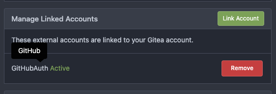
Modify OAuth login ui and fix display name, iconurl related logic ( #25030 )
...
Close #24808
Co-Authour @wxiaoguang @silverwind
1. Most svgs are found from https://worldvectorlogo.com/ , and some are
from conversion of png to svg. (facebook and nextcloud). And also
changed `templates/user/settings/security/accountlinks.tmpl`.
2. Fixed display name and iconurl related logic
# After
<img width="1436" alt="Screen Shot 2023-06-05 at 14 09 05"
src="https://github.com/go-gitea/gitea/assets/17645053/a5db39d8-1ab0-4676-82a4-fba60a1d1f84 ">
On mobile
<img width="378" alt="Screen Shot 2023-06-05 at 14 09 46"
src="https://github.com/go-gitea/gitea/assets/17645053/71d0f51b-baac-4f48-8ca2-ae0e013bd62e ">
user/settings/security/accountlinks (The dropdown might be improved
later)
<img width="973" alt="Screen Shot 2023-06-01 at 10 01 44"
src="https://github.com/go-gitea/gitea/assets/17645053/27010e7e-2785-4fc5-8c49-b06621898f37 ">
---------
Co-authored-by: silverwind <me@silverwind.io>
Co-authored-by: wxiaoguang <wxiaoguang@gmail.com>
2023-06-08 16:35:29 +00:00
silverwind
b6bcb79987
Improve notification icon and navbar ( #25111 )
...
Improvements to the notification icon and `<nav>`:
- Add a opaque color for header hover and use it, allowing the border to
be the right color on hover (sadly, not otherwise possible with CSS, not
even `color-mix`).
- Increase font size by 1px
- Use flexbox for slightly better text centering
- Reduce padding of user and add repo button, add margin on right side
of user menu
- Remove the `following bar` wrapper on navbar
<img width="176" alt="Screenshot 2023-06-07 at 00 07 08"
src="https://github.com/go-gitea/gitea/assets/115237/23cdc3d6-7f63-49df-bec3-f2e75e32a304 ">
<img width="63" alt="Screenshot 2023-06-07 at 00 07 14"
src="https://github.com/go-gitea/gitea/assets/115237/fae602c2-4467-4d50-b1ec-56317843f9a2 ">
<img width="84" alt="Screenshot 2023-06-07 at 00 07 36"
src="https://github.com/go-gitea/gitea/assets/115237/c48141b8-0b3c-48cc-846a-3a272524dbdb ">
<img width="329" alt="Screenshot 2023-06-07 at 00 25 10"
src="https://github.com/go-gitea/gitea/assets/115237/cda612f1-426e-466b-a351-fc992bfd18fd ">
<img width="186" alt="Screenshot 2023-06-07 at 00 35 45"
src="https://github.com/go-gitea/gitea/assets/115237/04484a2e-9bbf-493c-aa26-8e936da008fa ">
<img width="797" alt="Screenshot 2023-06-07 at 16 57 40"
src="https://github.com/go-gitea/gitea/assets/115237/e7ccb672-5807-4cb6-b306-b18ae0c7e321 ">
2023-06-07 22:21:57 +00:00
wxiaoguang
027014d7de
Fix webauthn regression and improve code ( #25113 )
...
Follow:
* #22697
There are some bugs in #22697 :
* https://github.com/go-gitea/gitea/pull/22697#issuecomment-1577957966
* the webauthn failure message is never shown and causes console error
* The `document.getElementById('register-button')` and
`document.getElementById('login-button')` is wrong
* there is no such element in code
* it causes JS error when a browser doesn't provide webauthn
* the end user can't see the real error message
These bugs are fixed in this PR.
Other changes:
* Use simple HTML/CSS layouts, no need to use too many `gt-` patches
* Make the webauthn page have correct "page-content" layout
* The "data-webauthn-error-msg" elements are only used to provide locale
texts, so move them into a single "gt-hidden", then no need to repeat a
lot of "gt-hidden" in code
* The `{{.CsrfTokenHtml}}` is a no-op because there is no form
* Many `hideElem('#webauthn-error')` in code is no-op because the
`webauthn-error` already has "gt-hidden" by default
* Make the tests for "URLEncodedBase64" really test with concrete cases.
Screenshots:
* Error message when webauthn fails (before, there is no error message):
<details>

</details>
* Error message when webauthn is unavailable
<details>
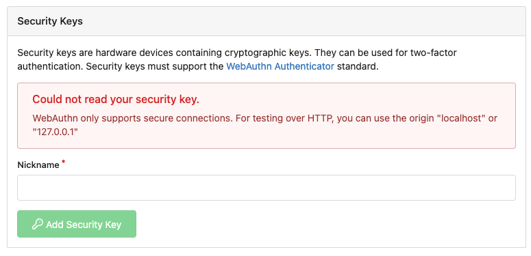
</details>
2023-06-07 19:20:18 +08:00
HesterG
58536093b3
Add details summary for vertical menus in settings to allow toggling ( #25098 )
...
Close #25051
[referenced
answer](https://stackoverflow.com/questions/10813581/can-i-replace-the-expand-icon-of-the-details-element/69722686#69722686 )
for marker overwrite. One limitation is that fomantic does not have
hover and active effects for the vertical submenu
([reference](https://fomantic-ui.com/collections/menu.html#sub-menu )).
And we might need to overwrite some styles if hover and active effects
are needed.
Update:
Used `data:image/svg` instead of `marker` content. And adjusted styles
for hover effect.
Take admin settings as an example:
https://github.com/go-gitea/gitea/assets/17645053/63f69823-ef43-47d5-a518-544b5ea35ba6
---------
Co-authored-by: silverwind <me@silverwind.io>
2023-06-07 10:49:48 +08:00
zeripath
036fb7861f
Clean up WebAuthn javascript code and remove JQuery code ( #22697 )
...
There were several issues with the WebAuthn registration and testing
code and the style
was very old javascript with jquery callbacks.

This PR uses async and fetch to replace the JQuery code.

Ref #22651

Signed-off-by: Andrew Thornton <art27@cantab.net>

---------

Signed-off-by: Andrew Thornton <art27@cantab.net>
Co-authored-by: delvh <dev.lh@web.de>
Co-authored-by: silverwind <me@silverwind.io>
2023-06-06 13:29:37 +08:00
JakobDev
7d192cb674
Add Progressbar to Milestone Page ( #25050 )
...
This is adds the progress bar, which is already on the Milestone List,
also to the Page of a Single Milestone.

---------
Co-authored-by: silverwind <me@silverwind.io>
2023-06-05 14:25:46 +08:00
Jack Hay
18de83b2a3
Redesign Scoped Access Tokens ( #24767 )
...
## Changes
- Adds the following high level access scopes, each with `read` and
`write` levels:
- `activitypub`
- `admin` (hidden if user is not a site admin)
- `misc`
- `notification`
- `organization`
- `package`
- `issue`
- `repository`
- `user`
- Adds new middleware function `tokenRequiresScopes()` in addition to
`reqToken()`
- `tokenRequiresScopes()` is used for each high-level api section
- _if_ a scoped token is present, checks that the required scope is
included based on the section and HTTP method
- `reqToken()` is used for individual routes
- checks that required authentication is present (but does not check
scope levels as this will already have been handled by
`tokenRequiresScopes()`
- Adds migration to convert old scoped access tokens to the new set of
scopes
- Updates the user interface for scope selection
### User interface example
<img width="903" alt="Screen Shot 2023-05-31 at 1 56 55 PM"
src="https://github.com/go-gitea/gitea/assets/23248839/654766ec-2143-4f59-9037-3b51600e32f3 ">
<img width="917" alt="Screen Shot 2023-05-31 at 1 56 43 PM"
src="https://github.com/go-gitea/gitea/assets/23248839/1ad64081-012c-4a73-b393-66b30352654c ">
## tokenRequiresScopes Design Decision
- `tokenRequiresScopes()` was added to more reliably cover api routes.
For an incoming request, this function uses the given scope category
(say `AccessTokenScopeCategoryOrganization`) and the HTTP method (say
`DELETE`) and verifies that any scoped tokens in use include
`delete:organization`.
- `reqToken()` is used to enforce auth for individual routes that
require it. If a scoped token is not present for a request,
`tokenRequiresScopes()` will not return an error
## TODO
- [x] Alphabetize scope categories
- [x] Change 'public repos only' to a radio button (private vs public).
Also expand this to organizations
- [X] Disable token creation if no scopes selected. Alternatively, show
warning
- [x] `reqToken()` is missing from many `POST/DELETE` routes in the api.
`tokenRequiresScopes()` only checks that a given token has the correct
scope, `reqToken()` must be used to check that a token (or some other
auth) is present.
- _This should be addressed in this PR_
- [x] The migration should be reviewed very carefully in order to
minimize access changes to existing user tokens.
- _This should be addressed in this PR_
- [x] Link to api to swagger documentation, clarify what
read/write/delete levels correspond to
- [x] Review cases where more than one scope is needed as this directly
deviates from the api definition.
- _This should be addressed in this PR_
- For example:
```go
m.Group("/users/{username}/orgs", func() {
m.Get("", reqToken(), org.ListUserOrgs)
m.Get("/{org}/permissions", reqToken(), org.GetUserOrgsPermissions)
}, tokenRequiresScopes(auth_model.AccessTokenScopeCategoryUser,
auth_model.AccessTokenScopeCategoryOrganization),
context_service.UserAssignmentAPI())
```
## Future improvements
- [ ] Add required scopes to swagger documentation
- [ ] Redesign `reqToken()` to be opt-out rather than opt-in
- [ ] Subdivide scopes like `repository`
- [ ] Once a token is created, if it has no scopes, we should display
text instead of an empty bullet point
- [ ] If the 'public repos only' option is selected, should read
categories be selected by default
Closes #24501
Closes #24799
Co-authored-by: Jonathan Tran <jon@allspice.io>
Co-authored-by: Kyle D <kdumontnu@gmail.com>
Co-authored-by: silverwind <me@silverwind.io>
2023-06-04 20:57:16 +02:00
wxiaoguang
e3897148f9
Minor UI improvements: logo alignment, auth map editor, auth name display ( #25043 )
...
Some minor UI improvements together (then no need to review 3 small PRs)
# The Map for auth sources
Close #24826
Now the LDAP and OAuth2 both have multiple line editor for the map (and
it can be resized by the handler)
<details>

</details>
# The account link display
Before, the UI is misaligned
This PR fixes the misalignment, remove "float right", and show the auth
source name and auth type (in the tooltip).
And the "active" color is changed from dark red to primary color.
Before:
<details>

</details>
After:
<details>
</details>
# The UI logo alignment
Changed file: `css/base.css`.
Before, there were some "fine tunes", these "fine tunes" only causes
misalignment.
<details>

</details>
After this PR:
<details>


</details>
2023-06-02 18:02:20 +08:00
silverwind
c5ede35124
Add button on diff header to copy file name, misc diff header tweaks ( #24986 )
...
1. Add this button:
<img width="232" alt="Screenshot 2023-05-29 at 15 21 47"
src="https://github.com/go-gitea/gitea/assets/115237/5eaf6bd1-83db-4ffc-9503-eda0c59807d2 ">
<img width="297" alt="Screenshot 2023-05-29 at 15 20 22"
src="https://github.com/go-gitea/gitea/assets/115237/708a344f-f6d7-4229-bfda-76e1571b42c8 ">
2. Correct `button-link` styles to not have a background hover effect.
3. Tweak `.ui.container` padding to be the same for fluid and non-fluid.
4. Misc enhancements to diff header:
Before:
<img width="984" alt="Screenshot 2023-05-29 at 15 38 53"
src="https://github.com/go-gitea/gitea/assets/115237/c7926f6a-bd0a-4b05-97ad-c91fc25c62d5 ">
After:
<img width="987" alt="Screenshot 2023-05-29 at 15 43 10"
src="https://github.com/go-gitea/gitea/assets/115237/0149f545-45f8-42cf-b443-e1c76bd5cdeb ">
2023-06-01 10:47:28 +00:00
wxiaoguang
48bfea6705
Fix incorrect issuel filter menu style ( #25018 )
...
Before:
<details>
</details>
After:
<details>


</details>
2023-05-31 12:44:28 +02:00
Denys Konovalov
0c79a655d4
various style fixes ( #25008 )
...
- fixing various style issues (border color/radius, margin)
- added indent at some radio input blocks
---
### Before:


### After:


---------
Co-authored-by: silverwind <me@silverwind.io>
2023-05-30 22:28:25 +00:00
HesterG
1ea5c8b0ff
Add show timestamp/seconds and fullscreen options to action page ( #24876 )
...
Part of #24728
- The timestamp shows local time and is parsed by `date.toLocaleString`;
- "show seconds" and "show timestamps" are mutually exclusive, and they
can be both hidden.
https://github.com/go-gitea/gitea/assets/17645053/89531e54-37b7-4400-a6a0-bb3cc69eb6f5
Update for timestamp format:
<img width="306" alt="Screen Shot 2023-05-25 at 09 07 47"
src="https://github.com/go-gitea/gitea/assets/17645053/2d99768d-d39c-4c9e-81a2-7bc7470399dd ">
---------
Co-authored-by: silverwind <me@silverwind.io>
Co-authored-by: wxiaoguang <wxiaoguang@gmail.com>
2023-05-30 20:38:55 +00:00
JakobDev
1b115296d3
Followup to pinned Issues ( #24945 )
...
This addressees some things from #24406 that came up after the PR was
merged. Mostly from @delvh.

---------

Co-authored-by: silverwind <me@silverwind.io>
Co-authored-by: delvh <dev.lh@web.de>
2023-05-30 15:26:51 +00:00
silverwind
79a4c80f8d
Rework button coloring, add focus and active colors ( #24507 )
...
We were missing overrides for `:focus` and `:active` styles which I've
added here along with two new color variants `dark-1` and `dark-2` for
them. Fomantic UI has 4 different colors but I think 3 are sufficient. I
also changed it on arc-green so button goes darker when pressed.
<img width="129" alt="Screenshot 2023-05-04 at 01 21 43"
src="https://user-images.githubusercontent.com/115237/236072060-7389276a-275b-4d3e-aa52-20b37c6e6d92.png ">
<img width="130" alt="Screenshot 2023-05-04 at 01 17 59"
src="https://user-images.githubusercontent.com/115237/236071818-0e46414a-33db-4bb2-a3bd-35b514a8a2d0.png ">
<img width="129" alt="Screenshot 2023-05-04 at 01 18 07"
src="https://user-images.githubusercontent.com/115237/236071819-562b1e38-541f-432b-b3b6-48e6d7594d00.png ">
<img width="131" alt="Screenshot 2023-05-04 at 01 18 13"
src="https://user-images.githubusercontent.com/115237/236071820-89b7dba9-ce6c-48e5-a075-9053063e6ad3.png ">
<img width="133" alt="Screenshot 2023-05-04 at 01 18 30"
src="https://user-images.githubusercontent.com/115237/236071823-b6fe2df4-b3f0-4dc8-97a8-f90ba6d19bec.png ">
<img width="133" alt="Screenshot 2023-05-04 at 01 18 40"
src="https://user-images.githubusercontent.com/115237/236071824-b02ce61a-2367-4c29-8a25-45f231f5e5ee.png ">
One misc change includes some fixes to editor and slightly darker
selection.
<img width="1245" alt="Screenshot 2023-05-28 at 19 16 19"
src="https://github.com/go-gitea/gitea/assets/115237/1ea4a4b6-26ba-45af-9cbc-5b8c476c2338 ">
2023-05-29 12:45:22 +00:00
silverwind
e4e98979ff
Add PDF rendering via PDFObject ( #24086 )
...
Use [PDFObject](https://pdfobject.com/ ) to embed PDFs, replacing our
outdated PDF.js copy we vendor (the last non-webpack vendoring).
[Commit
1](673e0263da9336f5769dhttps://github.com/go-gitea/gitea/assets/115237/169ce50c-bd1d-4bb0-86e5-1710bd0400a9 ">
<img width="1257" alt="Screenshot 2023-05-27 at 10 12 50"
src="https://github.com/go-gitea/gitea/assets/115237/318f7ee9-fb11-4093-83e7-17475aa70629 ">
Fallback for unsupporting browsers (most mobile ones, except Firefox
Mobile):
<img width="358" alt="Screenshot 2023-05-27 at 09 43 34"
src="https://github.com/go-gitea/gitea/assets/115237/8c12d7ba-57d6-4228-89a0-5fef9fad0cbb ">
---------
Co-authored-by: Giteabot <teabot@gitea.io>
2023-05-29 12:10:00 +00:00
silverwind
a70d853d06
Consolidate the two review boxes into one ( #24738 )
...
View diff:
https://github.com/go-gitea/gitea/pull/24738/files?diff=unified&w=1
Improve layout and functionality in review area:
<img width="439" alt="Screenshot 2023-05-15 at 20 10 01"
src="https://github.com/go-gitea/gitea/assets/115237/be10452b-5829-4927-8801-7b26a57b3dbd ">
Remove the "Reviewers" timeline box that appears before the merge box.
it's a duplicate of the top-right review area and all functionality of
it has been moved to the other box:
<img width="868" alt="Screenshot 2023-05-15 at 19 39 31"
src="https://github.com/go-gitea/gitea/assets/115237/35489445-e54b-40d3-b3cf-38d029478f96 ">
Increase timeline item vertical padding from 12px to 16px:
<img width="449" alt="Screenshot 2023-05-15 at 19 43 50"
src="https://github.com/go-gitea/gitea/assets/115237/919c4f9d-a485-4f51-b08c-2c0fc714a413 ">
---------
Co-authored-by: Giteabot <teabot@gitea.io>
2023-05-29 12:44:03 +02:00
silverwind
245f2c08db
Repo list improvements, fix bold helper classes ( #24935 )
...
- Fix bold helper classes that were broken because of CSS syntax error
- Refined the repo list CSS and layout
- Removing bold
- Downsize the mirror icon to fit
- Fix icon positions
- Adapted the org list to match
- Center the '+' icon and mute it
<img width="385" alt="Screenshot 2023-05-25 at 18 38 31"
src="https://github.com/go-gitea/gitea/assets/115237/ac8d6efb-5751-4845-a4ab-db1ddaf36ec3 ">
<img width="384" alt="Screenshot 2023-05-25 at 18 30 29"
src="https://github.com/go-gitea/gitea/assets/115237/bbd39ae7-da9d-4c6f-bfe3-42f28b7a74c3 ">
2023-05-29 16:55:23 +08:00
silverwind
faf8557b4c
Add dark mode to API Docs ( #24971 )
...
Add a dark mode to Swagger UI via CSS `invert`. No toggle or anything,
but I think it's better than nothing. Users can toggle via their OS.
Also includes a few misc CSS cleanups on the page.
<img width="1264" alt="Screenshot 2023-05-28 at 20 25 06"
src="https://github.com/go-gitea/gitea/assets/115237/de761b85-ca0c-4220-bee4-73798a4360a0 ">
<img width="1260" alt="Screenshot 2023-05-28 at 20 02 54"
src="https://github.com/go-gitea/gitea/assets/115237/29188ed2-c167-47f5-bf28-46193d1da22c ">
2023-05-28 21:37:34 +00:00
silverwind
a2e5c3c963
Replace Fomantic reset module with our own ( #24948 )
...
Replace the `reset` module with a modern version based on
[modern-normalize](https://github.com/sindresorhus/modern-normalize ).
The only things I removed from that module are the `font-family` rules
we don't need. Otherwise, it's similar to Fomantic's reset, but with the
legacy IE stuff removed.
I documented every change done to the module.
Also this introduces a new `--tab-size` variable but it has no real
effect on code yet.
2023-05-28 18:04:35 +00:00
silverwind
595e8abd68
Improve and fix bugs surrounding reactions ( #24760 )
...
- Slightly decrease size of reaction buttons
- Remove tooltip inside menu, it's obvious by the picture alone
- Fix top menu triangle
- Use `display: grid` to align icons in menu
- Use regular tooltip for reaction users
- Fix bug that deleted the reaction bar on clicking already reacted
reaction in dropdown
<img width="490" alt="Screenshot 2023-05-17 at 00 03 42"
src="https://github.com/go-gitea/gitea/assets/115237/61588b37-facb-4829-b75b-e1cb5dda8ca4 ">
<img width="67" alt="Screenshot 2023-05-17 at 00 11 14"
src="https://github.com/go-gitea/gitea/assets/115237/29605589-3b5f-40c6-8ad4-09923094bb8e ">
<img width="211" alt="Screenshot 2023-05-17 at 00 29 30"
src="https://github.com/go-gitea/gitea/assets/115237/7d2725da-6a3d-4e42-a351-53647f79f762 ">
<img width="210" alt="Screenshot 2023-05-17 at 00 29 54"
src="https://github.com/go-gitea/gitea/assets/115237/b50f8364-033c-4445-ba25-61a814bb2d92 ">
<img width="892" alt="Screenshot 2023-05-17 at 00 12 20"
src="https://github.com/go-gitea/gitea/assets/115237/30a46424-406a-46e5-b4de-47172eb8679d ">
---------
Co-authored-by: wxiaoguang <wxiaoguang@gmail.com>
Co-authored-by: Giteabot <teabot@gitea.io>
2023-05-28 01:34:18 +00:00
JakobDev
aaa1094663
Add the ability to pin Issues ( #24406 )
...
This adds the ability to pin important Issues and Pull Requests. You can
also move pinned Issues around to change their Position. Resolves #2175 .
## Screenshots


The Design was mostly copied from the Projects Board.
## Implementation
This uses a new `pin_order` Column in the `issue` table. If the value is
set to 0, the Issue is not pinned. If it's set to a bigger value, the
value is the Position. 1 means it's the first pinned Issue, 2 means it's
the second one etc. This is dived into Issues and Pull requests for each
Repo.
## TODO
- [x] You can currently pin as many Issues as you want. Maybe we should
add a Limit, which is configurable. GitHub uses 3, but I prefer 6, as
this is better for bigger Projects, but I'm open for suggestions.
- [x] Pin and Unpin events need to be added to the Issue history.
- [x] Tests
- [x] Migration
**The feature itself is currently fully working, so tester who may find
weird edge cases are very welcome!**
---------
Co-authored-by: silverwind <me@silverwind.io>
Co-authored-by: Giteabot <teabot@gitea.io>
2023-05-25 15:17:19 +02:00
silverwind
27c221aa5d
Rework notifications list ( #24812 )
...
- Replace `<table>` with flexbox
- Add issue modification time and issue number
- Remove big title
- Replace tabs with menu items
- Add clicked item deletion on back button cache restoration

---------

Co-authored-by: wxiaoguang <wxiaoguang@gmail.com>
2023-05-25 02:31:26 +00:00
silverwind
1fd7e3d6be
Improve Actions CSS ( #24864 )
...
- Various color tweaks
- Add sticky positioning to left sidebar, right header and right step
header
- Adjust margins and border radiuses
<img width="1235" alt="Screenshot 2023-05-23 at 11 18 06"
src="https://github.com/go-gitea/gitea/assets/115237/f601b00d-c7f2-43de-89f2-3ac55f2d9cdc ">
<img width="1239" alt="Screenshot 2023-05-23 at 11 18 18"
src="https://github.com/go-gitea/gitea/assets/115237/a2d24cc9-29fa-4c17-906b-84feea14b889 ">

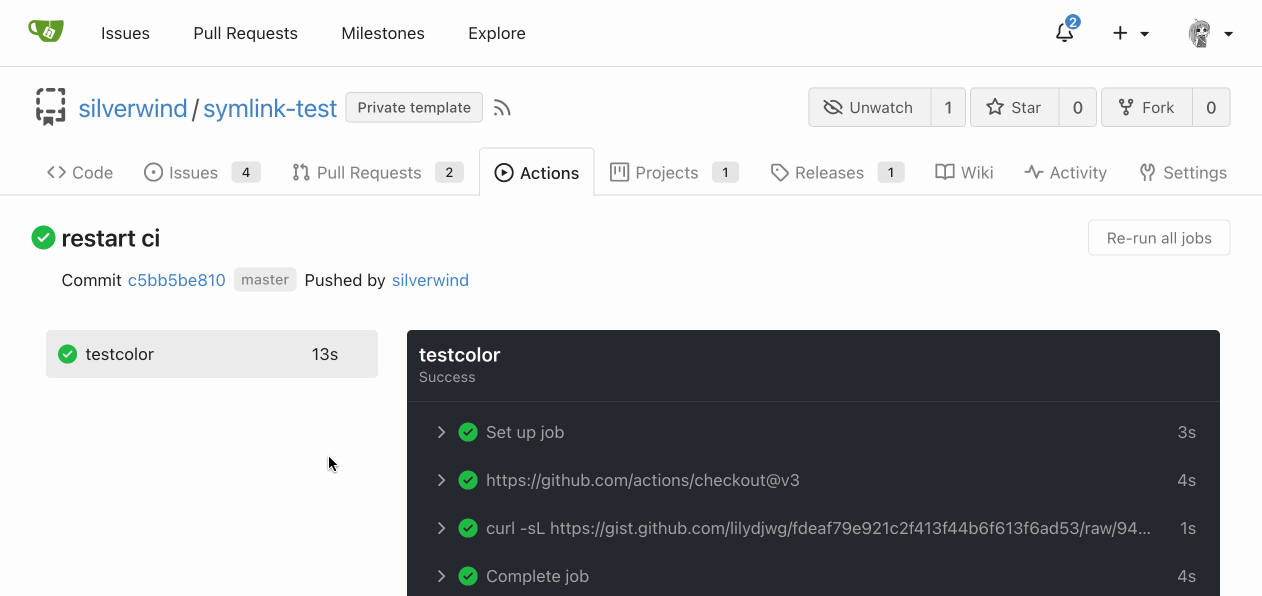
---------
Co-authored-by: yp05327 <576951401@qq.com>
2023-05-24 09:00:29 +00:00
silverwind
64e0672e3b
Fix @font-face overrides ( #24855 )
...
Fixes: https://github.com/go-gitea/gitea/issues/24850
Not sure how to do it for asian fonts only, so let's revert to previous
value for now.
### Before
<img width="414" alt="Screenshot 2023-05-22 at 10 34 10"
src="https://github.com/go-gitea/gitea/assets/115237/749f1556-a5cf-48fe-8b10-8dc447221657 ">
### After
<img width="416" alt="Screenshot 2023-05-22 at 10 34 04"
src="https://github.com/go-gitea/gitea/assets/115237/a0a315bb-d95f-4d03-863e-0534f665ca71 ">
2023-05-24 01:48:51 +00:00
wxiaoguang
bb9e20e434
Fix document and improve comment ( #24844 )
...
* Fix broken doc link:
https://github.com/go-gitea/gitea/actions/runs/5041309438/jobs/9040887385
* Improve comments about how font weight works:
https://github.com/go-gitea/gitea/pull/24827#pullrequestreview-1435584800

---------

Co-authored-by: silverwind <me@silverwind.io>
2023-05-22 08:47:33 +00:00
HesterG
da461b5a08
Improvements for action detail page ( #24718 )
...
Close #24625
Main changes:
1. For the left panel, show rerun icon only on hover, and add style when
the job is selected, and removed icon on the "rerun all" button and
modify the text on the button
https://github.com/go-gitea/gitea/assets/17645053/cc437a17-d2e9-4f1b-a8cf-f56e53962767
2. Adjust fonts, and add on hover effects to the log lines. And add
loading effect when the job is done and the job step log is expanded for
the first time. (With reference to github)
https://github.com/go-gitea/gitea/assets/17645053/2808d77d-f402-4fb0-8819-7aa0a018cf0c
3. Add `gt-ellipsis` to `step-summary-msg` and `job-brief-name`
<img width="898" alt="ellipsis"
src="https://github.com/go-gitea/gitea/assets/17645053/e2fb7049-3125-4252-970d-15b0751febc7 ">
4. Fixed
https://github.com/go-gitea/gitea/issues/24625#issuecomment-1541380010
by adding explicit conditions to `ActionRunStatus.vue` and `status.tmpl`
5. Adjust some css styles
---------
Co-authored-by: silverwind <me@silverwind.io>
2023-05-22 12:17:24 +08:00
silverwind
19993d8814
Change --font-weight-bold to --font-weight-semibold and 600 value, introduce new font weight variables ( #24827 )
...
There was some recent discussion about this in Discord `ui-design`
channel and the conclusion was that
https://github.com/go-gitea/gitea/issues/24305 should have fixed their
OS font installation to have semibold weights.

I have now tested this 601 weight on a Windows 10 machine on Firefox
myself, and I immediately noticed that bold was excessivly bold and
rendering as 700 because browsers are biased towards bolder fonts. So
revert this back to the previous value.
2023-05-21 23:37:32 +00:00
Brecht Van Lommel
268d121f4b
Fix video width overflow in markdown, and other changes to match img ( #24834 )
...
This change makes the CSS for `<video>` in markup match that of `<img>`,
and also allows additional attributes to be used. This way the width,
padding, alignment should work equally well for both.
2023-05-21 21:19:37 +00:00
delvh
e95b42e187
Improve accessibility when (re-)viewing files ( #24817 )
...
Visually, nothing should have changed.
Changes include
- Convert most `<a [no href]>` to `<button>` when (re-)viewing files:
- `<a [no href]>` are, by HTML definition, not a link and hence cannot
be focused
- `<a class="ui button">` can now be clicked (again?) using
<kbd>Enter</kbd>
- Previously, the installed keypress handler on `.ui.button` elements
disabled it for links somehow
- The `(un)escape file`, the `expand section` and the `expand/collapse
file` buttons can now be focused (and subsequently clicked using only
the keyboard)
- You can now press <kbd>Space</kbd> on a focused `View file` checkbox
to mark the file as viewed.
- previously, this was impossible as this checkbox listened on the wrong
event listener

The `add code comment` button has been left inaccessible for now as it
requires quite a bit of extra logic so that it is unhidden when it is
focused (you can otherwise focus it without seeing it as you are not
hovering on the corresponding line).

---------

Co-authored-by: silverwind <me@silverwind.io>
2023-05-21 20:47:41 +00:00
silverwind
32d9c47ec7
Add RTL rendering support to Markdown ( #24816 )
...
Support RTL content in Markdown:
Example document:
https://try.gitea.io/silverwind/symlink-test/src/branch/master/bidi-text.md
Same on GitHub:
https://github.com/silverwind/symlink-test/blob/master/bidi-text.md
`dir=auto` enables a browser heuristic that sets the text direction
automatically. It is the only way to get automatic text direction.
Ref: https://codeberg.org/Codeberg/Community/issues/1021
---------
Co-authored-by: wxiaoguang <wxiaoguang@gmail.com>
2023-05-20 23:02:52 +02:00
silverwind
a103b79f60
Rework label colors ( #24790 )
...
Introduce `--color-label-fg`, `--color-label-bg` and
`--color-label-hover-bg`, decoupling the label styles from other color
variables. I've set the colors so that non-interactive labels like on
tabs are dark-on-light on light theme, which imho looks better than
previous light-on-dark.
In the screenshot below, the leftmost label has hover, the second one
has active.
<img width="786" alt="Screenshot 2023-05-18 at 12 48 26"
src="https://github.com/go-gitea/gitea/assets/115237/d989bb68-504a-4406-b5f6-419ed9609f90 ">
<img width="789" alt="Screenshot 2023-05-18 at 13 04 07"
src="https://github.com/go-gitea/gitea/assets/115237/689a281a-a2b7-45e8-a5ee-dafb7a35e105 ">
---------
Co-authored-by: Giteabot <teabot@gitea.io>
2023-05-19 16:30:24 +00:00
HesterG
acde12a8a2
Fix max width and margin of comment box on conversation page ( #24809 )
...
Fix regression from #23937
The changes should only be limited to `.conversation-holder
.comment-code-cloud`, otherwise it will affect the `.comment-code-cloud`
in conversation tab
Before:
<img width="962" alt="Screen Shot 2023-05-19 at 18 22 25"
src="https://github.com/go-gitea/gitea/assets/17645053/0db01d04-2581-48f9-b46c-497836b1f12b ">
After:
<img width="997" alt="Screen Shot 2023-05-19 at 18 35 01"
src="https://github.com/go-gitea/gitea/assets/17645053/5d14b67b-88c1-46c6-b859-fd41752b3ebb ">
---------
Co-authored-by: Giteabot <teabot@gitea.io>
2023-05-19 16:02:34 +00:00
silverwind
1e1e8b5d43
Fix OAuth loading state ( #24788 )
...
Fix regression from https://github.com/go-gitea/gitea/pull/24740 where
the loading state was not showing because the `oauth-login-image` class
was removed. Replaced the Fomantic loader with a pure CSS loader and
cleaned up the HTML.
Diff:
https://github.com/go-gitea/gitea/pull/24788/files?diff=unified&w=1

Co-authored-by: Giteabot <teabot@gitea.io>
2023-05-18 11:50:11 +00:00
silverwind
6a3a54cf48
Remove background on user dashboard filter bar ( #24779 )
...
Was only an issue on arc-green:
### Before
<img width="313" alt="Screenshot 2023-05-17 at 23 33 15"
src="https://github.com/go-gitea/gitea/assets/115237/0f6916c6-c6c3-43c8-84cc-24b0a9800a43 ">
### After
<img width="310" alt="Screenshot 2023-05-17 at 23 32 52"
src="https://github.com/go-gitea/gitea/assets/115237/207d3d7f-ce6f-4170-b426-e743be760185 ">
Co-authored-by: Giteabot <teabot@gitea.io>
2023-05-18 09:27:29 +02:00
Zettat123
e7c2231dee
Support for status check pattern ( #24633 )
...
This PR is to allow users to specify status checks by patterns. Users
can enter patterns in the "Status Check Pattern" `textarea` to match
status checks and each line specifies a pattern. If "Status Check" is
enabled, patterns cannot be empty and user must enter at least one
pattern.
Users will no longer be able to choose status checks from the table. But
a __*`Matched`*__ mark will be added to the matched checks to help users
enter patterns.
Benefits:
- Even if no status checks have been completed, users can specify
necessary status checks in advance.
- More flexible. Users can specify a series of status checks by one
pattern.
Before:

After:
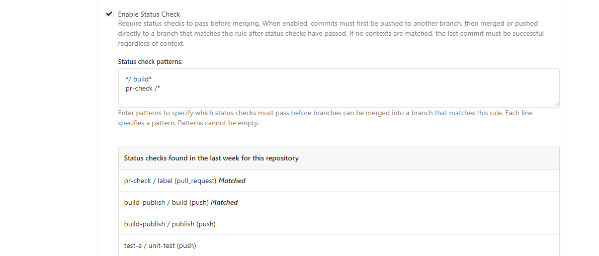
---------
Co-authored-by: silverwind <me@silverwind.io>
2023-05-17 16:11:13 +08:00
silverwind
b926f96da7
Reorganize CSS files ( #24739 )
...
Reorganize various CSS files for clarity, group together by subdirectory
in `index.css`. This reorders some of the rules, but I don't think it
should introduce any issues because of that.
2023-05-16 00:13:30 -04:00
silverwind
a7e18b9fb7
Rework Oauth login buttons, swap github logo to monocolor ( #24740 )
...
Diff without whitespace:
https://github.com/go-gitea/gitea/pull/24740/files?diff=unified&w=1
- Use SVGs for GitHub and GitLab oauth providers
- Replace section wrapping with a divider
- Rework icon rendering, increase size from 32px to 40px
Before:
<img width="853" alt="Screenshot 2023-05-15 at 21 54 23"
src="https://github.com/go-gitea/gitea/assets/115237/6ab5cfb4-46ff-469a-bd1f-06780d4a6a0b ">
After (more providers):
<img width="849" alt="Screenshot 2023-05-15 at 21 51 21"
src="https://github.com/go-gitea/gitea/assets/115237/fa84f92f-98e0-4aed-9357-5d62ddd98195 ">
<img width="856" alt="Screenshot 2023-05-15 at 21 56 45"
src="https://github.com/go-gitea/gitea/assets/115237/d3edd7ed-dadd-4302-aca7-08f20adc220e ">
Ref: https://codeberg.org/Codeberg/Community/issues/1023
---------
Co-authored-by: Giteabot <teabot@gitea.io>
2023-05-15 22:46:51 +00:00
silverwind
b92c142c97
Clean up various avatar dimensions ( #24701 )
...
Clean up a few cases where avatar dimensions were overwritten via CSS,
which were no longer needed or were possible to set via HTML width.
Also included are two small fixes:
- Fix one more case of incorrect avatar offset on review timeline
- Vertically center avatars in review sidebar
There is more to be done here, but some of the work depends on Fomantic
`comment` module removal, or in the case of org member lists, a refactor
of the `avatarlink` template to accept a size.
<img width="371" alt="image"
src="https://github.com/go-gitea/gitea/assets/115237/9c5902fb-2b89-4a7d-a152-60e74c3b2c56 ">
<img width="306" alt="image"
src="https://github.com/go-gitea/gitea/assets/115237/c8d92e2a-91c9-4f4a-a7de-6ae1a6bc0479 ">
---------
Co-authored-by: Giteabot <teabot@gitea.io>
2023-05-14 14:15:59 +00:00
silverwind
11552a779f
Remove Fomantic comment module ( #24703 )
...
Remove the comment module and put the styles that we still need into a
separate file, eliminating about 2/3 of the CSS in line count.
2023-05-14 04:21:24 +00:00
wxiaoguang
8a8b753647
Improve button-ghost, remove tertiary button ( #24692 )
...
<img width="474" alt="image"
src="https://github.com/go-gitea/gitea/assets/2114189/7fd231f9-71c3-4769-ba96-37a5b77cf224 ">
<img width="557" alt="image"
src="https://github.com/go-gitea/gitea/assets/2114189/c9945f61-39b4-4711-aea8-c34ef1d714c5 ">
<img width="641" alt="image"
src="https://github.com/go-gitea/gitea/assets/2114189/691be76e-74fd-420d-9b9e-ba1f3b08e0b4 ">
And a page to test buttons:
<details>
<img width="451" alt="image"
src="https://github.com/go-gitea/gitea/assets/2114189/5f61da24-2f36-40ad-a9bb-2205da5f5f04 ">
</details>
---------
Co-authored-by: Giteabot <teabot@gitea.io>
Co-authored-by: silverwind <me@silverwind.io>
2023-05-13 20:38:22 +00:00
wxiaoguang
82224c54e0
Improve avatar uploading / resizing / compressing, remove Fomantic card module ( #24653 )
...
Fixes : #8972
Fixes : #24263
And I think it also (partially) fix #24263 (no need to convert) ,
because users could upload any supported image format if it isn't larger
than AVATAR_MAX_ORIGIN_SIZE
The main idea:
* if the uploaded file size is not larger than AVATAR_MAX_ORIGIN_SIZE,
use the origin
* if the resized size is larger than the origin, use the origin
Screenshots:
JPG:
<details>

</details>
APNG:
<details>


</details>
WebP (animated)
<details>

</details>
The only exception: if a WebP image is larger than MaxOriginSize and it
is animated, then current `webp` package can't decode it, so only in
this case it isn't supported. IMO no need to support such case: why a
user would upload a 1MB animated webp as avatar? crazy .....
---------
Co-authored-by: silverwind <me@silverwind.io>
2023-05-13 20:59:11 +02:00
wxiaoguang
ec8ea58dbe
Rename ".button-link" to ".button-ghost" ( #24670 )
...
Mainstream frameworks:

* https://getbootstrap.com/docs/5.0/components/buttons/
* https://primer.style/css/components/buttons#link-button
* https://nextui.org/docs/components/button#light
* https://coreui.io/react/docs/components/button/
* https://design-system.hpe.design/components/button
* https://chakra-ui.com/docs/components/button/usage#button-variants
* https://mui.com/material-ui/react-button/

All (at least most?) of them make "link" button have "underline" when
hovering.

So, a "link" is a "link", when it's hovered, it should have the
underline by default. To be strict, Gitea's "button-link" is not
link-style, so it needs a better name.

Actually, for the "plain" button, there are some different approaches:

* Some frameworks just make "default" button as no style (not feasible
in Gitea/Fomantic UI)
* Primer uses "btn-invisible", which is not a proper word
* NextUI uses "light", which is not a proper word, either ...
* CoreUI / ChakraUI uses "ghost", I think this name is acceptable.


Welcome to suggest better name for such button.

Or, we just call it ".button-plain" or ".button-simple", in fact I
prefer such simple and clear name.
2023-05-12 14:58:44 +00:00
yp05327
b5c26fa825
Add markdown preview to Submit Review Textarea ( #24672 )
...
Before:

After:

---------
Co-authored-by: wxiaoguang <wxiaoguang@gmail.com>
Co-authored-by: Giteabot <teabot@gitea.io>
2023-05-12 10:53:41 +00:00
silverwind
a96c73f979
Remove svg.svg class, restore .rss-icon ( #24667 )
...
Fix regression from https://github.com/go-gitea/gitea/pull/24476 where
the `svg.svg` class misaligns SVG icons across the site and streched
buttons unintentionally in vertical height.
Before (button 30.3px):
<img width="157" alt="Screenshot 2023-05-11 at 22 09 42"
src="https://github.com/go-gitea/gitea/assets/115237/0fd137ab-ab52-4cf8-afca-c45776d526d0 ">
After (button 30px):
<img width="160" alt="Screenshot 2023-05-11 at 22 09 59"
src="https://github.com/go-gitea/gitea/assets/115237/4b741f4b-0fd2-4fae-9bee-16a7deb098e8 ">
[vertical-align:
middle](https://developer.mozilla.org/en-US/docs/Web/CSS/vertical-align )
is not suitable to align icons to text because
> Aligns the middle of the element with the baseline plus half the
x-height of the parent.
Example of `vertical-align: middle` from MDN:
<img width="232" alt="Screenshot 2023-05-11 at 22 29 28"
src="https://github.com/go-gitea/gitea/assets/115237/179fb756-85a1-4cab-8219-1a4958f333e2 ">
So I think the
[existing](365bb77a54/web_src/css/svg.css (L3)https://github.com/go-gitea/gitea/assets/115237/0cd6edf5-12c0-4bdb-8771-a900f5ba2d35 ">
Co-authored-by: Giteabot <teabot@gitea.io>
2023-05-12 10:23:53 +00:00
yp05327
4aec1f87a4
Remove highlight in repo list ( #24675 )
...
Before:
After:

private or internal repos have `lock` icon, no need to add highlights to
them.
2023-05-12 10:00:17 +02:00
silverwind
67db6b6976
RSS icon fixes ( #24476 )
...
Fix regression from https://github.com/go-gitea/gitea/pull/24471 where
CSS rules for `.icon.grey` were removed which were in use by the RSS
icons.
Gave them their own class instead, removed a wrapper and also fixed
vertical alignment on them. Additionally, did a few related fixes on the
org header for alignment.
Fixes: https://github.com/go-gitea/gitea/issues/24584
<img width="196" alt="Screenshot 2023-05-01 at 22 39 40"
src="https://user-images.githubusercontent.com/115237/235528228-959e2385-c1d2-4d5c-baec-e3784d459653.png ">
<img width="216" alt="Screenshot 2023-05-01 at 22 44 20"
src="https://user-images.githubusercontent.com/115237/235528231-95cbff86-5672-48eb-b214-8bdcefa1612c.png ">
<img width="120" alt="Screenshot 2023-05-01 at 22 56 36"
src="https://user-images.githubusercontent.com/115237/235529844-b94ab554-3259-4d0c-b040-82aed7d1a111.png ">
<img width="372" alt="Screenshot 2023-05-01 at 22 54 25"
src="https://user-images.githubusercontent.com/115237/235529744-1a9c201b-5692-4122-9765-2f201a322a9e.png ">
<img width="477" alt="Screenshot 2023-05-01 at 22 55 28"
src="https://user-images.githubusercontent.com/115237/235529748-62188554-9927-42ef-bc94-7052bce266e2.png ">
---------
Co-authored-by: wxiaoguang <wxiaoguang@gmail.com>
2023-05-10 22:27:02 +00:00
silverwind
f7ede92f82
Notification list enhancements, fix striped tables on dark theme ( #24639 )
...
- Make code block rendering via backticks work
- Remove link color unless hovered
- Remove table stripes and fix stripes rendering on dark theme for other
tables
- Introduce new `button-link` class discussed previously for buttons
that look and act like links and apply it to the two right-side buttons
- Reduce box padding by 8px on each side
- Fix "Mark all read" button margin-right
- brighten `--color-markup-code-block` on arc-green
### Before
<img width="1216" alt="Screenshot 2023-05-10 at 20 00 30"
src="https://github.com/go-gitea/gitea/assets/115237/66da9ec2-dd09-4ef0-8f1d-1822a18b6b43 ">
<img width="1211" alt="Screenshot 2023-05-10 at 20 00 48"
src="https://github.com/go-gitea/gitea/assets/115237/f48e30a2-9a00-4723-93aa-79b97ca0ba0c ">
### After
<img width="1222" alt="Screenshot 2023-05-10 at 20 09 59"
src="https://github.com/go-gitea/gitea/assets/115237/c956e0d0-b3d9-42a4-a3ed-f0431c22bf3f ">
<img width="1218" alt="Screenshot 2023-05-10 at 20 05 34"
src="https://github.com/go-gitea/gitea/assets/115237/f72c1628-3961-4c28-9263-07cdf7531316 ">
2023-05-10 21:59:58 +00:00
silverwind
ae0fa64ef6
Review fixes and enhancements ( #24526 )
...
- Fix regression with icons wrapping from
https://github.com/go-gitea/gitea/pull/24459
- Fix box misalignment on small screen
- Fix avatar misalignment on review comment
- Fix incorrect underline hover effect on review icons
- Move status icon to left side in review box
- Enhance review icon colors, add helper function for it
- Add missing inline avatars in review comments
- Tweak icon sizes because some octicons have inconsistent sizing
### Before
<img width="655" alt="Screenshot 2023-05-04 at 20 50 28"
src="https://user-images.githubusercontent.com/115237/236301230-92325507-6e03-47ac-bfb4-c9ddde310571.png ">
<img width="260" alt="Screenshot 2023-05-04 at 20 50 42"
src="https://user-images.githubusercontent.com/115237/236301236-0dfa50e7-b8fc-4179-ae68-d872bc90f1f3.png ">
### After
<img width="498" alt="Screenshot 2023-05-04 at 20 55 08"
src="https://user-images.githubusercontent.com/115237/236301810-23862c2c-c0a9-43a4-a3eb-ee611c14a7f4.png ">
<img width="219" alt="Screenshot 2023-05-04 at 20 55 16"
src="https://user-images.githubusercontent.com/115237/236301817-d0de02ea-6ab5-43e1-9183-6b3848b72995.png ">
---------
Co-authored-by: Giteabot <teabot@gitea.io>
2023-05-10 09:16:44 +00:00
Nicholas Pease
c090f87a8d
Add Gitea Profile Readmes ( #23260 )
...
Implements displaying a README.md file present in a users ```.profile```
repository on the users profile page. If no such repository/file is
present, the user's profile page remains unchanged.
Example of user with ```.profile/README.md```

Example of user without ```.profile/README.md```

This pull request closes the feature request in #12233
Special thanks to @techknowlogick for the help in the Gitea discord!
---------
Co-authored-by: techknowlogick <techknowlogick@gitea.io>
Co-authored-by: Yarden Shoham <hrsi88@gmail.com>
Co-authored-by: Lunny Xiao <xiaolunwen@gmail.com>
Co-authored-by: yp05327 <576951401@qq.com>
Co-authored-by: Yarden Shoham <git@yardenshoham.com>
2023-05-09 05:57:24 +00:00
yp05327
2ee72d011f
Add permission check for moving issue action in project view page ( #24589 )
...
Fix #22954
Only users who have write permission can move issues in the project view page.
2023-05-09 00:50:16 -04:00
silverwind
4a722c9a45
Make Issue/PR/projects more compact, misc CSS tweaks ( #24459 )
...
- Remove various horizontal dividers on repo pages that didn't provide
visual benefit
- Remove label/milestone pills on single issue/pr page
- Remove issue-related pill buttons on projects page
- Increase contrast of color-secondary on arc-green
- Improve notifications icon, make circle bigger
- Remove some inline styles
- Fix focus in issue/pr title edit and select all text on button click
### Issue and PR before and after
<img width="1249" alt="Screenshot 2023-05-01 at 11 44 22"
src="https://user-images.githubusercontent.com/115237/235436662-a708288e-84fb-4b2e-a5a2-3a1c17d28f6c.png ">
<img width="1248" alt="Screenshot 2023-05-01 at 11 58 51"
src="https://user-images.githubusercontent.com/115237/235437992-f863e483-f3cc-4cc1-8204-fd223647a0c9.png ">
### Projects before and after
<img width="1255" alt="Screenshot 2023-05-01 at 11 41 02"
src="https://user-images.githubusercontent.com/115237/235436433-0deb85d6-4e7d-4e74-847f-254cc70a0cf9.png ">
<img width="1267" alt="Screenshot 2023-05-01 at 11 40 03"
src="https://user-images.githubusercontent.com/115237/235436431-715b13cb-f78c-4d86-b27a-9229f9738c5b.png ">
### Releases before and after
<img width="1243" alt="Screenshot 2023-05-01 at 11 41 12"
src="https://user-images.githubusercontent.com/115237/235436457-b655ee6f-03b8-4595-8d8c-b15ea469e988.png ">
<img width="1240" alt="Screenshot 2023-05-01 at 11 40 10"
src="https://user-images.githubusercontent.com/115237/235436456-05a2a0dd-7cbb-4f26-b0d3-4f667df4bb95.png ">
### Misc
<img width="58" alt="Screenshot 2023-05-01 at 10 49 13"
src="https://user-images.githubusercontent.com/115237/235432494-936ce995-6e22-47bc-ab2d-c9e93d31987d.png ">
<img width="57" alt="Screenshot 2023-05-01 at 18 57 08"
src="https://user-images.githubusercontent.com/115237/235492430-1d32cfe0-0f2c-467c-b2fa-925b27e30e0e.png ">
Issue title edit and wrap:
<img width="1238" alt="Screenshot 2023-05-01 at 12 34 40"
src="https://user-images.githubusercontent.com/115237/235441407-d5067a57-e586-4865-a652-282e5944abb4.png ">
<img width="1232" alt="Screenshot 2023-05-01 at 12 06 24"
src="https://user-images.githubusercontent.com/115237/235438710-1a543dda-220f-4d87-8f93-f1710c0695f0.png ">
---------
Co-authored-by: wxiaoguang <wxiaoguang@gmail.com>
2023-05-03 17:58:59 -04:00
wxiaoguang
48e3e38ee0
Clean up polluted styles and remove dead CSS code ( #24497 )
...
Follow #24393
The funny history:
* At the beginning, `.ui.message` was polluted by `text-align: center`
* Then people do `<div class="ui ... message text left">`
* But `.ui.left` is polluted by `float: left`
* Then people do `#xxx .ui.message { width: 100% !important;}`
The code just becomes more and more hacky.
After removing the pollution, everything becomes clear and straight.
And, this PR also does:
1. Remove the `package.css`, its styles could be provided by `top
aligned`
2. Remove `#avatar-arrow`, dead code
Screenshot:


Co-authored-by: Giteabot <teabot@gitea.io>
2023-05-03 14:32:10 -04:00
silverwind
3ae997614a
Enhance stylelint rule config, remove dead CSS ( #24472 )
...
Make this stylelint rule match on more properties.
The dead CSS relates to the navbar, which currently has classes:
```
ui top secondary stackable main menu following bar light
```
Which means `.following.bar .top.menu` can never match, so remove this
dead CSS as well as inactive `z-index` and `left` on it.
Commits table striping becomes more visible on dark theme, but I don't
think it's worth introducing a new color until
https://github.com/go-gitea/gitea/pull/24423 is ready, which would have
to remove it again:
<img width="668" alt="Screenshot 2023-05-01 at 18 41 49"
src="https://user-images.githubusercontent.com/115237/235489873-6b272899-1d78-443a-872c-ee7731c269f9.png ">
<img width="680" alt="Screenshot 2023-05-01 at 18 41 41"
src="https://user-images.githubusercontent.com/115237/235489878-1b9468af-c74f-48a6-a469-9eba57cfcb4d.png ">
2023-05-02 23:15:52 -04:00
silverwind
fa506cd571
Remove font-awesome and fomantic icon module ( #24471 )
...
Fixes https://github.com/go-gitea/gitea/issues/10410 .
This PR removes around 120kB of CSS.
2023-05-01 13:25:54 -04:00
wxiaoguang
3e7101dd64
Improve "new-menu" ( #24465 )
...
I am not sure what "new-menu" means, but I think we need to fix these
problems:

1. it shouldn't have "stackable", which makes the items stacked when
width is small. the `new-menu` already has `overflow: auto`
2. `justify-content: center` doesn't work with `overflow: auto` (for
small width), so use `margin: auto`
*
https://bhch.github.io/posts/2021/04/centring-flex-items-and-allowing-overflow-scroll/
3. `runner-new-menu` is dead code (copying & pasting ?)
2023-05-01 12:08:37 -04:00
silverwind
5adf32b48e
Remove fomantic breadcrumb module ( #24463 )
...
### File path before/after
<img width="522" alt="Screenshot 2023-05-01 at 13 23 33"
src="https://user-images.githubusercontent.com/115237/235445636-57776038-c98e-4cab-8abe-045138a76958.png ">
<img width="522" alt="Screenshot 2023-05-01 at 13 24 08"
src="https://user-images.githubusercontent.com/115237/235445638-70bef62a-1b70-41f8-ba51-728db4d54402.png ">
### File edit before/after
<img width="499" alt="Screenshot 2023-05-01 at 13 24 46"
src="https://user-images.githubusercontent.com/115237/235445676-7b3cc23e-289b-40a6-8d4f-0d7fb2efb55e.png ">
<img width="497" alt="Screenshot 2023-05-01 at 13 24 52"
src="https://user-images.githubusercontent.com/115237/235445677-db9f3974-8456-46de-a32b-9198110c0540.png ">
### Cherry-pick before/after
<img width="590" alt="Screenshot 2023-05-01 at 13 25 30"
src="https://user-images.githubusercontent.com/115237/235445717-99445024-1bb2-46d4-9bd8-8086bad57d34.png ">
<img width="582" alt="Screenshot 2023-05-01 at 13 25 37"
src="https://user-images.githubusercontent.com/115237/235445720-9c1dc497-eb23-4e10-a727-27f4d6df69e6.png ">
2023-05-01 11:40:02 -04:00
wxiaoguang
ce16ff6219
Remove unnecessary g-menu-stackable-scrollable ( #24462 )
...
Fix #24460

That's a mistake but ..... no idea why I wrote so ... remove it.
2023-05-01 12:51:14 +02:00
silverwind
1bd2772235
Replace remaining fontawesome dropdown icons with SVG ( #24455 )
...
- Replace leftover dropdown triangles with SVG
- Replace remove icon with SVG and add styling for it:
<img width="817" alt="Screenshot 2023-05-01 at 00 40 05"
src="https://user-images.githubusercontent.com/115237/235379271-4674d4f7-b11e-4d6d-90f9-1478325443ca.png ">
<img width="816" alt="Screenshot 2023-05-01 at 00 46 56"
src="https://user-images.githubusercontent.com/115237/235379451-b515afb3-9773-4f6f-a259-e7048235bcba.png ">
2023-05-01 05:35:02 -04:00
silverwind
6981885303
Add ui-monospace and SF Mono to --fonts-monospace ( #24442 )
...
- Add `ui-monospace` to support Safari 13.4+.
- Add `SF Mono` variant to support the font on non-mac.
- Quote fonts as per [W3C
recommendation](https://www.w3.org/TR/2018/REC-css-fonts-3-20180920/#propdef-font-family ).
> it is recommended to quote font family names that contain white space,
digits, or punctuation characters other than hyphens
Fixes: https://github.com/go-gitea/gitea/issues/22125
2023-04-30 14:58:32 -04:00
silverwind
f7cf7e6848
Fix config list overflow and layout ( #24312 )
...
Fixes: https://github.com/go-gitea/gitea/issues/24299
<img width="531" alt="Screenshot 2023-04-24 at 21 05 40"
src="https://user-images.githubusercontent.com/115237/234091905-9db42697-87b3-40a0-bd18-9e910ad8a2ae.png ">
2023-04-30 13:32:07 -04:00
wxiaoguang
14c142b0bc
Improve issue list filter ( #24425 )
...
Partial regression of #24393 , not only regression, but broken for long
time, 24393 didn't really improve it but used wrong `overflow: scroll`.
Actually, that "ui secondary filter menu labels" shouldn't be set as
scrollable (I missed that at that time), the problem is: if a "ui menu"
has "dropdown" items, then it should not be scrollable. Otherwise the
dropdown menu can't be shown correctly.
And there are more problems:
* The "issue-filters" shouldn't be used anywhere else (copying&pasting
problem again ....)
* There is also an "issue-actions" container, it should also be fixed.
* There are similar problems on the milestone page.
* The old comment in code: "grid column" doesn't work well.
The major changes of this PR are: use "flex: 1" instead of "ui grid
column".
After this PR, not 100% perfect but much better than before.
2023-04-30 11:51:20 -04:00
sillyguodong
e8173c2c33
Move Rename branch from repo settings page to the page of branches list ( #24380 )
...
Co-Author: @wxiaoguang

It is more convenient that user just need to enter a new branch name after he selects the branch which he want to rename.
So this PR move the function of renaming branch to the page of branches list.

This PR also restyle the button of `new branch`, `download`, `delete`....

https://user-images.githubusercontent.com/33891828/235277997-413060bb-759f-430a-b5c4-df5e40ffcd28.mov

---------

Co-authored-by: wxiaoguang <wxiaoguang@gmail.com>
2023-04-30 23:08:51 +08:00
silverwind
8f4dafcd4e
Rework header bar on issue, pull requests and milestone ( #24420 )
...
- Make search bar dynamic full width via flexbox
- Make all buttons `small` so font size is the same for all elements in
the header
- Remove primary color from search field, add SVG icon like on Code tab
- Fix button vertical padding being enlarged by SVG icons
[View diff without
whitespace](https://github.com/go-gitea/gitea/pull/24420/files?diff=unified&w=1 )
<img width="1226" alt="Screenshot 2023-04-29 at 11 58 53"
src="https://user-images.githubusercontent.com/115237/235296851-74848267-664f-4c1f-b94c-a1b94196ff75.png ">
<img width="1219" alt="Screenshot 2023-04-29 at 11 59 39"
src="https://user-images.githubusercontent.com/115237/235296852-bcfde5ed-8658-43c2-b7e5-3ad84611e76f.png ">
Mobile:
<img width="437" alt="Screenshot 2023-04-29 at 11 59 52"
src="https://user-images.githubusercontent.com/115237/235296860-99263373-7b27-4540-868c-a93e70f281ca.png ">
<img width="433" alt="Screenshot 2023-04-29 at 12 00 00"
src="https://user-images.githubusercontent.com/115237/235296862-6cf64317-a864-405a-a00f-b5ab620349f5.png ">
2023-04-29 23:33:25 -04:00
wxiaoguang
5a5ab8ef5a
Start cleaning the messy ".ui.left / .ui.right", improve label list page, fix stackable menu ( #24393 )
...
Since 2015/2016, there is a global pollution: ".ui.left" / ".ui.right".
Fomantic UI doesn't work this way, it just conflicts with many Fomantic
definitions.
This PR starts the cleaning work of such techinical debts.
And, the "label list" page has been quite messy for long time, for
example, why "li" appears in "div" ......
And fix #24296
<details>


</details>
2023-04-29 07:35:59 -04:00
Hester Gong
72e956b79a
Improve protected branch setting page ( #24379 )
...
Main changes:
1. Change html structure of protected branch page, use [`grouped
fields`](https://fomantic-ui.com/collections/form.html#grouped-fields )
instead of `fields` for better margin, and wrap `grouped fields` around
related `field`s, remove unnecessary `<div id="protection_box"
class="fields">` outer div
2. Changed some order of field to make them more categorized, used `ui
dividing header` for categorization and fine tune css.
Before:
<img width="1907" alt="Screen Shot 2023-04-27 at 14 56 19"
src="https://user-images.githubusercontent.com/17645053/234783731-bce8a7ce-dfc9-4d47-a3a8-b962ebea9467.png ">
<img width="1849" alt="Screen Shot 2023-04-27 at 14 56 30"
src="https://user-images.githubusercontent.com/17645053/234783740-c47d314e-5e2d-4854-98fd-c88f85ef3584.png ">
<img width="1872" alt="Screen Shot 2023-04-27 at 14 56 36"
src="https://user-images.githubusercontent.com/17645053/234783745-18e35a75-07e8-451d-b001-f9bcf16fcab5.png ">
After:
https://user-images.githubusercontent.com/17645053/235114568-da010aad-7654-4410-ab8c-5d0fce7edadb.mov
3. Changed "Enable Merge Whitelist" to radio checkbox, and added "Enable
Merge" radio checkbox, which are exclusive
Before:
<img width="926" alt="Screen Shot 2023-04-28 at 13 08 29"
src="https://user-images.githubusercontent.com/17645053/235059233-75790f7a-e5ea-4e1c-82c6-509fef8b84b3.png ">
After:
<img width="942" alt="Screen Shot 2023-04-28 at 13 09 28"
src="https://user-images.githubusercontent.com/17645053/235059367-852d1f61-8407-4126-8c79-315b9c1ffada.png ">
4. Add a link to set default branch on branch list page (with reference
to github)
https://user-images.githubusercontent.com/17645053/234787404-61c1c7b6-aabf-429f-a109-5b690e4e0b5a.mov
5. Removed dead codes.
---------
Co-authored-by: wxiaoguang <wxiaoguang@gmail.com>
Co-authored-by: silverwind <me@silverwind.io>
Co-authored-by: Giteabot <teabot@gitea.io>
2023-04-29 06:44:52 -04:00
wxiaoguang
83022013c8
Fix layouts of admin table / adapt repo / email test ( #24370 )
...
Ref:
https://github.com/go-gitea/gitea/pull/24315#pullrequestreview-1403034993
And fix the incorrect layout for "dasbboard", the "form" shouldn't
follow `<h4 class="ui top attached header">`, so move it to inner.
Diff with ignoring spaces:
https://github.com/go-gitea/gitea/pull/24370/files?diff=unified&w=1
A known bug: the adapt/delete button doesn't work due to a historical
messy logic, will fix it in next PR (#24374 )


2023-04-28 09:48:41 +08:00
Hester Gong
63a401ac40
Move secrets and runners settings to actions settings ( #24200 )
...
This PR moves the secrets and runners settings to actions settings on
all settings(repo,org,user,admin) levels.
After this PR, if
[ENABLED](5e7543fcf4/custom/conf/app.example.ini (L2604)https://user-images.githubusercontent.com/17645053/234489731-15822d21-38e1-4560-8bbe-69f122376abc.png ">
2. User Level
"Secrets Management"
<img width="1427" alt="Screen Shot 2023-04-26 at 14 34 30"
src="https://user-images.githubusercontent.com/17645053/234489795-68c9c0cb-24f8-4f09-95c6-458ab914c313.png ">
3. Repo and Organization Levels
"Runners Management" and "Secrets Management"
Org:
<img width="1437" alt="Screen Shot 2023-04-26 at 14 35 07"
src="https://user-images.githubusercontent.com/17645053/234489996-f3af5ebb-d354-46ca-9087-a0b586845281.png ">
<img width="1433" alt="Screen Shot 2023-04-26 at 14 35 14"
src="https://user-images.githubusercontent.com/17645053/234490004-3abf8fed-81fd-4ce2-837a-935dade1793d.png ">
Repo:
<img width="1419" alt="Screen Shot 2023-04-26 at 14 34 50"
src="https://user-images.githubusercontent.com/17645053/234489904-80c11038-4b58-462c-9d0b-8b7cf70bc2b3.png ">
<img width="1430" alt="Screen Shot 2023-04-26 at 14 34 57"
src="https://user-images.githubusercontent.com/17645053/234489918-4e8d1fe2-9bcd-4d8a-96c1-238a8088d92e.png ">
It also finished these tasks :
- [x] rename routers function "runners" to "actions", and refactor
related file names
- [x] check and modify part of the runners related functions to match
their name
- [x] Fix backend check caused by fmt check
---------
Co-authored-by: wxiaoguang <wxiaoguang@gmail.com>
2023-04-27 20:08:47 -04:00
Hester Gong
f1a4330306
Modify width of ui container, fine tune css for settings pages and org header ( #24315 )
...
Close #24302
Part of #24229 , Follows #24246
This PR focused on CSS style fine-tune, main changes:
1. Give `.ui.ui.ui.container` a width of `1280px` with a max-width of
`calc(100vw - 64px)`, so the main contents looks better on large
devices.
2. Share styles for table elements in all levels settings pages to fix
overflow of runners table on mobile and for consistency (The headers on
mobile can be further improved, but haven't found a proper way yet).
3. Use [stackable
grid](https://fomantic-ui.com/collections/grid.html#stackable ) and
[device column width](https://fomantic-ui.com/examples/responsive.html )
for responsiveness for some pages (repo/org collaborators settings
pages, org teams related page)
4. Fixed #24302 by sharing label related CSS in reporg.css
5. Fine tune repo tags settings page
---------
Co-authored-by: wxiaoguang <wxiaoguang@gmail.com>
2023-04-26 11:59:08 -04:00
silverwind
4d5c803f8b
Fix Monaco IOS keyboard button ( #24341 )
...
Fix https://github.com/go-gitea/gitea/issues/16188 . Turns out the
element was completely misaligned by fomantic styles. Add most of the
original styles in `!important` form to fix.
Tapping the button doesn't do anything useful in Simulator.app, but I
guess it's still better to not outright hide it in case it has a
possiblity to work.
<img width="121" alt="image"
src="https://user-images.githubusercontent.com/115237/234379685-4e67f8cd-7e91-4bcc-8e17-9d5b2ebed6cd.png ">
Co-authored-by: Giteabot <teabot@gitea.io>
2023-04-26 01:31:50 -04:00
silverwind
75e35fb03a
Fix runner button height ( #24338 )
...
Fixes https://github.com/go-gitea/gitea/issues/24326 .
Set size class and downsize any such buttons that have a dropdown icon
because the dropdown icon increases button height artificially.
[`:has()`](https://developer.mozilla.org/en-US/docs/Web/CSS/:has ) is not
supported in Firefox yet, but works fine with the experimental pref
enabled. I see this as a graceful degradation in unsupporting browsers.
2023-04-26 00:09:29 -04:00
wxiaoguang
0e8045d8ea
Fix template function DateTime ( #24317 )
...
Before, 500 error

2023-04-25 15:48:30 -04:00
Zettat123
30c1cd9775
Add tags list for repos whose release setting is disabled ( #23465 )
...
Close #23427
Co-Author: @wxiaoguang
If a repo's release setting is enabled, the logic has't changed.
Clicking the "Tags" button will jump to `/{user}/{repo}/tags` and
`templates/repo/release/list.tmpl` template will be used.
<img
src="https://user-images.githubusercontent.com/15528715/224939362-bd8974fd-08b0-4f79-a114-3389d15847ca.png "
width="600px" />
If the release setting is disabled, clicking the "Tags" button will
still jump to `/{user}/{repo}/tags` but a new template
`templates/repo/tag/list.tmpl` will be used.
<img
src="https://user-images.githubusercontent.com/15528715/233834564-74741e49-f4e9-47c8-ac12-e306642798dc.png "
width="600px" />
Since both templates above need to render the tags list, I moved the
tags list to a shared template located in
`templates/repo/tag/table.tmpl`.
---------
Co-authored-by: wxiaoguang <wxiaoguang@gmail.com>
Co-authored-by: Giteabot <teabot@gitea.io>
2023-04-25 18:29:00 +02:00
wxiaoguang
f16b668980
Make SVG in dropdown menu have the same margin-right as IMG ( #24316 )
...
Fix #24226

Co-authored-by: silverwind <me@silverwind.io>
2023-04-25 07:34:37 -04:00
wxiaoguang
20a3b03fe5
Add --font-weight-bold and set previous bold to 601 ( #24307 )
...
Fix #24305

According to MDN, "bold" starts from 700, some fonts do not provide
"bolding" for weight 600

https://developer.mozilla.org/en-US/docs/Web/CSS/font-weight

---------

Co-authored-by: silverwind <me@silverwind.io>
Co-authored-by: Giteabot <teabot@gitea.io>
2023-04-24 13:46:00 -04:00
wxiaoguang
75c62054a6
Improve some modal action buttons ( #24289 )
...
Follow #24097 and #24285
And add a devtest page for modal action button testing.
http://localhost:3000/devtest/fomantic-modal
Now the `modal_actions_confirm.tmpl` could support: green / blue /
yellow positive buttons, the negative button is "secondary".
ps: this PR is only a small improvement, there are still a lot of
buttons not having proper colors. In the future these buttons could be
improved by this approach.
These buttons could also be improved according to the conclusion of
#24285 in the future.

And add GitHub-like single danger button (context:
https://github.com/go-gitea/gitea/issues/24285#issuecomment-1519100312 )
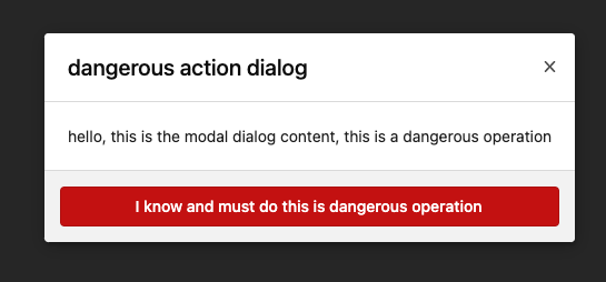
---------
Co-authored-by: silverwind <me@silverwind.io>
2023-04-24 07:08:59 -04:00
silverwind
774d1a0fbd
Tweak pull request branch delete ui ( #23951 )
...
- Move delete button to right and remove red color on it.
- Remove CLI instructions when PR has been merged.
Before:
<img width="855" alt="Screenshot 2023-04-06 at 20 21 47"
src="https://user-images.githubusercontent.com/115237/230463178-95735fc0-9632-4d51-bbd5-2131c40186c4.png ">
After:
<img width="865" alt="Screenshot 2023-04-06 at 20 23 17"
src="https://user-images.githubusercontent.com/115237/230463347-8155cbf9-4e58-421a-93a8-56ce6188dab8.png ">
After (deleted):
<img width="860" alt="Screenshot 2023-04-06 at 20 19 30"
src="https://user-images.githubusercontent.com/115237/230463442-f53d7500-191d-4d75-a097-d100a461672a.png ">
---------
Co-authored-by: Giteabot <teabot@gitea.io>
2023-04-23 14:12:36 -04:00
Hester Gong
476a043a5f
Refactor delete_modal_actions template and use it for project column related actions ( #24097 )
...
Co-Author: @wxiaoguang
This PR is to fix
https://github.com/go-gitea/gitea/issues/23318#issuecomment-1506275446 .
The way to fix this in this PR is to use `delete_modal_actions.tmpl`
here both to fix this issue and keep ui consistency (as suggested by
[TODO
here](4299c3b7db/templates/projects/view.tmpl (L161)https://user-images.githubusercontent.com/17645053/233825650-76307e65-9255-44bb-80e8-7062f58ead1b.png ">
<img width="786" alt="Screen Shot 2023-04-23 at 15 17 21"
src="https://user-images.githubusercontent.com/17645053/233825652-4dc6f7d1-a180-49fb-a468-d60950eaee0d.png ">
Test for functionalities:
https://user-images.githubusercontent.com/17645053/233826857-76376fda-022c-42d0-b0f3-339c17ca4e59.mov
---------
Co-authored-by: wxiaoguang <wxiaoguang@gmail.com>
2023-04-23 17:24:19 +08:00
wxiaoguang
7447b39de7
Fix footer display ( #24251 )
...
Fix #24249
Diff with ignoring spaces:
https://github.com/go-gitea/gitea/pull/24251/files?diff=split&w=1
Screenshots:
<details>
<img width="1440" alt="image"
src="https://user-images.githubusercontent.com/2114189/233592840-d9ef7296-64eb-4e48-a598-300807a7c2f9.png ">
<img width="923" alt="image"
src="https://user-images.githubusercontent.com/2114189/233593015-16edc531-43c2-4ff0-b27e-ca75dbadce0c.png ">
</details>
---------
Co-authored-by: silverwind <me@silverwind.io>
Co-authored-by: Giteabot <teabot@gitea.io>
2023-04-22 01:58:59 -04:00
silverwind
948a9ee5e8
Fix label color, fix divider in dropdown ( #24215 )
...
Two small CSS fixes:
1. Fix basic primary label hover
2. Fix border color of divider in dropdown and remove margin so it looks
better with hover effect, as discussed in
https://github.com/go-gitea/gitea/pull/24143 :
2023-04-20 21:53:17 -04:00
Hester Gong
6793ef0069
Use secondary pointing menu for tabs on user/organization home page ( #24162 )
...
Close #24108
Use secondary pointing menu for tabs on user/organization home page so
the tabs look the same.
Main changes:
1. modified a part of dom structure in
`templates/user/overview/header.tmpl` to make it the same as
`templates/org/header.tmpl` in order to produce the same ui.
2. Move some css to `web_src/css/shared/repoorgshared.css` to make them
shareable between `templates/user/overview/header.tmpl` and
`templates/org/header.tmpl`
After:
https://user-images.githubusercontent.com/17645053/232400617-2add5bec-d483-4ab1-b48d-eaee157f7b09.mov
For further improvements. Need some thoughts:
For [this
TODO](729ad294cb/templates/user/overview/header.tmpl (L1)729ad294cb/templates/user/overview/header.tmpl (L2-L17)729ad294cb/templates/org/header.tmpl (L1-L16)
2023-04-20 04:58:26 -04:00
wxiaoguang
de2268ffab
Fix issue attachment handling ( #24202 )
...
Close #24195
Some of the changes are taken from my another fix
f07b0de997#20147 (although that PR was discarded ....)
The bug is:
1. The old code doesn't handle `removedfile` event correctly
2. The old code doesn't provide attachments for type=CommentTypeReview
This PR doesn't intend to refactor the "upload" code to a perfect state
(to avoid making the review difficult), so some legacy styles are kept.
---------
Co-authored-by: silverwind <me@silverwind.io>
Co-authored-by: Giteabot <teabot@gitea.io>
2023-04-20 02:39:44 -04:00
wxiaoguang
b39a5bbbd6
Make wiki title supports dashes and improve wiki name related features ( #24143 )
...
Close #7570
1. Clearly define the wiki path behaviors, see
`services/wiki/wiki_path.go` and tests
2. Keep compatibility with old contents
3. Allow to use dashes in titles, eg: "2000-01-02 Meeting record"
4. Add a "Pages" link in the dropdown, otherwise users can't go to the
Pages page easily.
5. Add a "View original git file" link in the Pages list, even if some
file names are broken, users still have a chance to edit or remove it,
without cloning the wiki repo to local.
6. Fix 500 error when the name contains prefix spaces.
This PR also introduces the ability to support sub-directories, but it
can't be done at the moment due to there are a lot of legacy wiki data,
which use "%2F" in file names.


Co-authored-by: Giteabot <teabot@gitea.io>
2023-04-19 13:50:10 -04:00
Krzysztof Jeziorny
fcad9fd19f
Vertical widths of containers removed ( #24184 )
...
A vertical overflow appears in Firefox 112/MacOS 12.6 when the system
setting for scrollbars is to "Always" show them.
---
Here, the fixed 100vw container widths are removed, which removes the
overflow. It is, however, only simulated in Developer Tools in latest
Firefox and Chromium, so please test on a Gitea installation.
2023-04-19 12:13:00 -04:00
wxiaoguang
e422342eeb
Allow adding new files to an empty repo ( #24164 )
...

2023-04-19 21:40:42 +08:00
wxiaoguang
1ab16e48cc
Improve Wiki TOC ( #24137 )
...
The old code has a lot of technical debts, eg: `repo/wiki/view.tmpl` /
`Iterate`

This PR improves the Wiki TOC display and improves the code.

---------

Co-authored-by: delvh <dev.lh@web.de>
2023-04-17 15:05:19 -04:00
silverwind
dcde4701a5
Fix math and mermaid rendering bugs ( #24049 )
...
1. Fix multiple error display for math and mermaid:
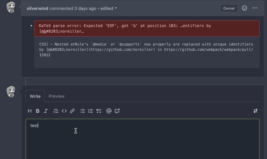
2. Fix height calculation of certain mermaid diagrams by reading the
iframe inner height from it's document instead of parsing it from SVG:
Before:
<img width="866" alt="Screenshot 2023-04-11 at 11 56 27"
src="https://user-images.githubusercontent.com/115237/231126480-b194e02b-ea8c-4ddf-8c79-50c525815d92.png ">
After:
<img width="855" alt="Screenshot 2023-04-11 at 11 56 35"
src="https://user-images.githubusercontent.com/115237/231126494-5fe86a48-8d21-455a-8b95-79b6ee27a16f.png ">
3. Refactor error handling to a common function
4. Rename to `renderAsciicast` for consistency
5. Improve mermaid loading sequence
Note: I did try `securityLevel: 'sandbox'` to make mermaid output a
iframe directly, but that showed a bug in mermaid where the iframe style
height was set incorrectly. Opened
https://github.com/mermaid-js/mermaid/issues/4289 for this.
---------
Co-authored-by: Giteabot <teabot@gitea.io>
2023-04-17 12:10:22 +02:00
wxiaoguang
0e05984667
Set EasyMDE heading font-size to the same size as the resulting markdown ( #24151 )
...
Fix #23816
According to my personal experience, the EasyMDE is still useful when
writing a lot of contents, eg: the wiki page.
It's not difficult to improve its heading styles, so let's make it.
Before:
<img width="815" alt="image"
src="https://user-images.githubusercontent.com/2114189/232280943-9177f0bc-e380-426f-8588-20ff8d8e5293.png ">
After:
<img width="538" alt="image"
src="https://user-images.githubusercontent.com/2114189/232280903-e8c476ee-f5b1-48fe-8a93-86fcd79680c3.png ">
2023-04-16 20:01:08 +08:00
wxiaoguang
1c8bc4081a
Show friendly 500 error page to users and developers ( #24110 )
...
Close #24104
This also introduces many tests to cover many complex error handling
functions.
### Before
The details are never shown in production.
<details>

</details>
### After
The details could be shown to site admin users. It is safe.

2023-04-14 13:19:11 +08:00
silverwind
469dc4459b
Add monospace toggle button to textarea ( #24034 )
...
- Add new button to textarea to switch font. State is persisted in
localStorage.
- Change markdown-switch-easymde button from `<span>` to `<button>`
- Slightly increased monospace font globally by 5% as I think it fits
better.
For hover effect on these buttons I'm deferring to
https://github.com/go-gitea/gitea/pull/23896 .
---------
Co-authored-by: delvh <dev.lh@web.de>
2023-04-13 15:05:06 -04:00
wxiaoguang
704f3aa91c
Fine tune markdown editor toolbar ( #24046 )
...
1. Remove unnecessary `btn-link` `muted` classes
* Link is link, button is button, I can't see a real requirement to make
a button like a link.
* If anyone insists, please help to show me real example from modern
frameworks / websites, how and why they do so.
* No need to duplicate a lot of class names on similar elements
* Declare styles clearly, for example, `markdown-toolbar` itself should
have `display: flex`, but not use `gt-df` to overwrite the `display:
block`.
2. Remove unnecessary `role` attribute
* https://github.com/github/markdown-toolbar-element/issues/70
* The `markdown-toolbar-element` does want to add `role=button`, but
there is a bug.
* So we do the similar thing as upstream does (add the role by JS),
until they fix their bugs.
3. Indent `markdown-switch-easymde` (before it doesn't have a proper
indent)
Screenshot:

2023-04-11 16:36:18 +08:00
delvh
91c8261e2c
Add tooltips for MD editor buttons and add muted class for buttons ( #23896 )
...
Followup of #23876 according to my unreleased review demanding tooltips.
Additionally
- add a `muted` equivalent for buttons
- convert `switch to legacy` to an actual button
- enroll `switch to legacy` in the builtin pseudo focus cycle
- remove spaces between the buttons
The effect of the `muted` class is what you would expect: The button
loses all of its normal styling, and is defined only by its content instead.
This will help reduce a11y infractions in the future, as that was one of
the major points why people didn't use `<button>` tags and decided on a
bad fix (i.e. through `<div>`s) instead.
## Appearance

---------
Co-authored-by: silverwind <me@silverwind.io>
2023-04-11 15:26:18 +08:00
silverwind
9f6bc7c6f4
Replace tribute with text-expander-element for textarea ( #23985 )
...
The completion popup now behaves now much more as expected than before
for the raw textarea:
- You can press <kbd>Tab</kbd> or <kbd>Enter</kbd> once the completion
popup is open to accept the selected item
- The menu does not close automatically when moving the cursor
- When you delete text, previously correct suggestions are shown again
- If you delete all text until the opening char (`@` or `:`) after
applying a suggestion, the popup reappears again
- Menu UI has been improved
<img width="278" alt="Screenshot 2023-04-07 at 19 43 42"
src="https://user-images.githubusercontent.com/115237/230653601-d6517b9f-0988-445e-aa57-5ebfaf5039f3.png ">
2023-04-09 12:18:45 -04:00
sillyguodong
bedad23f9e
Expand/Collapse all changed files ( #23639 )
...
close #23628

Now in `...` dropdown, you can expand or collapse all diff files that
have loaded.

https://user-images.githubusercontent.com/33891828/227749688-2d406916-3347-49f6-93a5-4092a00e8809.mov

Co-authored-by: silverwind <me@silverwind.io>
2023-04-09 21:11:02 +08:00
silverwind
f2b98d8259
Show errors for KaTeX and mermaid on the preview tab ( #24009 )
...
There is a conflicting fomantic rule that hid the error messages inside
the markdown preview tab for things like mermaid or katex.
Overruled it to always show these errors.
<img width="774" alt="image"
src="https://user-images.githubusercontent.com/115237/230738528-322814c1-8994-495e-b901-bbb79b924ccb.png ">
2023-04-09 08:07:43 -04:00
Hester Gong
a519aac6d5
Show protected branch rule names again ( #23907 )
...
`!important`s for one of the primary label selectors are removed by
#23774 , so the repository branch protection settings ui will not have
the demanding css. This PR modifies `.ui.primary.label` to fix it.
Before:
<img width="1408" alt="飞书20230404-115410"
src="https://user-images.githubusercontent.com/17645053/229683221-ef9c7d5c-68a8-42b0-ba19-ef2d5dfce5f9.png ">
After:
<img width="1419" alt="截屏2023-04-04 11 56 32"
src="https://user-images.githubusercontent.com/17645053/229683469-70cfc92d-d7ef-4323-a7f5-2247810fabce.png ">
---------
Co-authored-by: delvh <dev.lh@web.de>
Co-authored-by: Lunny Xiao <xiaolunwen@gmail.com>
2023-04-09 06:15:43 -04:00
silverwind
cf5a281fdc
Adjust sticky pr header to cover background ( #23956 )
...
Very minor CSS tweak: Adjust sticky PR header to cover the box-shadow of
selected files.
Before:
<img width="1250" alt="Screenshot 2023-04-06 at 22 54 59"
src="https://user-images.githubusercontent.com/115237/230492218-4d71da48-a362-4c52-a7f7-01daf4ffa458.png ">
After:
<img width="1255" alt="Screenshot 2023-04-06 at 22 54 46"
src="https://user-images.githubusercontent.com/115237/230492227-c7142210-e535-4da8-b610-37d33dcbb549.png ">
2023-04-08 20:43:15 +08:00
silverwind
c0246677a6
Fix markup background, improve wiki rendering ( #23750 )
...
Fix regression from https://github.com/go-gitea/gitea/pull/23578 . Only
visible on arc-green.
Before:
<img width="997" alt="Screenshot 2023-03-27 at 19 14 21"
src="https://user-images.githubusercontent.com/115237/228016589-e7cabfb9-bfd0-45fd-9407-6b76c665ed1a.png ">
After:
<img width="1000" alt="Screenshot 2023-03-27 at 19 14 05"
src="https://user-images.githubusercontent.com/115237/228016600-db2e6002-4e2c-4d18-8393-9d7e1f525acb.png ">
Fixes: https://github.com/go-gitea/gitea/issues/20625
Fixes: https://github.com/go-gitea/gitea/issues/23718
2023-04-07 17:30:04 -04:00
wxiaoguang
93eb914438
Improve markdown editor: width, height, preferred ( #23895 )
...
Follow #23876
1. Fine tune the heights of the editors (like before)
* Auto expand the editor (increase/decrease the height) when editing
2. Remember user's last used editor (textarea/easymde) in LocalStorage,
then next time the editor will be switched automatically
* No need to introduce extra config option, it satisfies all users,
including who prefer EasyMDE
3. Also fix the width problem of Review Panel
Screenshot:
<details>


</details>
---------
Co-authored-by: silverwind <me@silverwind.io>
2023-04-07 13:03:29 -04:00
Hester Gong
6eb678374b
Refactor authors dropdown (send get request from frontend to avoid long wait time) ( #23890 )
...
Right now the authors search dropdown might take a long time to load if
amount of authors is huge.
Example: (In the video below, there are about 10000 authors, and it
takes about 10 seconds to open the author dropdown)

https://user-images.githubusercontent.com/17645053/229422229-98aa9656-3439-4f8c-9f4e-83bd8e2a2557.mov

Possible improvements can be made, which will take 2 steps (Thanks to
@wolfogre for advice):

Step 1:
Backend: Add a new api, which returns a limit of 30 posters with matched
prefix.
Frontend: Change the search behavior from frontend search(fomantic
search) to backend search(when input is changed, send a request to get
authors matching the current search prefix)

Step 2:
Backend: Optimize the api in step 1 using indexer to support fuzzy
search.

This PR is implements the first step. The main changes:
1. Added api: `GET /{type:issues|pulls}/posters` , which return a limit
of 30 users with matched prefix (prefix sent as query). If
`DEFAULT_SHOW_FULL_NAME` in `custom/conf/app.ini` is set to true, will
also include fullnames fuzzy search.
2. Added a tooltip saying "Shows a maximum of 30 users" to the author
search dropdown
3. Change the search behavior from frontend search to backend search

After:

https://user-images.githubusercontent.com/17645053/229430960-f88fafd8-fd5d-4f84-9df2-2677539d5d08.mov

Fixes: https://github.com/go-gitea/gitea/issues/22586

---------

Co-authored-by: wxiaoguang <wxiaoguang@gmail.com>
Co-authored-by: silverwind <me@silverwind.io>
2023-04-07 08:11:02 +08:00
Yoan Blanc
9b416b2e36
Use graceful editorconfig loader to reduce errors when loading malformed editorconfigs ( #21257 )
...
The _graceful_ should fail less when the `.editorconfig` file isn't
properly written, e.g. boolean values from YAML or unparseable numbers
(when a number is expected). As is... information is lost as the
_warning_ (a go-multierror.Error) is ignored. If anybody knows how to
send them to the UI as warning; any help is appreciated.

Closes #20694

Signed-off-by: Yoan Blanc <yoan@dosimple.ch>
2023-04-06 16:01:20 -04:00
wxiaoguang
376396a088
Fix image border-radius ( #23886 )
...
1. Instead of polluting the `border-radius` style globally, each "img"
usage should declare their own styles.
2. There were some bugs in code, I believe the `.img` selector was done
by mistake.
After:


2023-04-05 02:44:52 +02:00
Jimmy Praet
54197b67f9
Scroll collapsed file into view ( #23702 )
2023-04-05 07:51:42 +08:00
wxiaoguang
d149093ce3
Fix code view (diff) broken layout ( #23096 )
...
Close #22911
I think it's ready for review now, feel free to test it, welcome to help
to improve.
### Before
### After

2023-04-04 19:05:07 +08:00
silverwind
62a9052075
Org pages style fixes ( #23901 )
...
Few fixes/enhancements around org pages:
Use flexbox for member and repo lists and tweak rendering of tabs and
list:
<img width="765" alt="Screenshot 2023-04-03 at 22 54 24"
src="https://user-images.githubusercontent.com/115237/229625716-92a834c3-9121-4729-8b9b-3a3973cf9a91.png ">
<img width="771" alt="Screenshot 2023-04-03 at 22 55 15"
src="https://user-images.githubusercontent.com/115237/229625719-acc08ce8-4489-44a6-a9b9-e36755c55b1d.png ">
Vertically center remove/leave buttons, add link to avatar:
<img width="1223" alt="Screenshot 2023-04-03 at 21 51 20"
src="https://user-images.githubusercontent.com/115237/229612616-b662b795-e754-41a1-a77a-381c267e6104.png ">
2023-04-04 06:49:09 +02:00
wxiaoguang
5115ffa90c
Remove fomantic ".link" selector and styles ( #23888 )
...
It's difficult to play with Fomantic's ".link" selector&styles, and it
doesn't bring any real benefit.
Instead, it sometimes introduces regressions (because of the `:not`
selector, really difficult to fine-tune).
Regression:
<details>

</details>
After this PR, there is no ".link" in code anymore. We do not need to
play the overwriting and `:not()` game anymore.


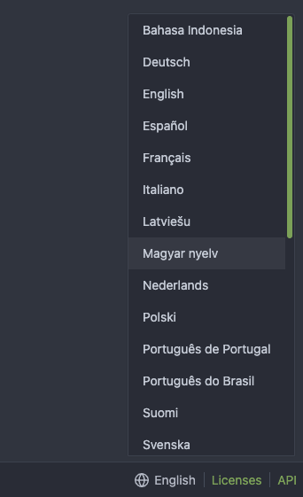
2023-04-03 20:47:23 -04:00
wxiaoguang
5ab1c7acec
Fix user profile description rendering ( #23882 )
...
The `ul li` styles were polluted.
Before:

After:

2023-04-03 16:11:16 -04:00
silverwind
d0c406a86f
Fix review box viewport overflow issue ( #23800 )
...
Fix regression that came likely from
https://github.com/go-gitea/gitea/pull/23271 :
Long lines of text currently cause the review box's CodeMirror element
to resize which apparently is not recognized by [popper's resize
detection](https://popper.js.org/docs/v2/modifiers/event-listeners/ ) and
which causes the element to go partially out of viewport until a reflow
happens:

Fix this by setting the element to a static width derived from viewport
width and remove the previously clumsy media queries.
2023-04-03 11:11:34 -04:00
wxiaoguang
5cc0801de9
Introduce GitHub markdown editor, keep EasyMDE as fallback ( #23876 )
...
The first step of the plan
* #23290
Thanks to @silverwind for the first try in #15394 . Close #10729 and a
lot of related issues.
The EasyMDE is not removed, now it works as a fallback, users can switch
between these two editors.
Editor list:
* Issue / PR comment
* Issue / PR comment edit
* Issue / PR comment quote reply
* PR diff view, inline comment
* PR diff view, inline comment edit
* PR diff view, inline comment quote reply
* Release editor
* Wiki editor
Some editors have attached dropzone
Screenshots:
<details>


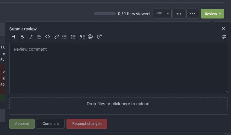

</details>
---------
Co-authored-by: silverwind <me@silverwind.io>
2023-04-03 18:06:57 +08:00
silverwind
ca03ca9e6e
CSS color tweaks ( #23828 )
...
Change grey shades in arc-green to match the theme more:
<img width="661" alt="Screenshot 2023-03-30 at 21 42 34"
src="https://user-images.githubusercontent.com/115237/228957952-8e099e56-6923-4aa6-8ce9-3c1cd898b73e.png ">
Adjusted grey shade in light theme:
<img width="652" alt="image"
src="https://user-images.githubusercontent.com/115237/228963876-3bde6181-8397-4dc2-be72-33982e6c7acb.png ">
Increase contrast in arc-green, change background to slightly darker
shade, change forgeground to slightly brighter colors:
<img width="283" alt="Screenshot 2023-03-30 at 22 33 20"
src="https://user-images.githubusercontent.com/115237/228957957-272c24a5-dd0b-427a-b6b7-e62836bdd73c.png ">
Increase contrast of grey text in light theme as well by making them
darker:
<img width="273" alt="Screenshot 2023-03-30 at 22 33 35"
src="https://user-images.githubusercontent.com/115237/228957959-283139c7-6fa7-4b68-9fdd-16c668ad1301.png ">
Add color rule for border multiple select items:
<img width="183" alt="Screenshot 2023-03-30 at 22 29 31"
src="https://user-images.githubusercontent.com/115237/228957954-6b5a752d-bbb0-4519-ab35-d02c0804d955.png ">
<img width="181" alt="Screenshot 2023-03-30 at 22 29 46"
src="https://user-images.githubusercontent.com/115237/228957956-fca9790a-d6c9-4f31-8d1b-d183ab3ac669.png ">
Added color rule for red `*` on required form fields:
<img width="97" alt="image"
src="https://user-images.githubusercontent.com/115237/228958760-517ad9ef-565d-4349-b734-9b559ab42429.png ">
2023-03-31 16:24:47 +08:00
silverwind
525b7382d3
Convert issue list checkboxes to native ( #23596 )
...
Use native instead of fomantic checkboxes in issue list. Benefits
include no more JS pop-in on load and perfect a11y.
Before, with JS pop-in:
<img width="92" alt="Screenshot 2023-03-20 at 17 02 02"
src="https://user-images.githubusercontent.com/115237/226398955-99029a1c-1150-449c-821b-e4165e7446a8.png ">
After, Firefox on macOS:
<img width="126" alt="Screenshot 2023-03-20 at 17 01 26"
src="https://user-images.githubusercontent.com/115237/226399018-58df2c32-c2b2-4c78-b7df-7b76523abe21.png ">
After, Chrome on macOS:
<img width="79" alt="Screenshot 2023-03-20 at 17 01 42"
src="https://user-images.githubusercontent.com/115237/226399074-947e6279-8dc3-42c2-90b5-b106c471b23d.png ">
I opted to not do styling yet but I see that the inconsistency between
browsers may already be reason enough on doing it. I think if we style
them, there should be one global style, including markdown ones which
currently have custom styling.
2023-03-30 11:02:47 -04:00
silverwind
aa4d1d94f7
Diff improvements ( #23553 )
...
- Avoid flash of wrong tree toggle icon on page load by setting icon
based on sync state
- Avoid "pop-in" of tree on page load by leaving space based on sync
state
- Use the same border/box-shadow combo used on comment `:target` also
for file `:target`.
- Refactor `DiffFileTree.vue` to use `toggleElem` instead of hardcoded
class name.
- Left-align inline comment boxes and make them fit the same amount of
markup content on a line as GitHub.
- Fix height of `diff-file-list`
Fixes: https://github.com/go-gitea/gitea/issues/23593
<img width="1250" alt="Screenshot 2023-03-18 at 00 52 04"
src="https://user-images.githubusercontent.com/115237/226071392-6789a644-aead-4756-a77e-aba3642150a0.png ">
<img width="1246" alt="Screenshot 2023-03-18 at 00 59 43"
src="https://user-images.githubusercontent.com/115237/226071443-8bcba924-458b-48bd-b2f0-0de59cb180ac.png ">
<img width="1250" alt="Screenshot 2023-03-18 at 01 27 14"
src="https://user-images.githubusercontent.com/115237/226073121-ccb99f9a-d3ac-40b7-9589-43580c4a01c9.png ">
<img width="1231" alt="Screenshot 2023-03-19 at 21 44 16"
src="https://user-images.githubusercontent.com/115237/226207951-81bcae1b-6b41-4e39-83a7-0f37951df6be.png ">
(Yes I'm aware the border-radius in bottom corners is suboptimal, but
this would be notorously hard to fix without relying on `overflow:
hidden`).
2023-03-30 20:06:10 +08:00
silverwind
79e7a6ec1e
Add CSS rules for basic colored labels ( #23774 )
...
Before:
<img width="164" alt="Screenshot 2023-03-28 at 23 35 46"
src="https://user-images.githubusercontent.com/115237/228372437-663111b9-7285-4fa2-9125-fb5e1cad21d7.png ">
After:
<img width="166" alt="Screenshot 2023-03-28 at 23 35 54"
src="https://user-images.githubusercontent.com/115237/228372441-49430517-6b2d-4389-b11c-c30a724f6de7.png ">
Also I removed the `!important` on the primary label as it's very likely
unnecessary with the amount of specificity the selector already has.
2023-03-28 22:58:31 -04:00
wxiaoguang
12fff36d05
Fine tune more downdrop settings, use SVG for labels, improve Repo Topic Edit form ( #23626 )
...
Although it seems that some different purposes are mixed in this PR,
however, they are all related, and can be tested together, so I put them
together to save everyone's time.
Diff: `+79 −84`, everything becomes much better.
### Improve the dropdown settings.
Move all fomantic-init related code into our `fomantic.js`
Fine-tune some dropdown global settings, see the comments.
Also help to fix the first problem in #23625 , cc: @yp05327
The "language" menu has been simplified, and it works with small-height
window better.
### Use SVG instead of `<i class="delete icon">`
It's also done by `$.fn.dropdown.settings.templates.label` , cc:
@silverwind
### Remove incorrect `tabable` CSS class
It doesn't have CSS styles, and it was only in Vue. So it's totally
unnecessary, remove it by the way.
### Improve the Repo Topic Edit form
* Simplify the code
* Add a "Cancel" button
* Align elements
Before:
<details>

</details>
After:

2023-03-26 19:31:26 +08:00
John Olheiser
73b4010fcd
Remove row clicking from notification table ( #22695 )
...
Resolves #22692

I don't think there's a need for this entire row to be clickable (and
even different links depending on which segment you click)
The links still point to the same spot, so no information is lost here.

---------

Signed-off-by: jolheiser <john.olheiser@gmail.com>
Co-authored-by: wxiaoguang <wxiaoguang@gmail.com>
2023-03-25 14:37:34 -05:00
Hester Gong
a9cceb0597
Fix long project name display in issue list and in related dropdown ( #23653 )
...
This PR is to fix the second problem mentioned in #23625 , along with the
long texts problem in `issue-item-bottom-row` of `issuelist.tmpl`
Main changes are:
1. Add `max-width` to the search dropdowns in issue list and make the
possible long texts inside to show ellipsis if texts are long
2. Adjust the conditions in
[issuelist.tmpl](1d35fa0e78/templates/shared/issuelist.tmpl (L146-L167)https://github.com/go-gitea/gitea/issues/23625#issuecomment-1479281060 )
3. Use `word-break: break-word;` in `issue-item-bottom-row` to break the
possible long texts.
After the PR
issuelist in repo (similar for pr list):
<img width="366" alt="截屏2023-03-23 17 42 40"
src="https://user-images.githubusercontent.com/17645053/227163953-93e9adbd-5785-4c16-b538-9db901787775.png ">
dropdowns with long name (Here take reference from github to deal with
the long names cases: show ellipsis with no title, because all these
options are clickable, and it might not be necessary to add titles to
them ):
<img width="370" alt="截屏2023-03-23 17 43 50"
src="https://user-images.githubusercontent.com/17645053/227164215-df6fcaaa-9fee-4256-a57c-053fbcffafbb.png ">
<img width="365" alt="截屏2023-03-23 17 43 56"
src="https://user-images.githubusercontent.com/17645053/227164227-9c99abcd-f410-4e07-b5b8-cbce764eedcd.png ">
issue page (similar for pr page):
<img width="374" alt="截屏2023-03-23 17 45 37"
src="https://user-images.githubusercontent.com/17645053/227164668-654a8188-dac8-4bbf-a6e3-f3768a644a1b.png ">
on PC:
<img width="1412" alt="截屏2023-03-23 17 47 20"
src="https://user-images.githubusercontent.com/17645053/227166694-e7bcc6e5-9667-4cef-9fbf-db85640a2c6c.png ">
<img width="1433" alt="截屏2023-03-23 17 46 40"
src="https://user-images.githubusercontent.com/17645053/227165182-4e2a5d19-74bc-4c66-b73c-23cbca176ffe.png ">
2023-03-24 15:11:23 +08:00
Hester Gong
9cefb7be73
Fix new issue/pull request btn margin when it is next to sort ( #23647 )
...
Close #23627
Added margin left to the button when it is next to the svg, which has a
margin-right of `-0.5rem`
And here it might be better if `white-space: nowrap;` is added because
otherwise it might look like below on pull requests page on smaller
screen
<img width="945" alt="截屏2023-03-23 09 57 41"
src="https://user-images.githubusercontent.com/17645053/227079613-71c696ab-55ec-4641-acb9-622a8baebb31.png ">
After:
<img width="936" alt="截屏2023-03-23 10 08 27"
src="https://user-images.githubusercontent.com/17645053/227080971-6bf2588e-40dd-4770-b0d1-45d7c63e0f48.png ">
Pull Request on smaller screen
<img width="922" alt="截屏2023-03-23 10 25 16"
src="https://user-images.githubusercontent.com/17645053/227084144-0c2ed3e6-5c11-4252-bba2-b5f971b70f4a.png ">
2023-03-23 14:07:04 -04:00
wxiaoguang
389e83f7eb
Improve <SvgIcon> to make it output svg node and optimize performance ( #23570 )
...
Before, the Vue `<SvgIcon>` always outputs DOM nodes like:
```html
<span class="outer-class">
<svg class="class-name-defined" ...></svg>
</span>
```
The `span` is redundant and I guess such layout and the inconsistent
`class/class-name` attributes would cause bugs sooner or later.
This PR makes the `<SvgIcon>` clear, and it's faster than before,
because it doesn't need to parse the whole SVG string.
Before:
<details>

</details>
After:

---------
Co-authored-by: silverwind <me@silverwind.io>
2023-03-23 11:24:16 +08:00
silverwind
ca0ce9feb0
Set opaque background on markup and images ( #23578 )
...
- Set opaque background on markup images so they can visually break
`<hr>`
- Change padding of comment box so `padding` is provided by the
`.markup` element instead of its parent, matching the file rendering
view which does the same.
Before:
<img width="243" alt="Screenshot 2023-03-19 at 19 22 03"
src="https://user-images.githubusercontent.com/115237/226198663-8ff4d940-6a15-452d-ac58-14485b37fbc7.png ">
After:
<img width="261" alt="Screenshot 2023-03-19 at 19 23 26"
src="https://user-images.githubusercontent.com/115237/226198689-1bf56561-4726-46dc-b583-423d65e1e13a.png ">
<img width="263" alt="image"
src="https://user-images.githubusercontent.com/115237/226199002-e93c817d-6d9c-4b98-bad8-0aa0bd45b62f.png ">
Example documents:
https://try.gitea.io/silverwind/symlink-test/src/branch/master/test-page.md
https://github.com/silverwind/symlink-test/blob/master/test-page.md
2023-03-21 17:38:04 -04:00
silverwind
253a00aaac
Remove conflicting CSS rules on notifications, improve notifications table ( #23565 )
...
Dropdowns on `/notifications/subscriptions` before and after:
<img width="157" alt="Screenshot 2023-03-18 at 20 37 12"
src="https://user-images.githubusercontent.com/115237/226133906-e4ad6a0a-de24-4324-8e1d-94081d23fe85.png ">
<img width="152" alt="Screenshot 2023-03-18 at 20 41 29"
src="https://user-images.githubusercontent.com/115237/226134038-c3946c32-a424-4b92-ad15-890e1036cafe.png ">
These selectors are meant to target the notification list which I
improved:
<img width="1145" alt="Screenshot 2023-03-19 at 01 52 11"
src="https://user-images.githubusercontent.com/115237/226147907-1c35736a-4bc9-4698-9813-21a20a1d2106.png ">
<img width="1148" alt="Screenshot 2023-03-19 at 01 54 17"
src="https://user-images.githubusercontent.com/115237/226147920-626dbd84-11d3-48db-a177-6d808e3212c0.png ">
2023-03-21 15:11:25 -04:00
wxiaoguang
30668e0047
Fix dropdown icon misalignment when using fomantic icon ( #23558 )
...
There are still many dropdowns using fomantic icon. For example: new
issue with issue template.
Avoid polluting the fomantic styles.
Before:

After:

2023-03-18 22:24:26 -04:00
silverwind
9efcce563b
Fix sticky header in diff view ( #23554 )
...
Ressurection of #23549 .
Fix regression https://github.com/go-gitea/gitea/pull/23513#issuecomment-1474356817 from #23271 .
The previous sticky CSS did assume the content is always 2 rows, but since that PR, it's single-row above 993px width.
Adjust the sticky offset to match and add a small tweak that hides content behind the `border-radius`.
Single row:
<img width="1264" alt="Screenshot 2023-03-17 at 21 33 05"
src="https://user-images.githubusercontent.com/115237/226034050-a04b131d-fd3f-45c0-bc72-413738a59825.png ">
Double row:
<img width="1243" alt="Screenshot 2023-03-17 at 21 32 53"
src="https://user-images.githubusercontent.com/115237/226034163-2f1c6aa9-fc72-432f-bc46-9a7119da8677.png ">
2023-03-18 18:51:00 -04:00
wxiaoguang
27fcfae6d9
Fix some broken css ( #23560 )
...
1. The "close" inside "modal" are likely broken for long time
    * There is no var called `--body-color`
    * There is no `fullscreen modal`
* The `.ui.modal > .close.inside` doesn't seem to match most icons. It
only matches a few like "fork-repo-modal" or "adopt repo". Other places
are just buggy code copied again and again.
2. Convert the legacy `&:hover` LESS syntax to CSS syntax
2023-03-18 17:53:12 -04:00
Hester Gong
d42015e6eb
Fix long name ui issues and label ui issue ( #23541 )
...
This PR fixes some ui problems as mentioned in the two issues below.
1. Long file path has no word break
## Before
<img width="1357" alt="截屏2023-03-17 17 49 43"
src="https://user-images.githubusercontent.com/17645053/225873491-27c7bf9a-d5d5-4065-9e4a-ff228e935abf.png ">
## After
<img width="1248" alt="截屏2023-03-17 17 51 22"
src="https://user-images.githubusercontent.com/17645053/225873562-93b87af7-9c83-43f8-aa0d-36a9174d25ac.png ">
on mobile
<img width="408" alt="截屏2023-03-17 17 51 15"
src="https://user-images.githubusercontent.com/17645053/225873554-1b8c8999-1dfc-4251-a7fc-20ecd3444cb0.png ">
2. Texts in labels
## Before
<img width="1219" alt="截屏2023-03-17 17 49 24"
src="https://user-images.githubusercontent.com/17645053/225873369-812b1b52-c104-4e32-988f-c3e55ad2f844.png ">
## After
<img width="1259" alt="截屏2023-03-17 17 51 31"
src="https://user-images.githubusercontent.com/17645053/225873317-9717fd2c-e9e1-4a00-a27d-6bdc5933c3ca.png ">
with two labels
<img width="1258" alt="截屏2023-03-17 17 51 53"
src="https://user-images.githubusercontent.com/17645053/225873323-13198192-71de-472d-8e78-6fd86ddba3d9.png ">
In explore and star pages
<img width="896" alt="截屏2023-03-17 18 25 00"
src="https://user-images.githubusercontent.com/17645053/225878962-9e26e3aa-cff0-451c-9133-19f4ad1507a4.png ">
<img width="913" alt="截屏2023-03-17 18 25 09"
src="https://user-images.githubusercontent.com/17645053/225878967-6adaa414-136e-43c2-87d0-7e46a0da112e.png ">
3. Long name repository on creating new fork page
## Before
<img width="919" alt="截屏2023-03-17 17 50 01"
src="https://user-images.githubusercontent.com/17645053/225873723-5c4ea137-3b51-4074-a458-ef442e330ddf.png ">
## After
<img width="907" alt="截屏2023-03-17 17 50 37"
src="https://user-images.githubusercontent.com/17645053/225873772-fc4a52c3-49c6-4ca6-903d-a13707f2a98b.png ">
<img width="383" alt="截屏2023-03-17 17 50 48"
src="https://user-images.githubusercontent.com/17645053/225873779-6de1dfde-5c05-4ae9-89e1-85c25b3a1682.png ">
Closes #23535
Closes #23534
2023-03-18 17:07:59 +01:00
silverwind
d0f48187f9
Fix diff detail buttons wrapping, use tippy for review box ( #23271 )
...
Fix visual regression introduced by
https://github.com/go-gitea/gitea/pull/22986 .
Before:
<img width="1277" alt="image"
src="https://user-images.githubusercontent.com/115237/222792814-d70c2173-0c7c-4db2-8839-95be63cdc8ee.png ">
<img width="649" alt="image"
src="https://user-images.githubusercontent.com/115237/222792989-9b1f5e12-becd-40cc-b02c-e9f59a8e72a4.png ">
After:
<img width="1274" alt="image"
src="https://user-images.githubusercontent.com/115237/222792769-e7a9702f-4b6a-46c4-9385-da103ed4dff0.png ">
<img width="565" alt="image"
src="https://user-images.githubusercontent.com/115237/222793084-6de6482b-11dc-4d38-b514-15884d20e140.png ">
2023-03-17 12:24:00 -05:00
silverwind
6aca9287a2
Increase horizontal page padding ( #23507 )
...
Add a bit more empty space on left and right side of page content for a
more pleasant viewing experience. Also tweaked the mobile navbar to
match.
Before:
<img width="1276" alt="Screenshot 2023-03-16 at 00 58 23"
src="https://user-images.githubusercontent.com/115237/225473942-f544106f-1b61-456a-99fb-3ba136cabc8d.png ">
After:
<img width="1270" alt="Screenshot 2023-03-16 at 00 58 37"
src="https://user-images.githubusercontent.com/115237/225473959-8b555359-a08d-48e1-9476-2710aabb1166.png ">
Mobile Navbar:
<img width="673" alt="Screenshot 2023-03-16 at 01 05 12"
src="https://user-images.githubusercontent.com/115237/225473966-adccef2b-4d34-44ed-8c75-d4ca46d96cf3.png ">
2023-03-17 02:23:23 -04:00
silverwind
4b72206805
Update mini-css-extract-plugin, remove postcss ( #23520 )
...
Follow-up and proper fix for
https://github.com/go-gitea/gitea/pull/23504
Update to
[mini-css-extract-plugin@2.7.4](https://github.com/webpack-contrib/mini-css-extract-plugin/releases/tag/v2.7.4 )
which fixes our specific issue described in
https://github.com/webpack-contrib/css-loader/issues/1503 and which
allows us to again drop the postcss dependency.
Backport of this is not necessary as I have included it in
https://github.com/go-gitea/gitea/pull/23508 .
Co-authored-by: techknowlogick <techknowlogick@gitea.io>
2023-03-16 15:06:53 -04:00
wxiaoguang
6bad0fb24f
Fix review comment context menu clipped bug ( #23523 )
...
This is another regression of #22959 (the first regression has been
fixed by the Image Diff fix)
Close #23517
This is a quick fix. Luckily, there is no "dropdown menu" for image/csv
view, so we could only add the "overflow-x: scroll" to the image/csv
view.
After fix:


Co-authored-by: KN4CK3R <admin@oldschoolhack.me>
2023-03-16 14:25:04 -04:00
Hester Gong
661e78bed5
Allow both fullname and username search when DEFAULT_SHOW_FULL_NAME is true ( #23463 )
...
This PR adds the ability to search both fullname and username for
assignees, reviewers and author search boxes when the config
[`DEFAULT_SHOW_FULL_NAME`](6ff5400af9/custom/conf/app.example.ini (L1238)https://projects.blender.org/infrastructure/blender-projects-platform/issues/14 )
And if `DEFAULT_SHOW_FULL_NAME` is set to `false`(default value), these
search boxes will only show username.
Example:
When `DEFAULT_SHOW_FULL_NAME = true`
<img width="1220" alt="截屏2023-03-14 14 28 06"
src="https://user-images.githubusercontent.com/17645053/224914546-80ef2837-ab72-4d66-9f00-6eb77ed4baaa.png ">
When `DEFAULT_SHOW_FULL_NAME = false` (default value)
<img width="1243" alt="截屏2023-03-14 14 29 37"
src="https://user-images.githubusercontent.com/17645053/224914798-f69ec8a2-0929-4330-827c-3e30188f9b47.png ">
The specific search boxes that adapts these changes include:
1. Author, Assignee search boxes in pull requests tab and issues tab in
repository
<img width="1283" alt="截屏2023-03-14 14 35 01"
src="https://user-images.githubusercontent.com/17645053/224916250-8e452525-71d6-4b48-bf1c-bf7a176abaaa.png ">
2. Assigee and Author on milestones issue page (Added missing search box
for author here)
<img width="1261" alt="截屏2023-03-14 14 38 20"
src="https://user-images.githubusercontent.com/17645053/224916569-d3105619-7824-4bb8-a6d0-1a600eaa9963.png ">
3. Assignee on issues and PR Sidebar, Reviewer on PR Sidebar
<img width="976" alt="截屏2023-03-14 14 41 06"
src="https://user-images.githubusercontent.com/17645053/224917431-c45d821e-9660-4f58-a196-5979a0bb64ce.png ">
<img width="1027" alt="截屏2023-03-14 14 41 58"
src="https://user-images.githubusercontent.com/17645053/224917290-ad4dbc52-0c20-45c4-9fce-9dcd59ad7d47.png ">
4. Assignee when creating new issue
<img width="961" alt="截屏2023-03-14 14 44 33"
src="https://user-images.githubusercontent.com/17645053/224917694-34bee5a7-e975-4f37-8862-56ebc2556808.png ">
5. Whitelisted users for pushing, Whitelisted users for merging and
Whitelisted reviewers in Protected branch settings
<img width="920" alt="截屏2023-03-14 14 48 56"
src="https://user-images.githubusercontent.com/17645053/224918551-9b46b44e-b075-4895-8d33-1aafc7d3c8e5.png ">
<img width="901" alt="截屏2023-03-14 14 49 02"
src="https://user-images.githubusercontent.com/17645053/224918584-efa66f23-a593-4e26-a3eb-bb1fbc5516ae.png ">
<img width="944" alt="截屏2023-03-14 14 49 21"
src="https://user-images.githubusercontent.com/17645053/224918591-be60455d-0513-4f66-84f6-b5e1bc40ff91.png ">
6. "Allowed users" in tags settings
<img width="935" alt="截屏2023-03-14 14 50 11"
src="https://user-images.githubusercontent.com/17645053/224918701-797699aa-c7e5-4290-b3fe-27dcead1c6c7.png ">
2023-03-16 11:32:25 -05:00
silverwind
19cbd5c3d9
Fix theme-auto loading ( #23504 )
...
Fix regression from https://github.com/go-gitea/gitea/pull/23481 .
The conditional on the CSS import was being stripped away by webpack's
`css-loader`, resulting in the dark theme always loading. The old syntax
with `@import` nested inside `@media` also did not work as `css-loader`
(rightfully) ignores such non-standard `@import` syntax that was
previously supported by Less.
Unfortunately, we have to re-introduce postcss to the CSS pipeline to
fix this and I loaded only the minimal plugins to make it work.
There is one variant of the fix that does work without postcss, which is
to exclude the file from transpilation but I did not consider it as it
would have meant the `@import` was being done without a version suffix
in the URL, which would have caused cache issue.
Related: https://github.com/webpack-contrib/css-loader/issues/1503
---------
Co-authored-by: John Olheiser <john.olheiser@gmail.com>
2023-03-15 17:15:12 -04:00
silverwind
202803fc69
Replace Less with CSS ( #23481 )
...
Ran most of the Less files through the Less compiler and Prettier and
then followed up with a round of manual fixes.

The Less compiler had unfortunately stripped all `//` style comments
that I had to restore (It did preserve `/* */` comments). Other fixes
include duplicate selector removal which were revealed after the
transpilation and which weren't caught by stylelint before but now are.

Fixes: https://github.com/go-gitea/gitea/issues/15565
2023-03-14 22:20:19 -04:00
silverwind
fdf6d25915
Reorganize frontend files and tooling ( #10168 )
...
- move "vendor" files to js/vendor and less/vendor
- move swagger to js/standalone (meant for standalone pages)
- move gitgraph to features and streamline its loading
- add linting configs to webpack dependencies in make
- set ignored files for eslint/stylelint directly in their configs

Co-authored-by: Lunny Xiao <xiaolunwen@gmail.com>
Co-authored-by: zeripath <art27@cantab.net>
Co-authored-by: Antoine GIRARD <sapk@users.noreply.github.com>
2020-02-07 18:09:30 +01:00
silverwind
7bc8c6b180
move semantic.dropdown.custom.js to webpack ( #9064 )
...
* move semantic.dropdown.custom.js to webpack

Also disabled a annoying linter rule which insisted that imports can not
contain a file extension.

Fixes: https://github.com/go-gitea/gitea/issues/8971

* reorganize web_src files and rebuild

* restart ci
2019-11-21 18:30:14 -05:00
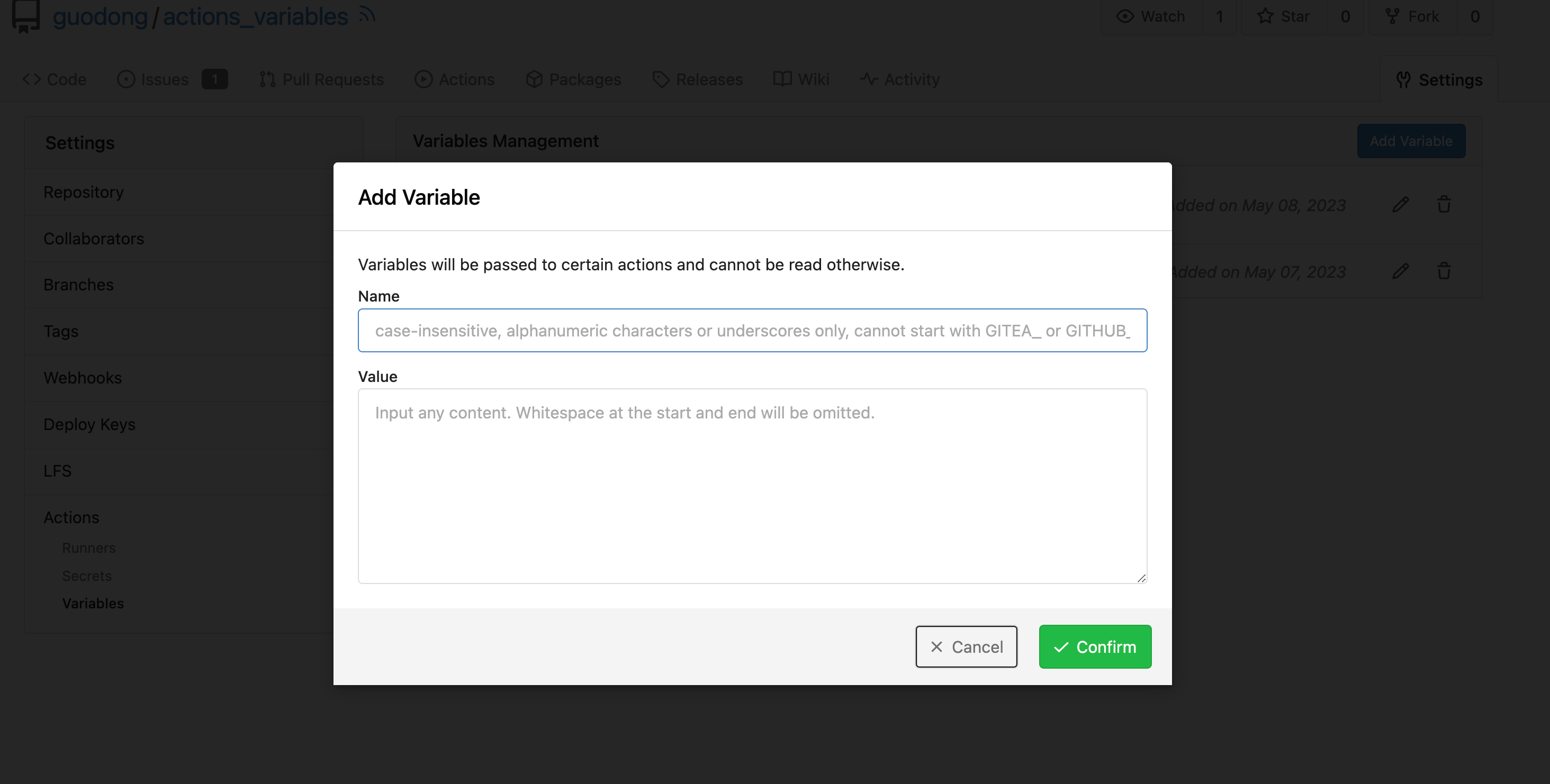
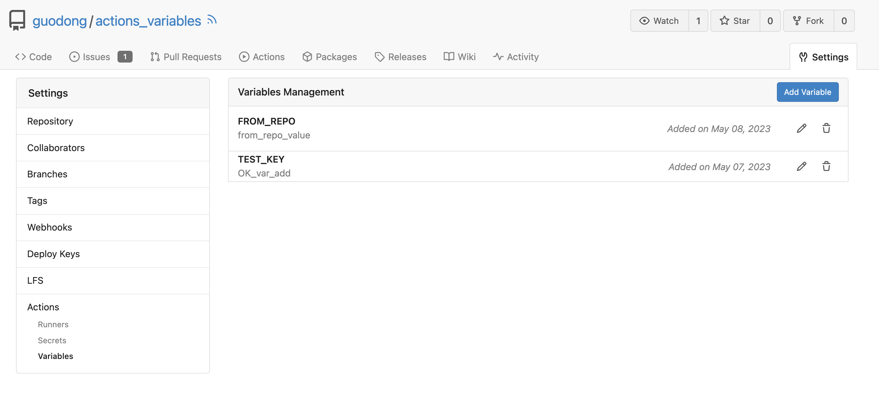
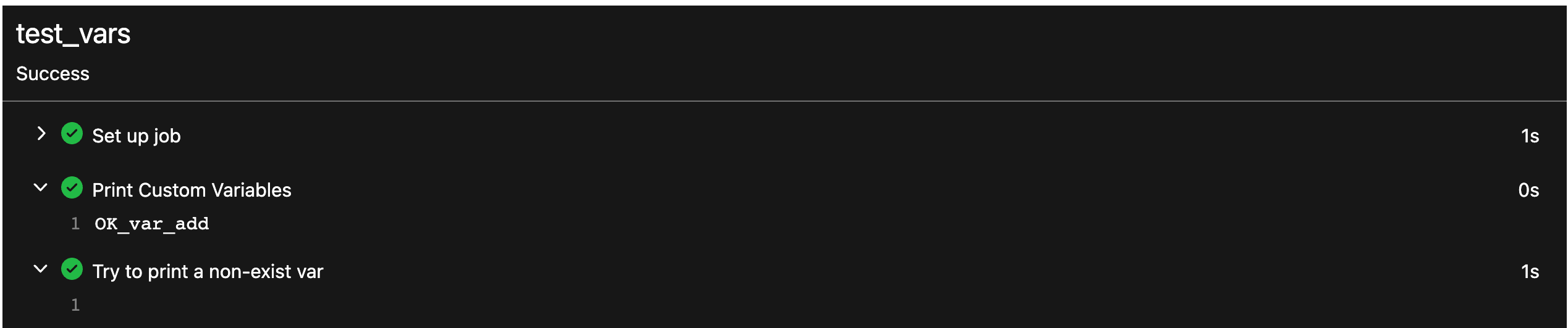
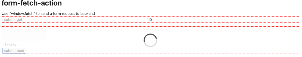
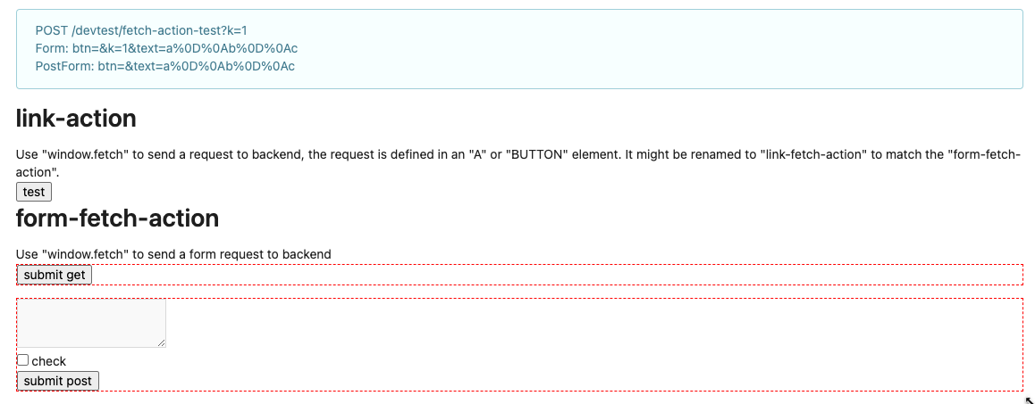
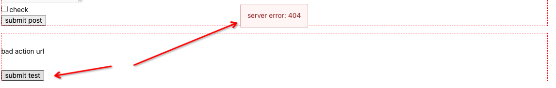
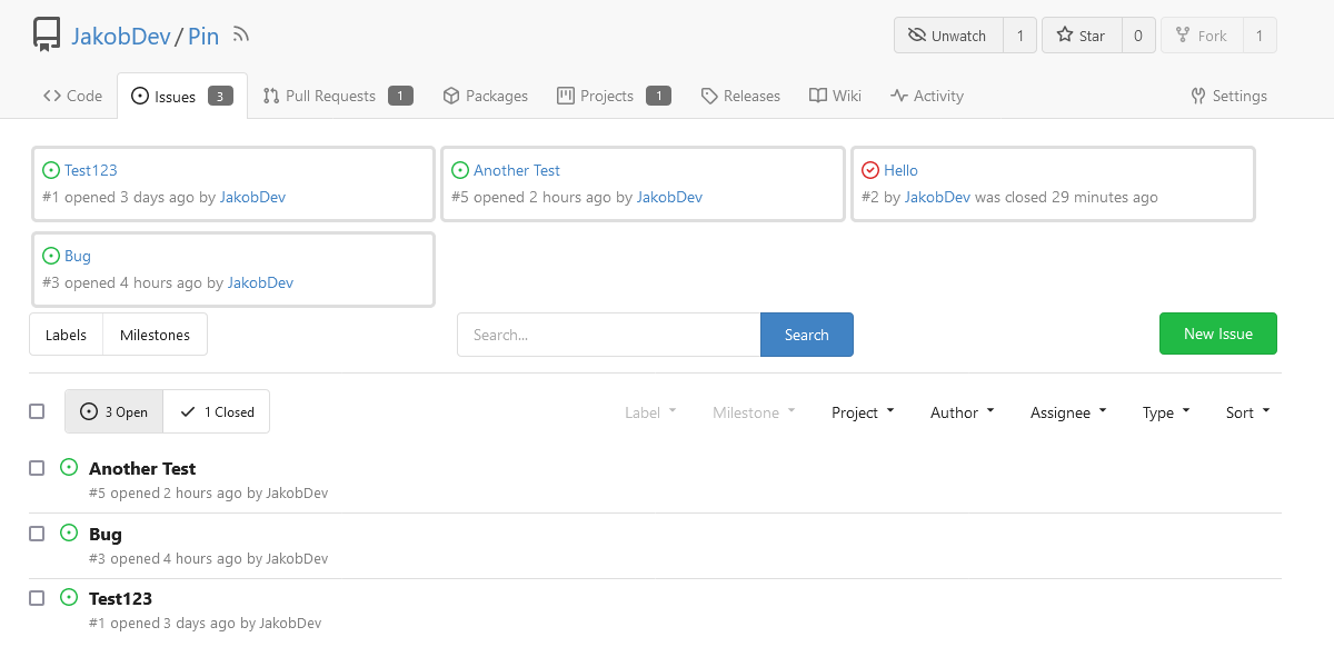
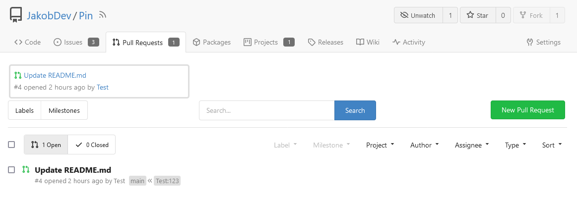
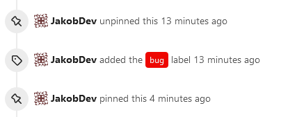
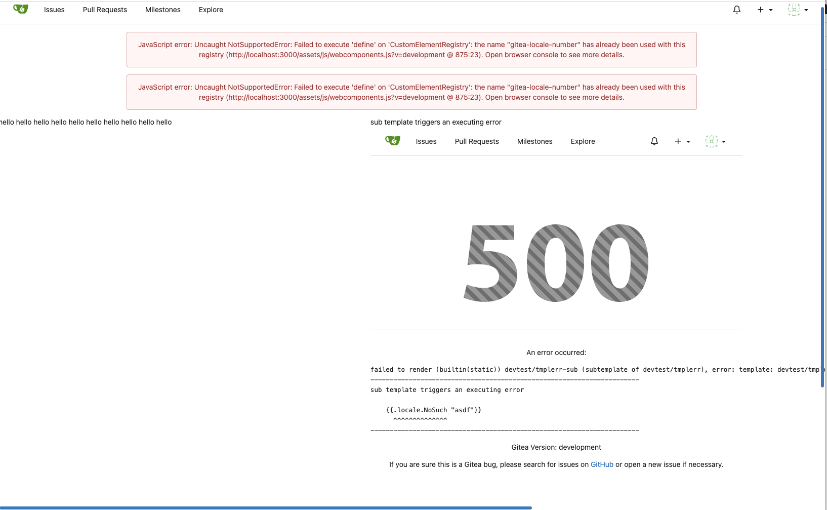
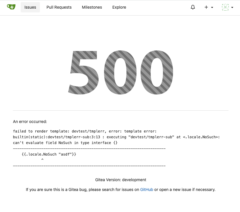
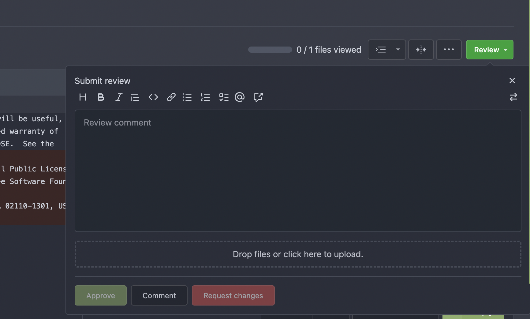
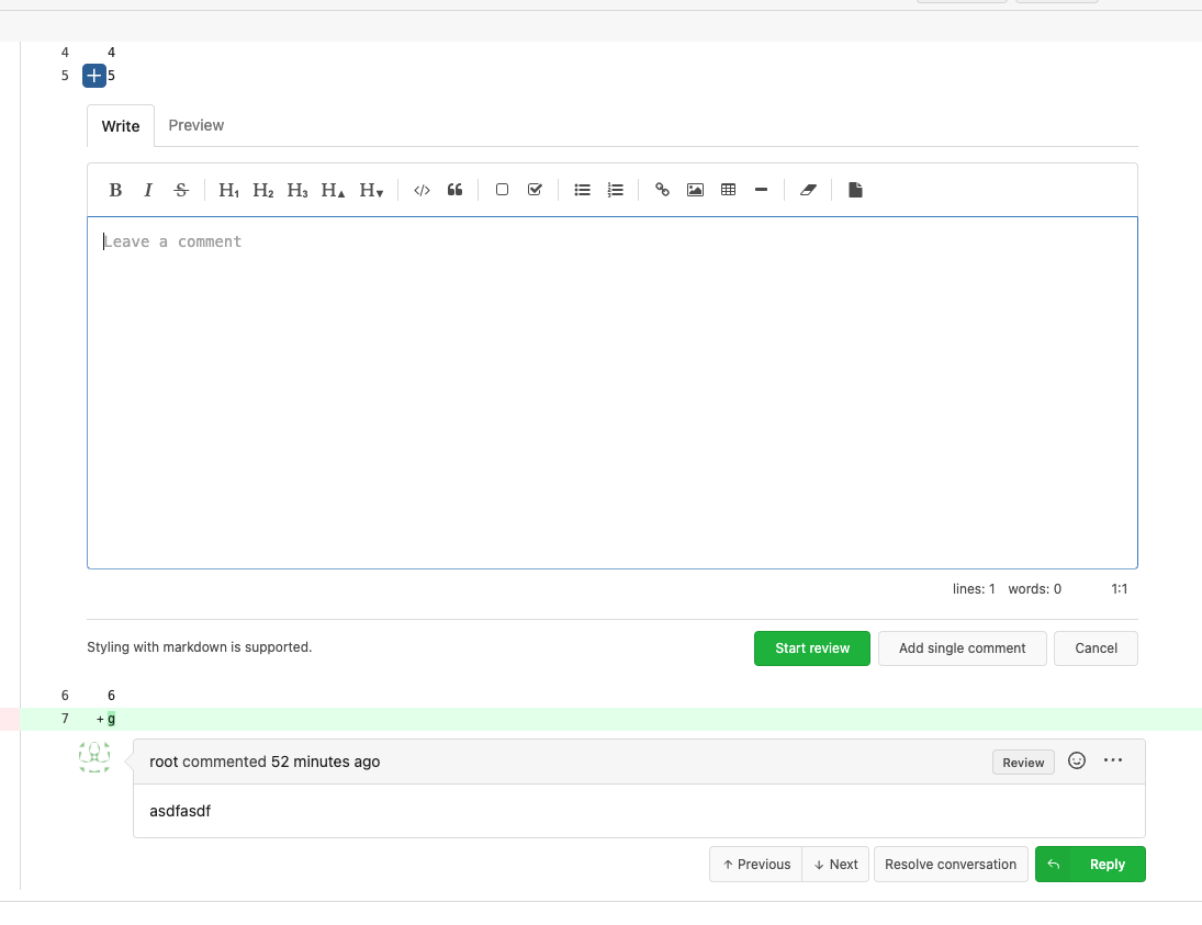
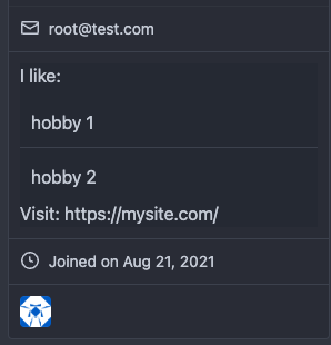
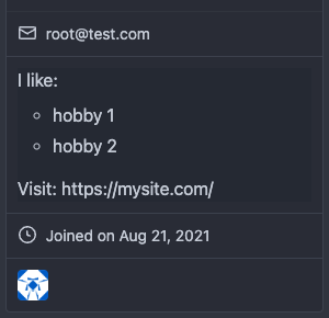
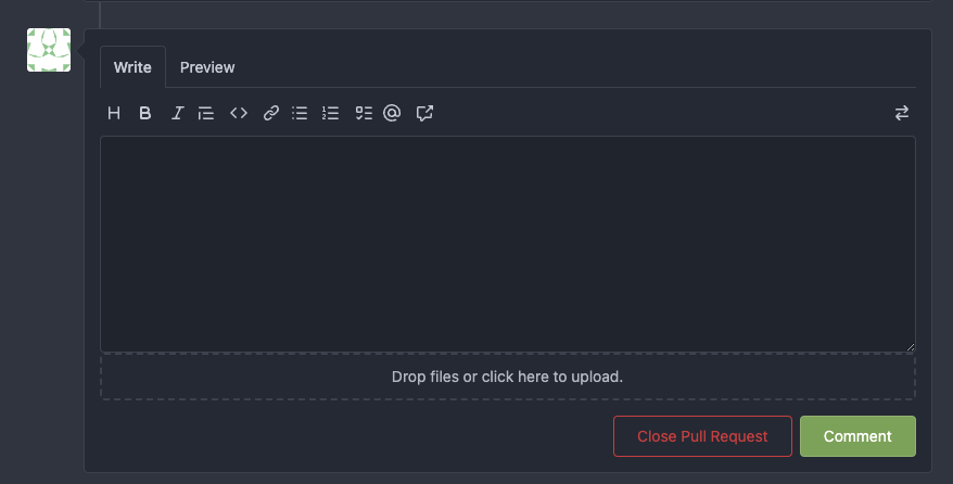
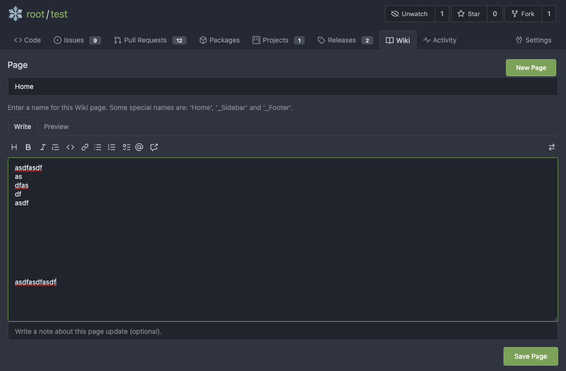
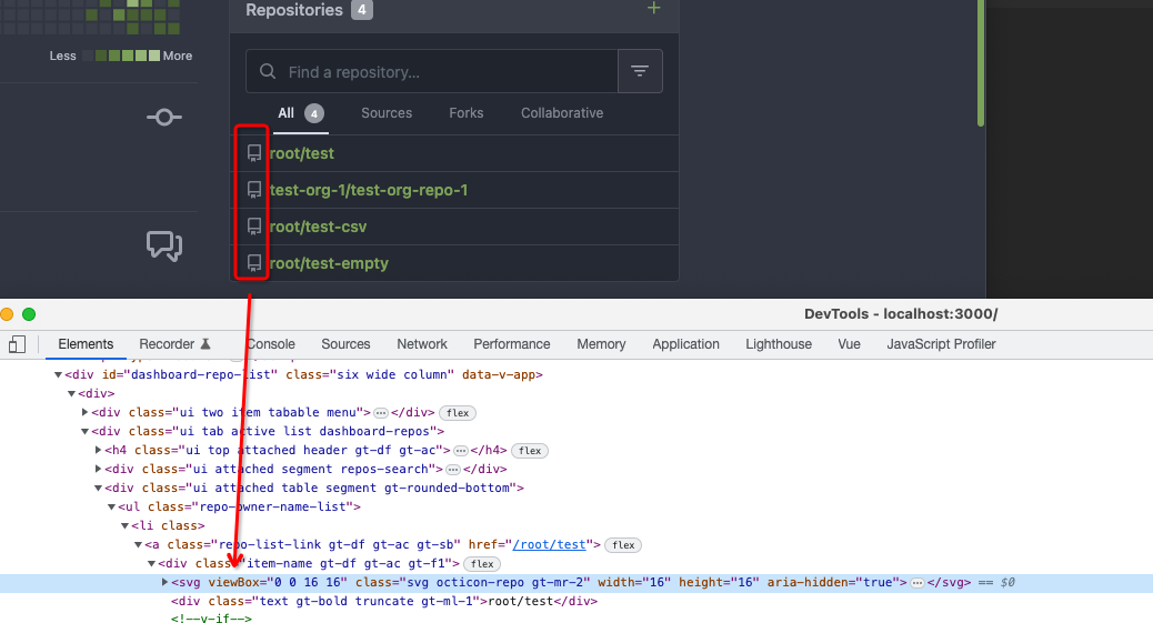
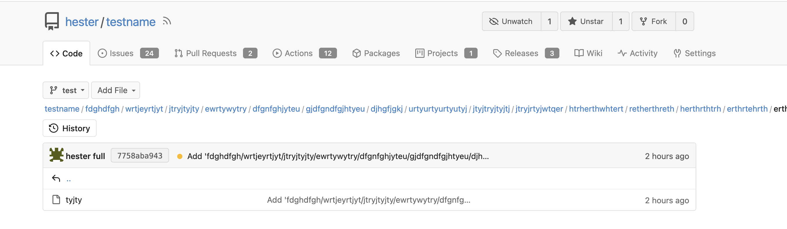
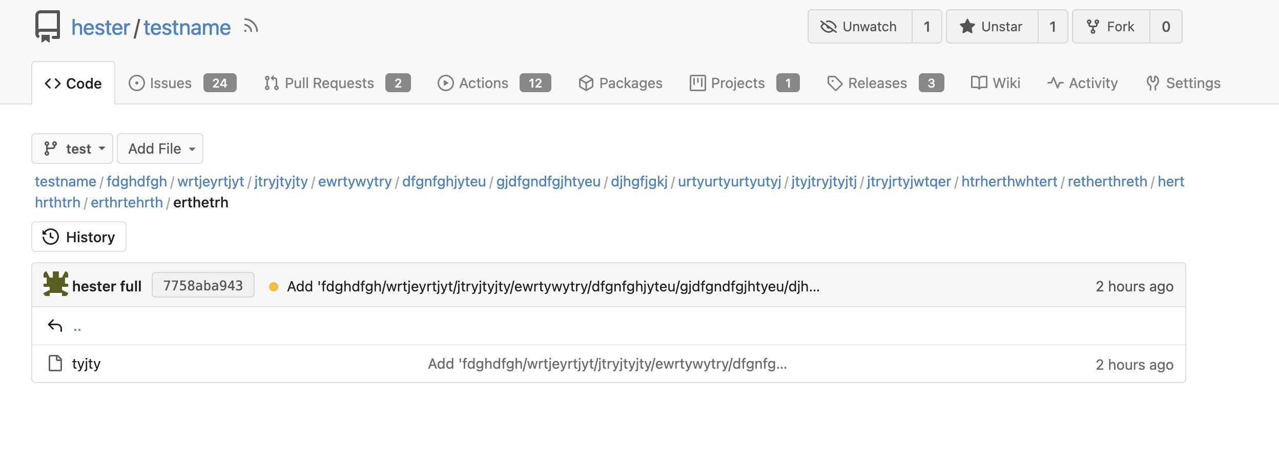
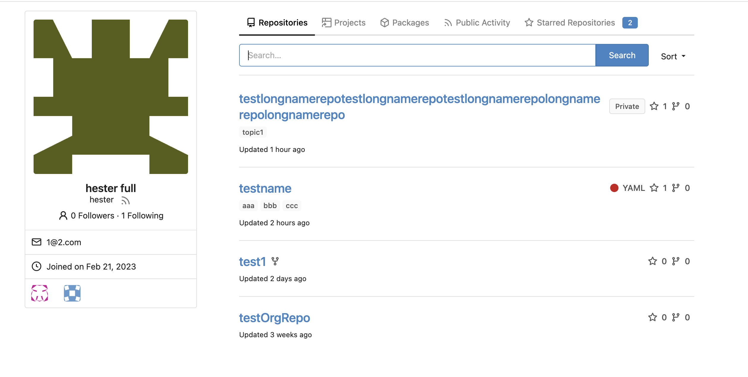
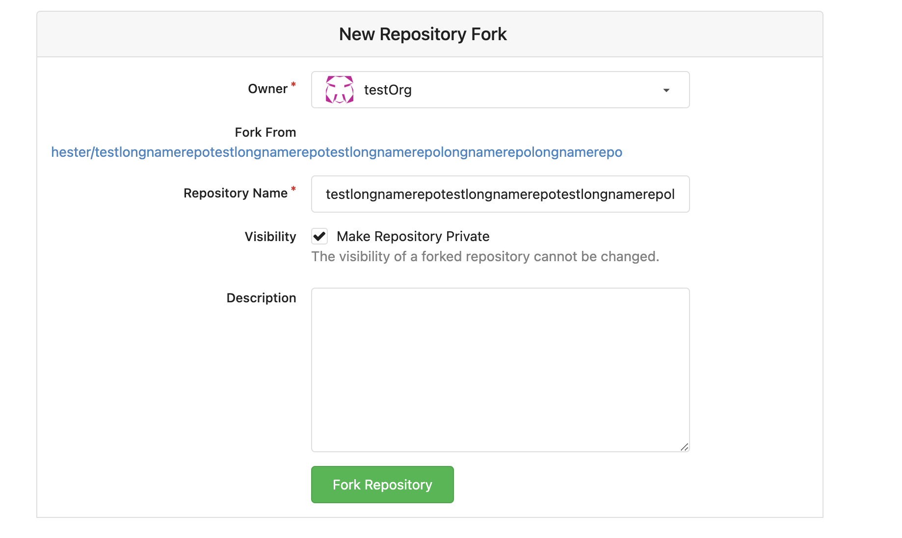
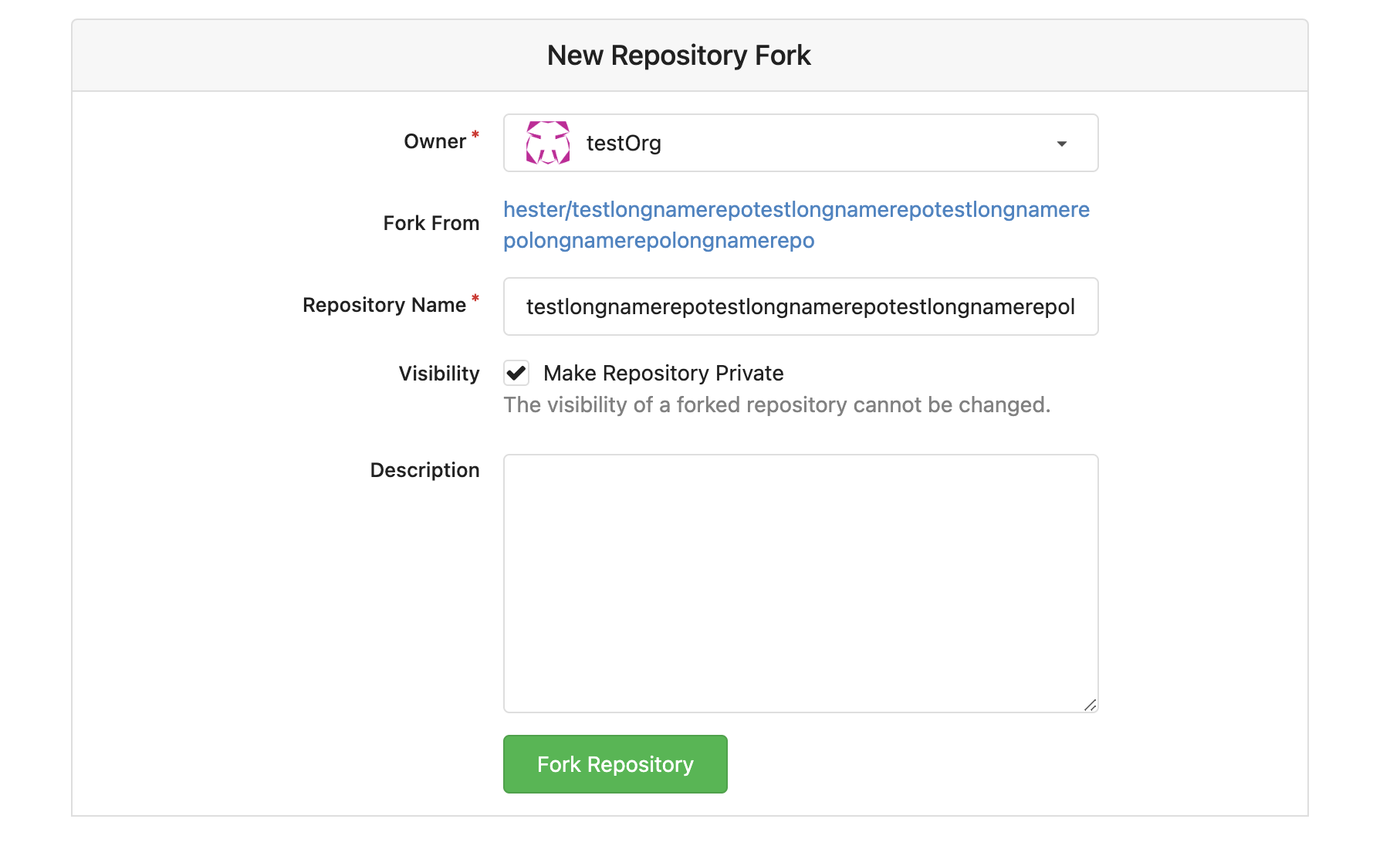