wxiaoguang
5115ffa90c
Remove fomantic ".link" selector and styles ( #23888 )
...
It's difficult to play with Fomantic's ".link" selector&styles, and it
doesn't bring any real benefit.
Instead, it sometimes introduces regressions (because of the `:not`
selector, really difficult to fine-tune).
Regression:
<details>

</details>
After this PR, there is no ".link" in code anymore. We do not need to
play the overwriting and `:not()` game anymore.


2023-04-03 20:47:23 -04:00
silverwind
ca03ca9e6e
CSS color tweaks ( #23828 )
...
Change grey shades in arc-green to match the theme more:
<img width="661" alt="Screenshot 2023-03-30 at 21 42 34"
src="https://user-images.githubusercontent.com/115237/228957952-8e099e56-6923-4aa6-8ce9-3c1cd898b73e.png ">
Adjusted grey shade in light theme:
<img width="652" alt="image"
src="https://user-images.githubusercontent.com/115237/228963876-3bde6181-8397-4dc2-be72-33982e6c7acb.png ">
Increase contrast in arc-green, change background to slightly darker
shade, change forgeground to slightly brighter colors:
<img width="283" alt="Screenshot 2023-03-30 at 22 33 20"
src="https://user-images.githubusercontent.com/115237/228957957-272c24a5-dd0b-427a-b6b7-e62836bdd73c.png ">
Increase contrast of grey text in light theme as well by making them
darker:
<img width="273" alt="Screenshot 2023-03-30 at 22 33 35"
src="https://user-images.githubusercontent.com/115237/228957959-283139c7-6fa7-4b68-9fdd-16c668ad1301.png ">
Add color rule for border multiple select items:
<img width="183" alt="Screenshot 2023-03-30 at 22 29 31"
src="https://user-images.githubusercontent.com/115237/228957954-6b5a752d-bbb0-4519-ab35-d02c0804d955.png ">
<img width="181" alt="Screenshot 2023-03-30 at 22 29 46"
src="https://user-images.githubusercontent.com/115237/228957956-fca9790a-d6c9-4f31-8d1b-d183ab3ac669.png ">
Added color rule for red `*` on required form fields:
<img width="97" alt="image"
src="https://user-images.githubusercontent.com/115237/228958760-517ad9ef-565d-4349-b734-9b559ab42429.png ">
2023-03-31 16:24:47 +08:00
silverwind
aa4d1d94f7
Diff improvements ( #23553 )
...
- Avoid flash of wrong tree toggle icon on page load by setting icon
based on sync state
- Avoid "pop-in" of tree on page load by leaving space based on sync
state
- Use the same border/box-shadow combo used on comment `:target` also
for file `:target`.
- Refactor `DiffFileTree.vue` to use `toggleElem` instead of hardcoded
class name.
- Left-align inline comment boxes and make them fit the same amount of
markup content on a line as GitHub.
- Fix height of `diff-file-list`
Fixes: https://github.com/go-gitea/gitea/issues/23593
<img width="1250" alt="Screenshot 2023-03-18 at 00 52 04"
src="https://user-images.githubusercontent.com/115237/226071392-6789a644-aead-4756-a77e-aba3642150a0.png ">
<img width="1246" alt="Screenshot 2023-03-18 at 00 59 43"
src="https://user-images.githubusercontent.com/115237/226071443-8bcba924-458b-48bd-b2f0-0de59cb180ac.png ">
<img width="1250" alt="Screenshot 2023-03-18 at 01 27 14"
src="https://user-images.githubusercontent.com/115237/226073121-ccb99f9a-d3ac-40b7-9589-43580c4a01c9.png ">
<img width="1231" alt="Screenshot 2023-03-19 at 21 44 16"
src="https://user-images.githubusercontent.com/115237/226207951-81bcae1b-6b41-4e39-83a7-0f37951df6be.png ">
(Yes I'm aware the border-radius in bottom corners is suboptimal, but
this would be notorously hard to fix without relying on `overflow:
hidden`).
2023-03-30 20:06:10 +08:00
silverwind
79e7a6ec1e
Add CSS rules for basic colored labels ( #23774 )
...
Before:
<img width="164" alt="Screenshot 2023-03-28 at 23 35 46"
src="https://user-images.githubusercontent.com/115237/228372437-663111b9-7285-4fa2-9125-fb5e1cad21d7.png ">
After:
<img width="166" alt="Screenshot 2023-03-28 at 23 35 54"
src="https://user-images.githubusercontent.com/115237/228372441-49430517-6b2d-4389-b11c-c30a724f6de7.png ">
Also I removed the `!important` on the primary label as it's very likely
unnecessary with the amount of specificity the selector already has.
2023-03-28 22:58:31 -04:00
wxiaoguang
12fff36d05
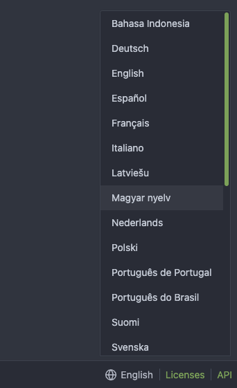
Fine tune more downdrop settings, use SVG for labels, improve Repo Topic Edit form ( #23626 )
...
Although it seems that some different purposes are mixed in this PR,
however, they are all related, and can be tested together, so I put them
together to save everyone's time.
Diff: `+79 −84`, everything becomes much better.
### Improve the dropdown settings.
Move all fomantic-init related code into our `fomantic.js`
Fine-tune some dropdown global settings, see the comments.
Also help to fix the first problem in #23625 , cc: @yp05327
The "language" menu has been simplified, and it works with small-height
window better.
### Use SVG instead of `<i class="delete icon">`
It's also done by `$.fn.dropdown.settings.templates.label` , cc:
@silverwind
### Remove incorrect `tabable` CSS class
It doesn't have CSS styles, and it was only in Vue. So it's totally
unnecessary, remove it by the way.
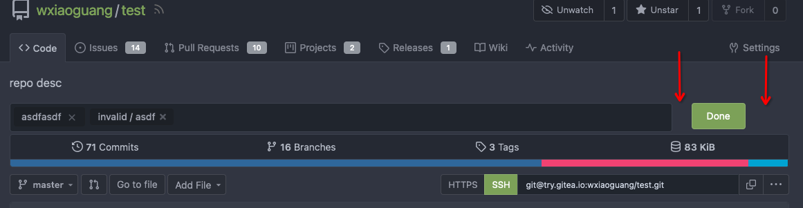
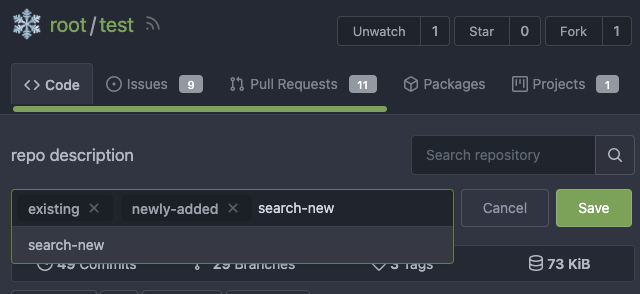
### Improve the Repo Topic Edit form
* Simplify the code
* Add a "Cancel" button
* Align elements
Before:
<details>

</details>
After:

2023-03-26 19:31:26 +08:00
wxiaoguang
389e83f7eb
Improve <SvgIcon> to make it output svg node and optimize performance ( #23570 )
...
Before, the Vue `<SvgIcon>` always outputs DOM nodes like:
```html
<span class="outer-class">
<svg class="class-name-defined" ...></svg>
</span>
```
The `span` is redundant and I guess such layout and the inconsistent
`class/class-name` attributes would cause bugs sooner or later.
This PR makes the `<SvgIcon>` clear, and it's faster than before,
because it doesn't need to parse the whole SVG string.
Before:
<details>

</details>
After:

---------
Co-authored-by: silverwind <me@silverwind.io>
2023-03-23 11:24:16 +08:00
wxiaoguang
30668e0047
Fix dropdown icon misalignment when using fomantic icon ( #23558 )
...
There are still many dropdowns using fomantic icon. For example: new
issue with issue template.
Avoid polluting the fomantic styles.
Before:

After:

2023-03-18 22:24:26 -04:00
wxiaoguang
27fcfae6d9
Fix some broken css ( #23560 )
...
1. The "close" inside "modal" are likely broken for long time
    * There is no var called `--body-color`
    * There is no `fullscreen modal`
* The `.ui.modal > .close.inside` doesn't seem to match most icons. It
only matches a few like "fork-repo-modal" or "adopt repo". Other places
are just buggy code copied again and again.
2. Convert the legacy `&:hover` LESS syntax to CSS syntax
2023-03-18 17:53:12 -04:00
silverwind
6aca9287a2
Increase horizontal page padding ( #23507 )
...
Add a bit more empty space on left and right side of page content for a
more pleasant viewing experience. Also tweaked the mobile navbar to
match.
Before:
<img width="1276" alt="Screenshot 2023-03-16 at 00 58 23"
src="https://user-images.githubusercontent.com/115237/225473942-f544106f-1b61-456a-99fb-3ba136cabc8d.png ">
After:
<img width="1270" alt="Screenshot 2023-03-16 at 00 58 37"
src="https://user-images.githubusercontent.com/115237/225473959-8b555359-a08d-48e1-9476-2710aabb1166.png ">
Mobile Navbar:
<img width="673" alt="Screenshot 2023-03-16 at 01 05 12"
src="https://user-images.githubusercontent.com/115237/225473966-adccef2b-4d34-44ed-8c75-d4ca46d96cf3.png ">
2023-03-17 02:23:23 -04:00
silverwind
202803fc69
Replace Less with CSS ( #23481 )
...
Ran most of the Less files through the Less compiler and Prettier and
then followed up with a round of manual fixes.

The Less compiler had unfortunately stripped all `//` style comments
that I had to restore (It did preserve `/* */` comments). Other fixes
include duplicate selector removal which were revealed after the
transpilation and which weren't caught by stylelint before but now are.

Fixes: https://github.com/go-gitea/gitea/issues/15565
2023-03-14 22:20:19 -04:00