mirror of
https://codeberg.org/forgejo/forgejo.git
synced 2024-06-28 18:13:44 +02:00
Some minor UI improvements together (then no need to review 3 small PRs) # The Map for auth sources Close #24826 Now the LDAP and OAuth2 both have multiple line editor for the map (and it can be resized by the handler) <details> 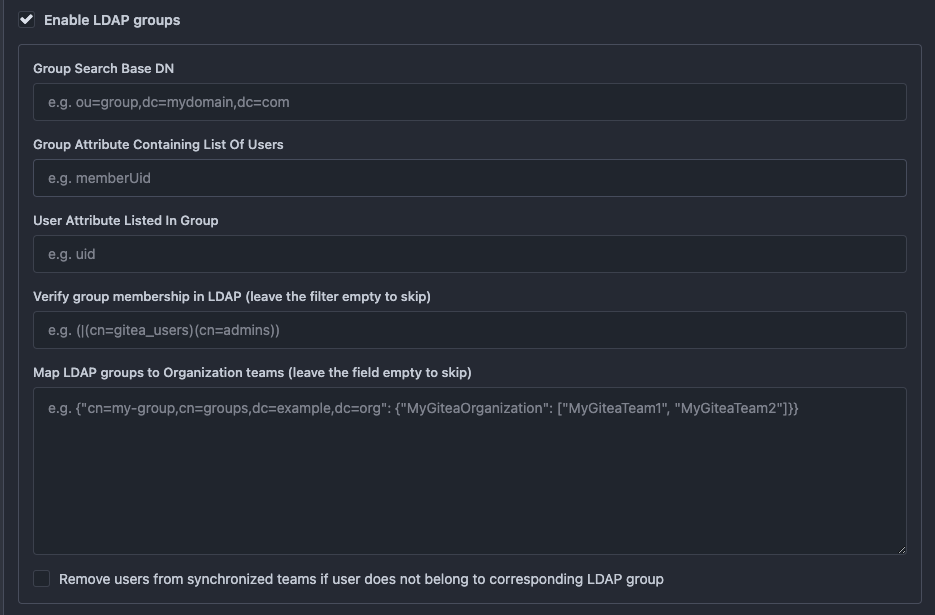 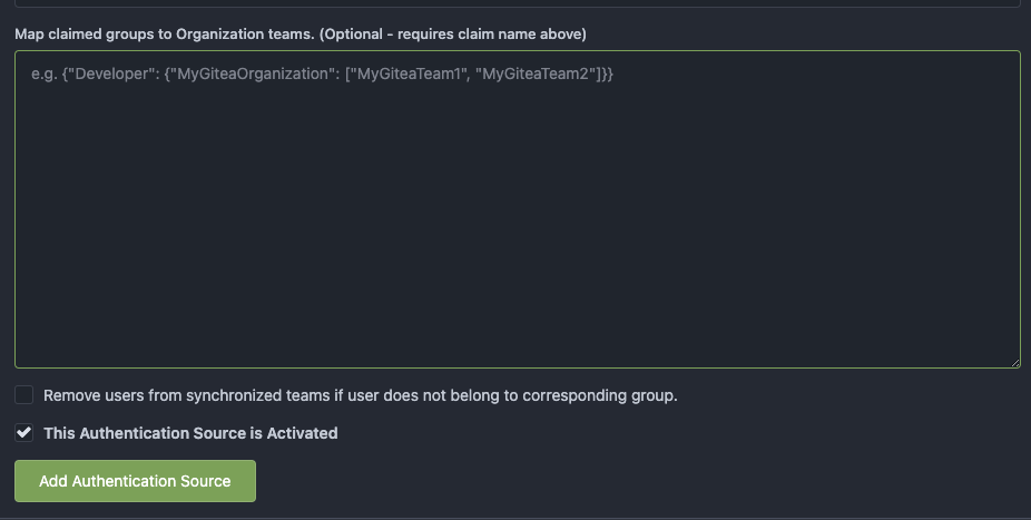 </details> # The account link display Before, the UI is misaligned This PR fixes the misalignment, remove "float right", and show the auth source name and auth type (in the tooltip). And the "active" color is changed from dark red to primary color. Before: <details>  </details> After: <details>  </details> # The UI logo alignment Changed file: `css/base.css`. Before, there were some "fine tunes", these "fine tunes" only causes misalignment. <details>  </details> After this PR: <details> 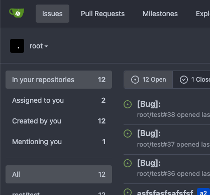 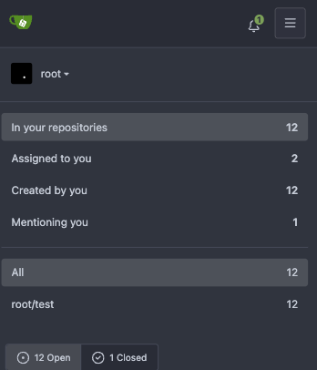 </details> |
||
|---|---|---|
| .. | ||
| source | ||
| edit.tmpl | ||
| list.tmpl | ||
| new.tmpl | ||